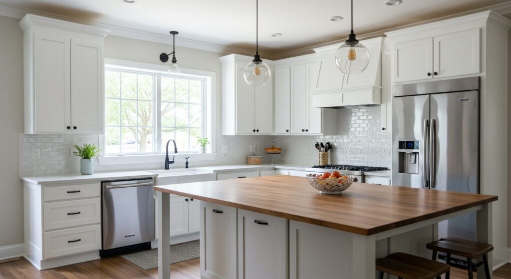
There’s something about walking into a kitchen with two-tone cabinets that just feels intentional. Like someone actually thought about the space instead of just picking whatever was on sale.
I’ve been noticing this trend everywhere lately, from fancy design magazines to real homes where people actually cook. The beauty of mix and match cabinets is that they add depth and personality without requiring a complete overhaul. You’re basically creating visual zones in your kitchen, and trust me, it’s way more forgiving than committing to one color that might feel too dark or too sterile.
What I love most? You can experiment with stylish kitchen colors in a way that feels safe. Dark on the bottom grounds the space. Light on top keeps things airy. Or flip it entirely if you’re feeling bold. Let’s explore some combinations that actually work in real life.
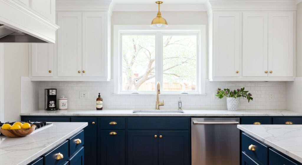
1. Classic Navy and White Contrast
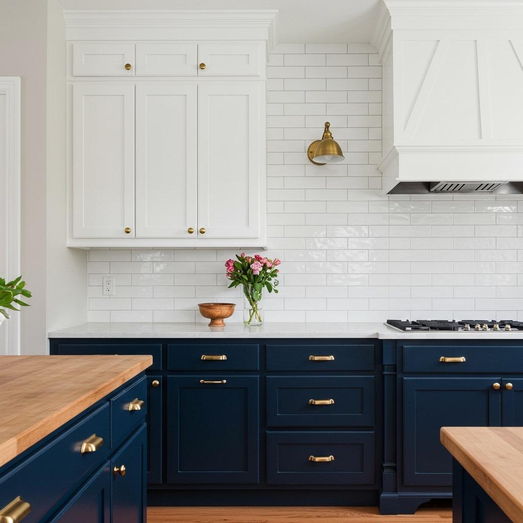
Navy blue lower cabinets with white uppers is probably the safest place to start if you’re new to this whole two-tone thing. The dark base hides scuffs and spills (because life happens), while the white upper cabinets keep your kitchen from feeling like a cave.
This combination works especially well in kitchens with limited natural light. The white reflects whatever light you do have, bouncing it around the room. I’ve seen this look in both modern farmhouse and traditional homes, which tells you how versatile it really is.
Hardware makes a huge difference here. Brass or gold pulls add warmth, while chrome or nickel keeps things crisp and contemporary. Don’t overthink it, just pick what feels right with your countertops.
2. Warm Wood Tone with Soft White
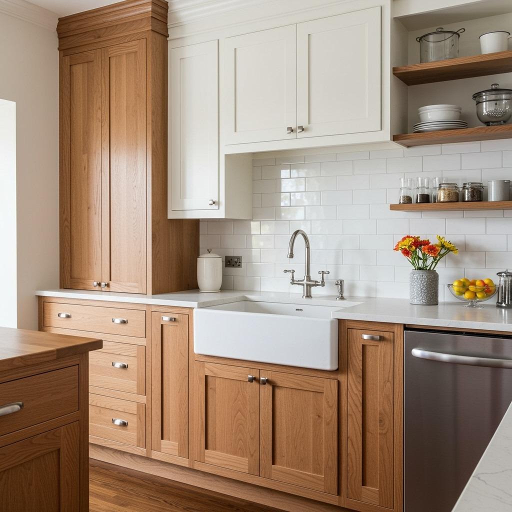
Pairing natural wood base cabinets with white uppers brings this organic, lived-in feeling that’s hard to beat. The wood adds texture and warmth without overwhelming the space, especially if you’re working with a smaller kitchen layout.
I’m particularly drawn to this combination in homes with Scandinavian-inspired design elements throughout. It bridges that gap between minimalist and cozy. The wood tones don’t have to match your floors perfectly either, actually, a slight variation often looks more collected.
One thing to consider: if your wood cabinets have a strong grain pattern, keep your countertops relatively simple. You want visual interest, not visual chaos.
3. Sage Green and Cream Dream
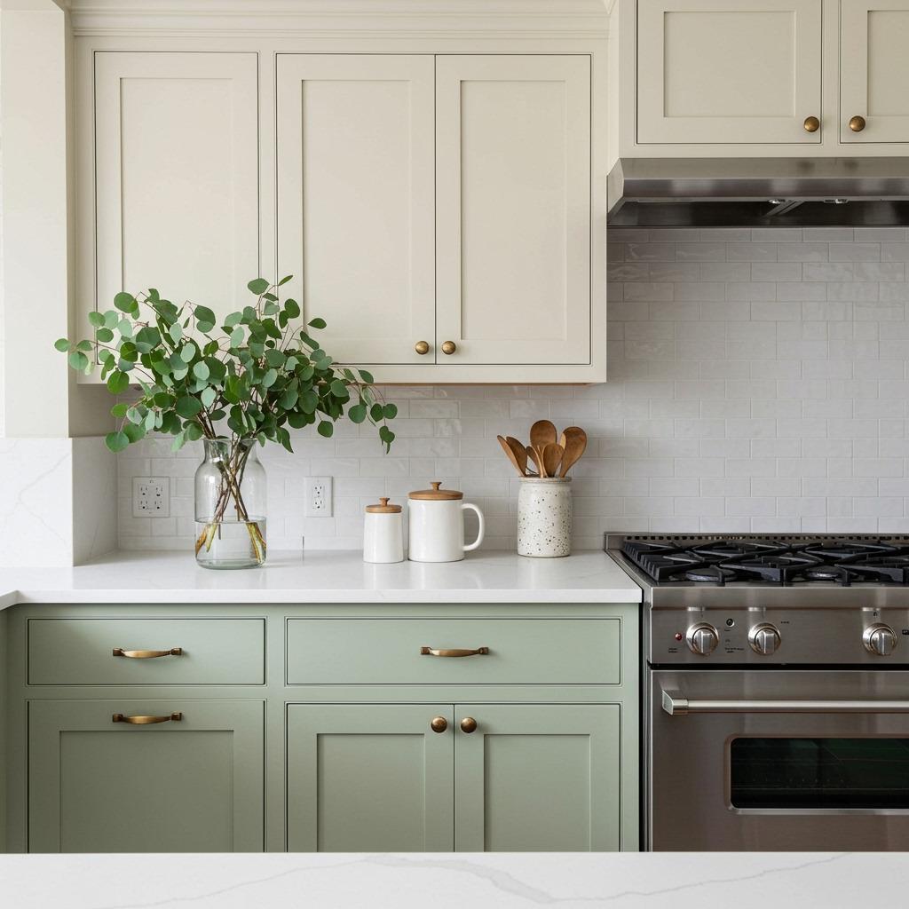
Sage green has been having a moment, and I completely understand why. It’s sophisticated without being stuffy, and when you pair those green lowers with cream uppers, you get this calming, nature-inspired palette that somehow still feels current.
This combination works beautifully in kitchens that get morning light. The green takes on different tones throughout the day, shifting from cool to warm depending on the sun. It’s one of those cabinet trends that I think will age well because it’s rooted in nature rather than being aggressively trendy.
The cream uppers soften the whole look. Pure white might feel too stark against sage, but cream has this buttery quality that complements the earthiness of the green.
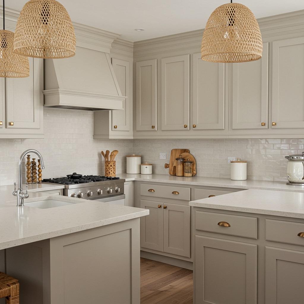
4. Charcoal Gray and Light Gray Sophistication
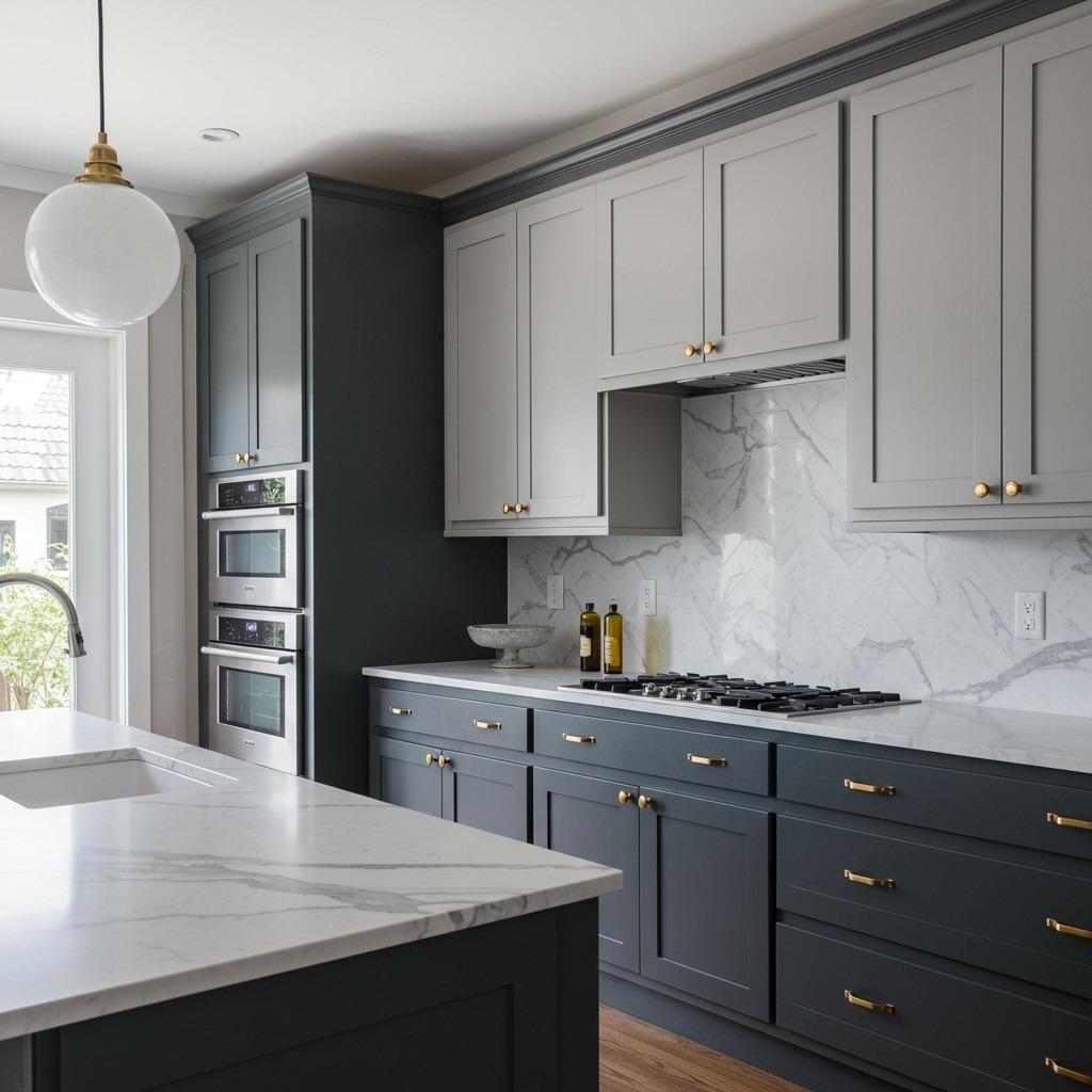
Going tone-on-tone with different shades of gray creates this sophisticated, almost gallery-like quality in your kitchen. The dark charcoal bases anchor the room, while lighter gray uppers maintain the cool, contemporary vibe without feeling too heavy.
This approach is perfect if you want a modern look but aren’t quite ready to commit to stark black and white. Gray is inherently forgiving. It hides fingerprints, works with stainless steel appliances, and pairs well with both warm and cool accent colors.
I’d recommend sampling your gray paint colors in the actual space before committing. Grays can pull blue, green, or purple depending on your lighting, and you want to make sure they’re playing nicely together.
5. Bold Black Lower with Natural Wood Upper
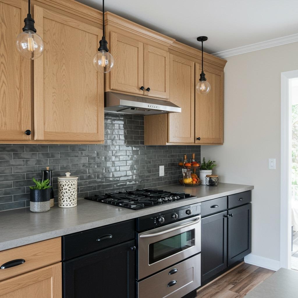
This combination flips the traditional approach on its head, and I’m here for it. Black lower cabinets create a striking foundation, while natural wood uppers add unexpected warmth and prevent the space from feeling too industrial or cold.
It’s a look that works particularly well in modern home improvement projects where you’re going for that urban loft vibe. The contrast is strong without being harsh, and the wood tones soften what could otherwise feel too masculine or stark.
Keep your hardware minimal here. The combination itself makes a statement, so you don’t need ornate pulls competing for attention. Simple bar handles or even touch-latch cabinets maintain the clean lines.
6. Soft Blue and Bright White Freshness
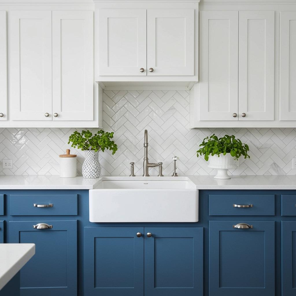
Light blue cabinets on the bottom with white on top brings this airy, coastal feeling without leaning too heavily into beach house territory. It’s fresh and clean, perfect for kitchens that face south or west where you’re getting plenty of natural light.
This combination reminds me of well-designed bathroom spaces where blue and white create that spa-like atmosphere. In a kitchen, it has the same calming effect while still feeling practical and hardworking.
The key is choosing a blue that’s not too saturated. You want something that reads as soft and approachable, not electric or overwhelming. Think robin’s egg or powder blue rather than cobalt or royal.
7. Warm Taupe and Soft White Elegance
Taupe is one of those colors that people either love or haven’t considered yet. Paired with soft white uppers, it creates this elegant, timeless look that’s neither too warm nor too cool. It’s like the perfect neutral that works with everything.
This combination is especially flattering if your kitchen opens into your living spaces. Taupe bridges the gap between typical kitchen colors and living room tones, creating better flow throughout your home’s layout. It’s sophisticated without trying too hard.
I’ve noticed taupe cabinets look particularly beautiful with natural materials like wood, stone, and linen. They complement rather than compete, which is exactly what you want in a hardworking kitchen space.
8. Forest Green and Cream Cottage Charm
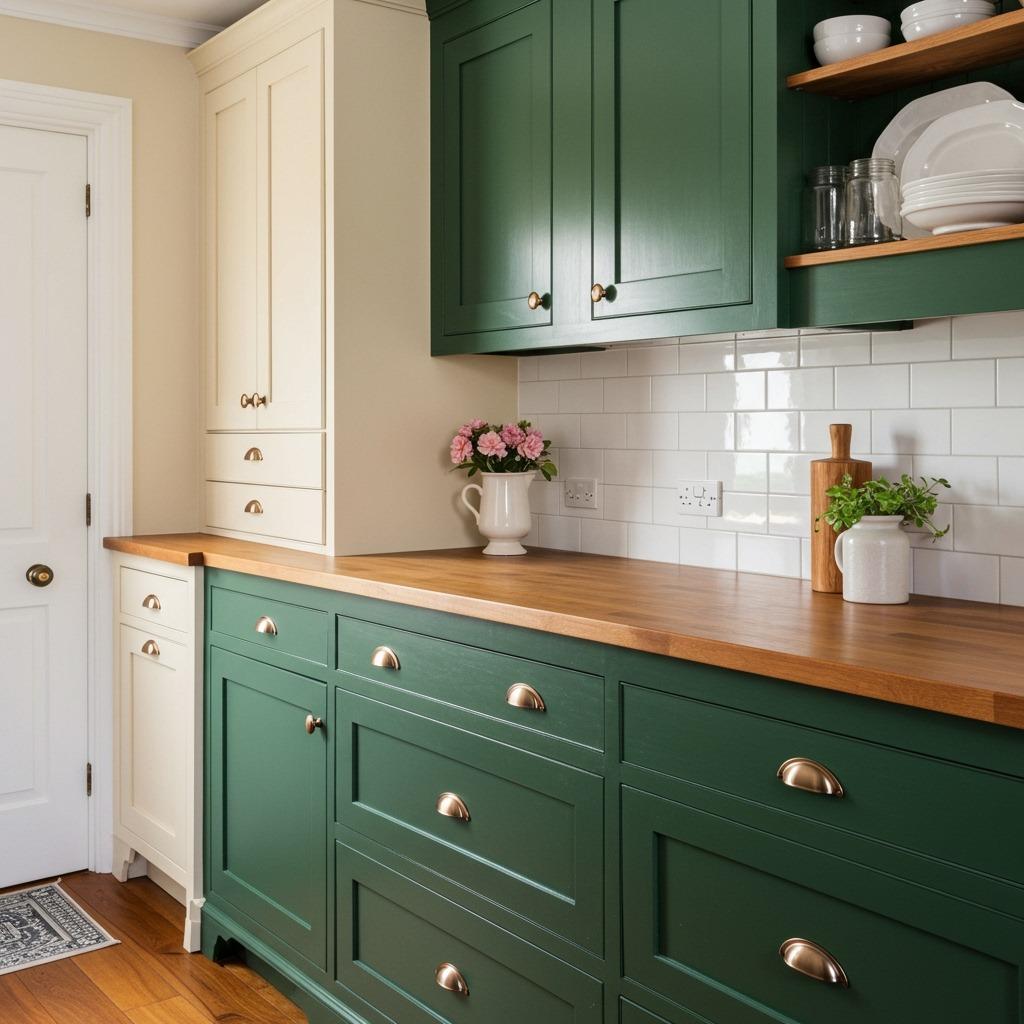
Forest green brings this richness and depth that cream beautifully balances out. Together, they create a cottage-inspired look that feels both cozy and collected. It’s one of those combinations that makes a kitchen feel like it’s been in the family for generations.
The dark green grounds the space in a way that lighter greens can’t quite achieve. It hides wear and tear around your most-used base cabinets while the cream uppers keep things from feeling too enclosed or dark. This balance is key in small space renovations where every design choice matters.
Natural brass or bronze hardware enhances the vintage quality of this combination. Modern chrome would work too if you want to keep things more contemporary, but there’s something about warm metals that just clicks with forest green.
9. Two-Tone Gray with Different Finishes

Here’s a less obvious approach: using the same color but different finishes. Matte gray lowers with glossy gray uppers creates visual distinction without introducing another color. It’s subtle but effective, especially in modern or contemporary kitchens.
The matte finish on base cabinets is practical because it hides fingerprints and general wear. The glossy uppers reflect light, making your kitchen feel brighter and more spacious.
This technique works with nearly any color, actually. You could do it with navy, black, or even white. The finish variation provides the interest rather than color contrast.
10. Terracotta and White Warmth
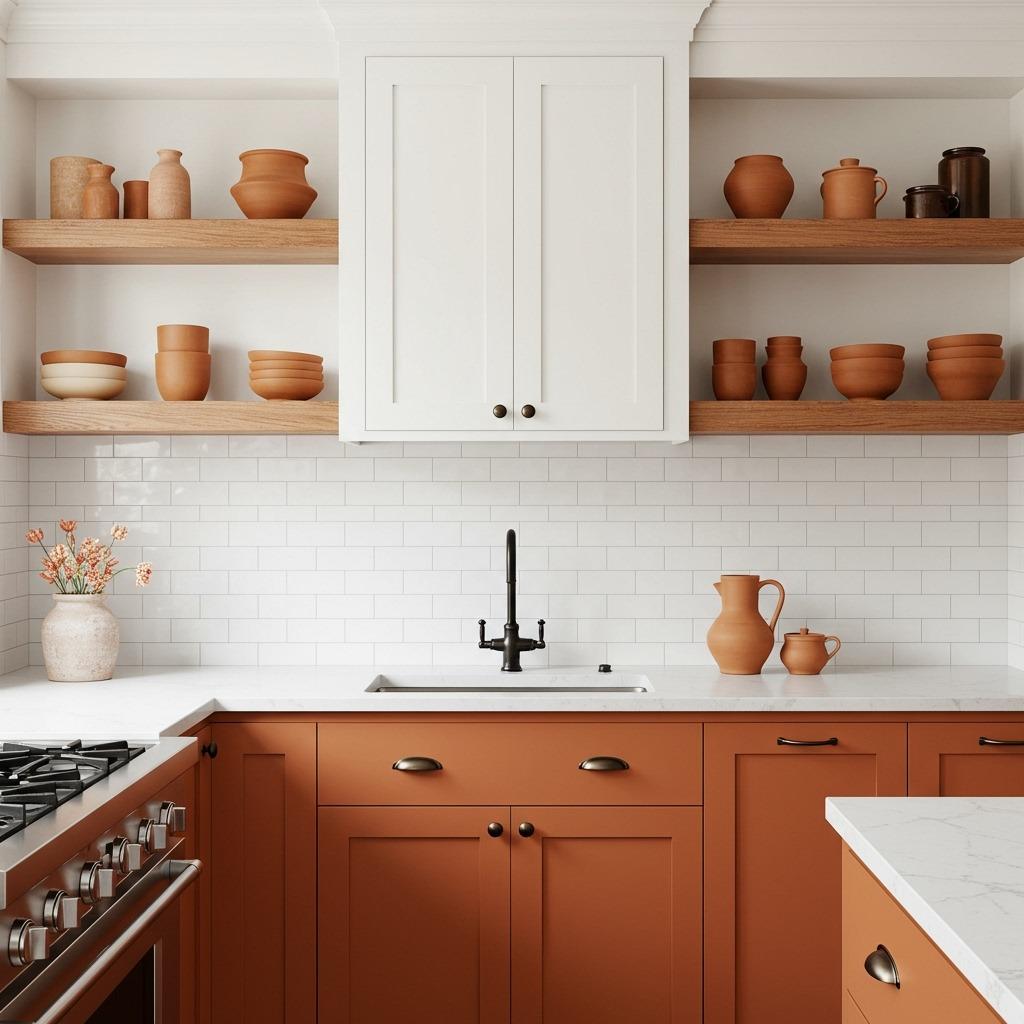
Terracotta cabinets might sound bold, but hear me out. When balanced with white uppers, this earthy orange-brown brings incredible warmth without feeling overwhelming. It’s like bringing a sunset into your kitchen, and paired with white, it actually feels quite sophisticated.
This combination works best in kitchens with good natural light, where the terracotta can show its true depth and complexity. In artificial light alone, it might read too flat or too orange. But catch it in morning or evening light, and you’ll see why this color is having such a resurgence.
Keep your accessories natural with this palette. Wood cutting boards, ceramic dishes, and woven textiles all complement terracotta’s earthy quality. Avoid anything too shiny or synthetic, which would clash with the organic feel.
11. Midnight Blue and Light Wood Contrast
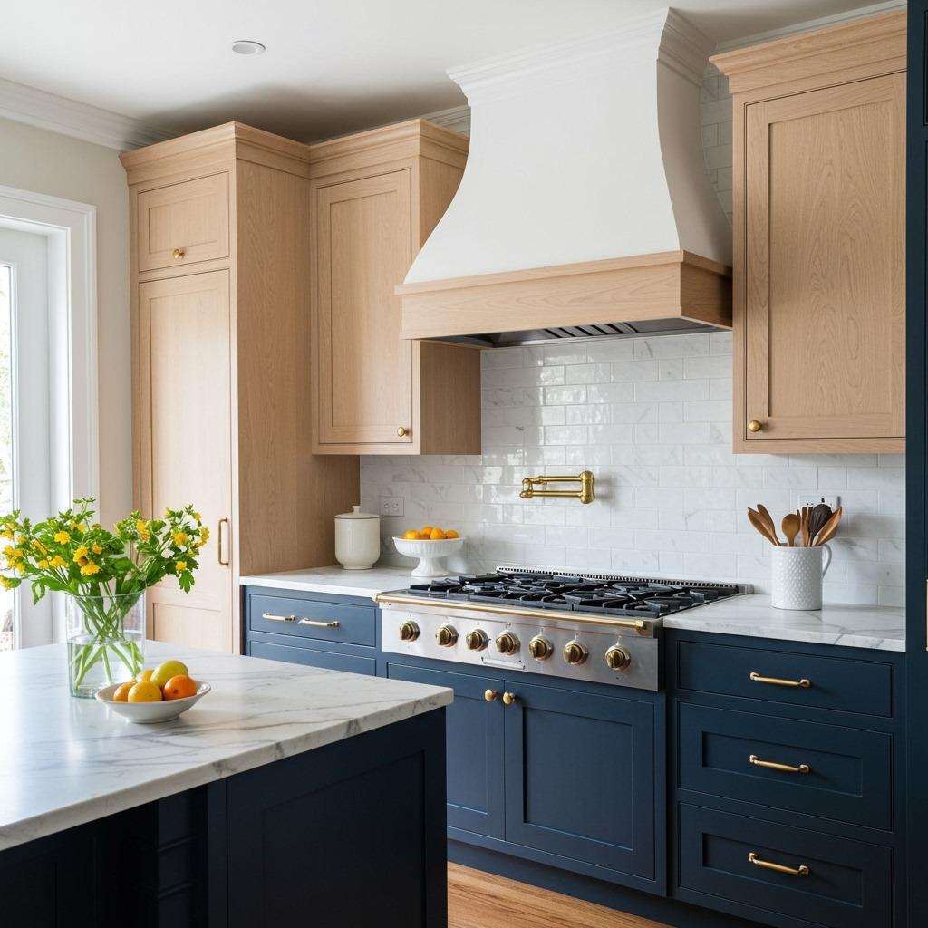
Midnight blue paired with light wood creates this unexpected but totally gorgeous contrast. The deep blue provides drama and sophistication, while the light wood keeps things from feeling too serious or formal. It’s a combination I’ve been seeing more in high-end kitchen renovations.
The wood grain adds texture and visual interest that solid-colored uppers wouldn’t provide. Plus, it brings warmth to balance the coolness of the blue. This is one of those combinations that photographs beautifully, which is why it’s becoming increasingly popular on Pinterest and design blogs.
If you’re worried about the blue feeling too dark, make sure your uppers are a truly light wood like maple or birch. Skip darker woods like walnut here, they’ll compete with the blue rather than complement it.
12. Soft Pink and White Romance
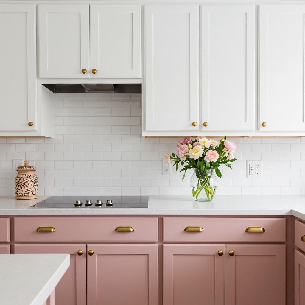
Blush or dusty pink cabinets are braver than your typical neutrals, but when you balance them with white uppers, they become surprisingly versatile. This combination brings a soft, romantic quality that works in both modern and traditional settings.
I’ll be honest, this one isn’t for everyone. But if you’re someone who loves colorful minimalist design, this could be your perfect kitchen palette. The pink adds personality without screaming for attention, especially when you choose a muted, dusty tone rather than bright bubblegum.
Gold or brass hardware elevates this combination from sweet to sophisticated. It’s those warm metallic accents that prevent the pink from feeling too juvenile or trendy.
13. Olive Green and Warm White Natural Look
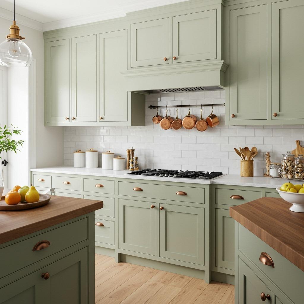
Olive green has this earthy, grounded quality that warm white perfectly complements. Together, they create a natural, organic kitchen aesthetic that feels collected rather than designed. It’s one of those color combinations that just makes sense, like it’s always existed in nature.
This pairing works beautifully in kitchens that incorporate other natural materials. Think butcher block counters, terracotta tiles, or natural fiber rugs. The olive and white provide a backdrop that lets these textures shine without competing for attention.
Lighting is crucial with olive tones. They can look muddy in poor lighting but absolutely glow in natural light. Make sure your kitchen has good light sources before committing to this beautiful but nuanced color.
14. Chocolate Brown and Cream Timeless Appeal
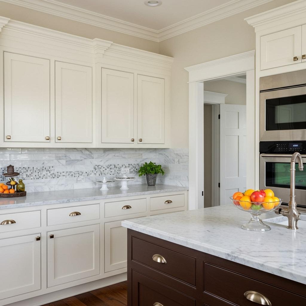
Chocolate brown cabinets bring this timeless, almost furniture-like quality to kitchens. Paired with cream uppers, the combination feels established and elegant without being stuffy. It’s reminiscent of traditional kitchens but works equally well in more contemporary spaces when you keep the lines clean.
Brown is one of those colors that’s been in and out of favor over the years, but quality never goes out of style. This combination has staying power because it’s based on natural color relationships rather than trending palettes. It’s the kind of choice you won’t regret in five years.
The cream softens what could otherwise feel too heavy or dark, especially in kitchens with limited natural light. It’s that balance between grounded and airy that makes the space feel both cozy and functional.
15. Pale Yellow and White Sunshine Vibes
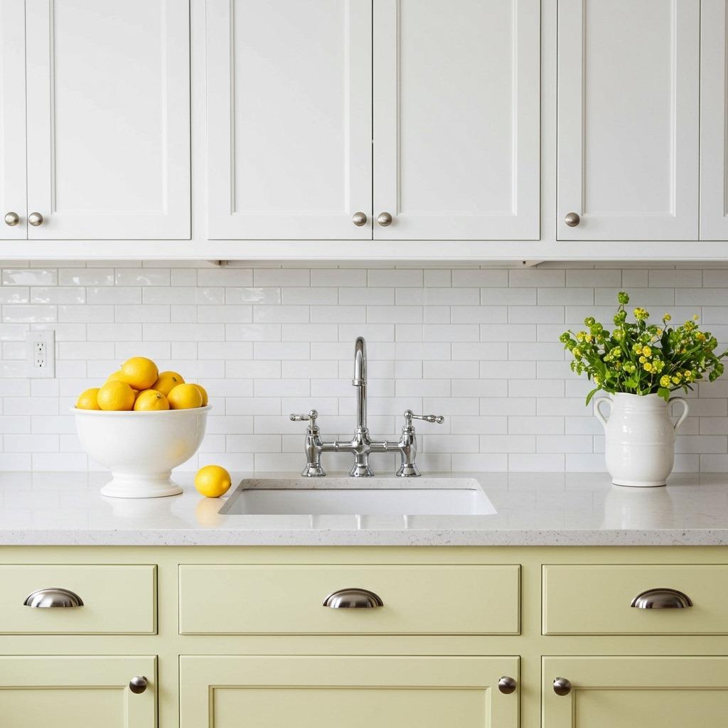
Pale yellow cabinets bring instant cheerfulness to a kitchen without being too bold or overwhelming. When you pair that sunny yellow with crisp white uppers, you get a fresh, happy space that feels welcoming every time you walk in. It’s particularly nice in kitchens that don’t get tons of natural light because it creates its own brightness.
This combination reminds me of vintage kitchens from the 1950s but updated for modern living. It has that retro charm without feeling dated or kitschy. The key is keeping your yellow soft and buttery rather than bright or neon.
White countertops and backsplash let the yellow shine without competing. Add some greenery or fresh flowers, and you’ve got a kitchen that feels alive and inviting year-round.
Choosing the Right Combination for Your Space
Picking your two-tone cabinet combination isn’t just about what looks pretty on Pinterest. You need to consider your actual space, lighting, and how you really use your kitchen. A color that looks amazing in someone else’s sun-drenched cooking space might fall flat in your north-facing galley kitchen.
Start by observing your kitchen’s natural light at different times of day. Colors shift dramatically depending on light exposure. That gorgeous navy might look nearly black without good light, while soft blue could wash out completely in bright afternoon sun.
Think about your lifestyle too. If you’ve got kids constantly grabbing snacks, those beautiful light-colored base cabinets might stress you out. There’s no shame in choosing darker lowers for practical reasons. You want a kitchen you’ll actually enjoy living in, not one that requires constant maintenance to look good.
Making Two-Tone Cabinets Work in Small Kitchens
The conventional wisdom says dark colors make spaces feel smaller, but two-tone cabinets can actually help define and organize a compact kitchen. The key is being strategic about your placement. Keeping darker colors low maintains that open, airy feeling above while adding visual weight where you need it most.
In small space renovations, vertical division created by two-tone cabinets can make ceilings feel higher. Your eye travels up the lighter upper cabinets, creating an illusion of height. It’s one of those design tricks that actually works in real life, not just theory.
Glass-front uppers in your lighter tone can enhance this effect even more. They break up the visual mass of cabinets while displaying dishes or glassware, adding another layer of interest without making the space feel cluttered.
Hardware and Finishing Touches
Your cabinet hardware is like jewelry for your kitchen. It can completely change the vibe of your two-tone cabinets, taking them from farmhouse to modern with a simple swap. Don’t underestimate this detail because it’s often what separates DIY-looking kitchens from professionally designed spaces.
For a cohesive look, I usually recommend keeping the same hardware style on both cabinet colors. But you could use different finishes if you’re feeling adventurous, like brass on dark cabinets and chrome on light ones. Just make sure there’s something tying them together, maybe matching shapes or a repeated accent color elsewhere.
Consider how your hardware interacts with your cabinet colors too. Dark hardware pops against light cabinets, while light hardware can get lost. Sometimes the unexpected choice (like black pulls on white cabinets paired with brass on navy) creates the most interesting, layered look.
Maintaining the Balance
The split between your two cabinet colors matters more than you might think. The most common approach is darker on bottom, lighter on top, with the division happening at countertop level. It’s instinctive and works with how we naturally perceive space and weight.
But you could also consider vertical divisions if your kitchen layout supports it. Maybe the island is one color while perimeter cabinets are another. Or perhaps just your pantry wall differs from the rest. These less obvious approaches can be really striking when done thoughtfully.
Whatever division you choose, make sure it follows some logic. Random color placement without reason looks chaotic rather than intentional. Your two-tone choice should enhance your kitchen’s architecture, not fight against it.
Two-tone kitchen cabinets give you room to express personality while keeping things grounded and practical. Whether you go bold with contrasting colors or subtle with different shades of the same tone, you’re creating visual depth that single-color kitchens simply can’t match. The beauty is in finding that sweet spot between making a statement and creating a space you’ll genuinely love cooking in for years to come.