
There’s something about walking into a room painted in gentle hues that instantly makes you exhale. Pastel bedrooms have this magical ability to quiet the noise of the day and wrap you in comfort. If you’ve been craving a space that feels like a soft hug after a long day, you’re in the right place.
Creating a pastel bedroom isn’t about following rigid rules or emptying your wallet on expensive makeovers. It’s more about understanding how these delicate colors work together and finding the right balance for your personal style. Some people worry pastels might feel too juvenile or overly sweet, but that’s where thoughtful styling comes in.
Whether you’re starting from scratch or just want to refresh your current space, these ideas will help you build a bedroom that feels calm without being boring. Let’s explore how to work with soft bedroom colors in ways that feel grown-up, intentional, and completely yours.
Understanding the Magic of Pastel Color Palettes
Pastels are essentially colors mixed with white, which gives them that soft, muted quality. This isn’t just about aesthetics – there’s actual psychology behind why these shades make us feel more relaxed. Lighter colors reflect more light, making spaces feel airier and more open.
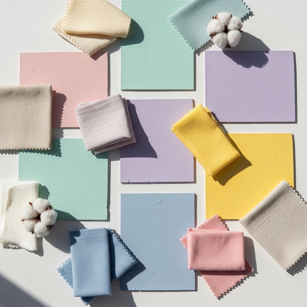
The beauty of pastels is their versatility. You can lean into a single color family for a monochromatic look, or mix several pastels together for something more dynamic. Mint green plays beautifully with blush pink. Lavender pairs surprisingly well with butter yellow. Powder blue and peachy coral? Unexpectedly charming together.
One thing I’ve noticed is that pastels work differently depending on your lighting. A pale blue that looks crisp and cool in northern light might read warmer and softer in a south-facing room. Before committing to a wall color, try painting large poster boards and moving them around your room at different times of day.
1. Start with Pastel Walls as Your Foundation
Your walls are the largest surface in your bedroom, so they set the entire mood. Pastel wall colors create an envelope of calm that everything else can play off of. If you’re nervous about commitment, remember that paint is one of the most changeable elements in a room.
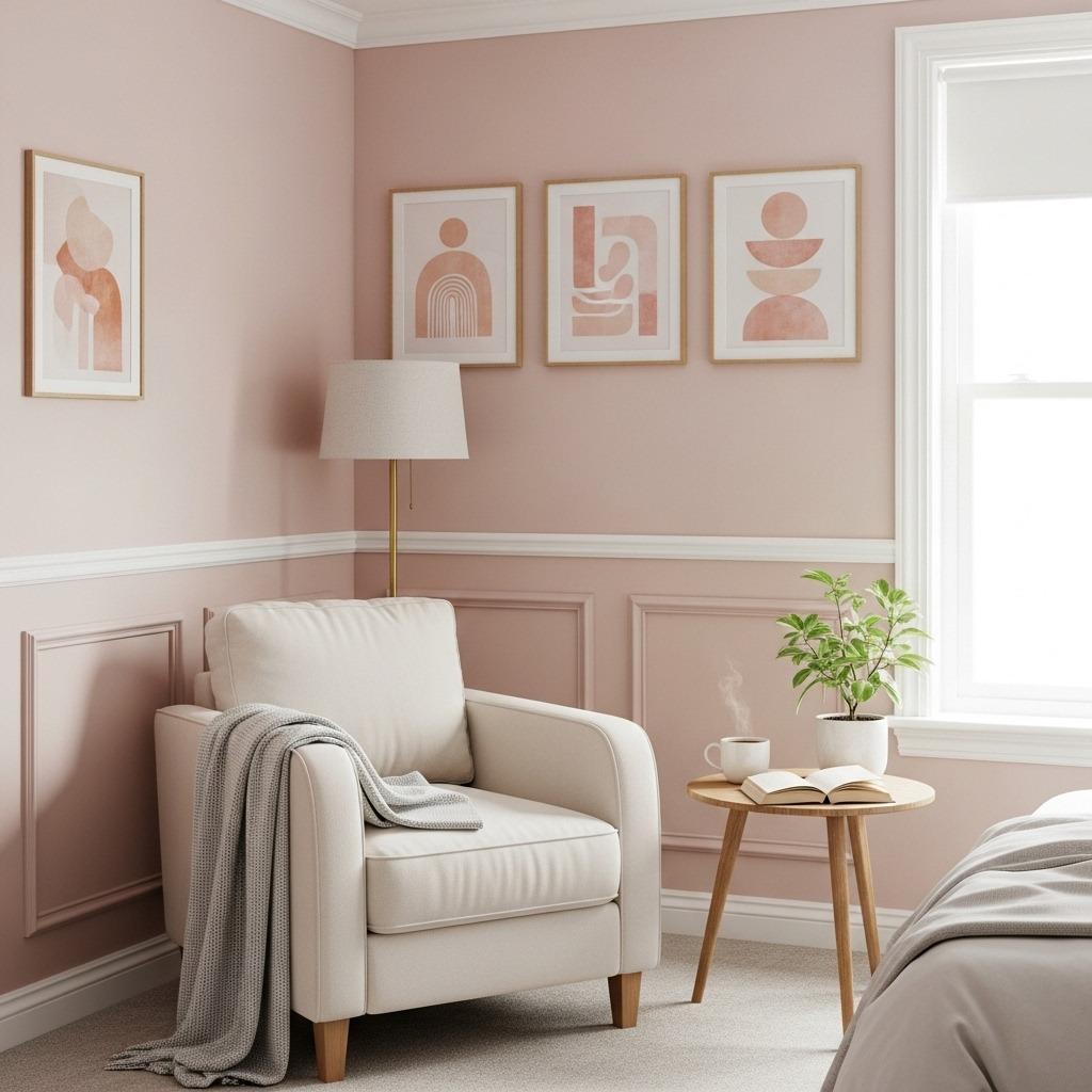
Soft pink walls have become incredibly popular, but not the bubblegum pink of childhood bedrooms. Think more like the inside of a seashell – that barely-there blush that catches light beautifully. This shade works particularly well in bedrooms with lots of natural light, creating warmth without feeling heavy.
Pale sage or mint green walls bring an organic, nature-inspired feel that’s become a favorite in modern calming bedroom decor. These shades have a slightly retro vibe that feels both nostalgic and fresh. They’re especially lovely in rooms with wooden furniture or natural fiber rugs.
Don’t overlook the power of a soft lavender or periwinkle. These cooler tones can make a room feel more spacious and are perfect if you run warm at night. They create a dreamy, almost ethereal quality that photographs beautifully – hence their Pinterest popularity.
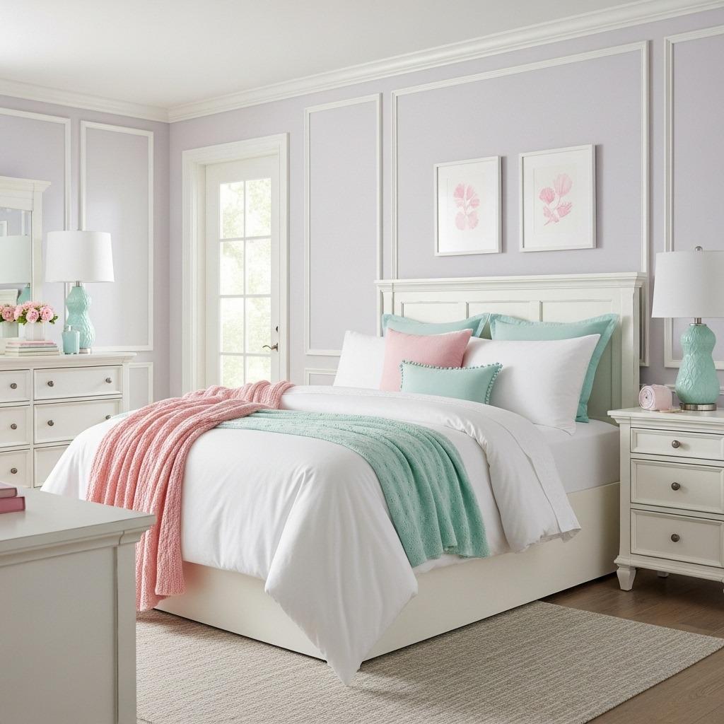
2. Layer Pastel Bedding for Maximum Comfort
Your bed is the focal point of any bedroom, and pastel bedding tips can truly transform the space. The key is layering different textures and shades to create depth and interest. A bed that’s all one flat color can look more like a hotel than a home.
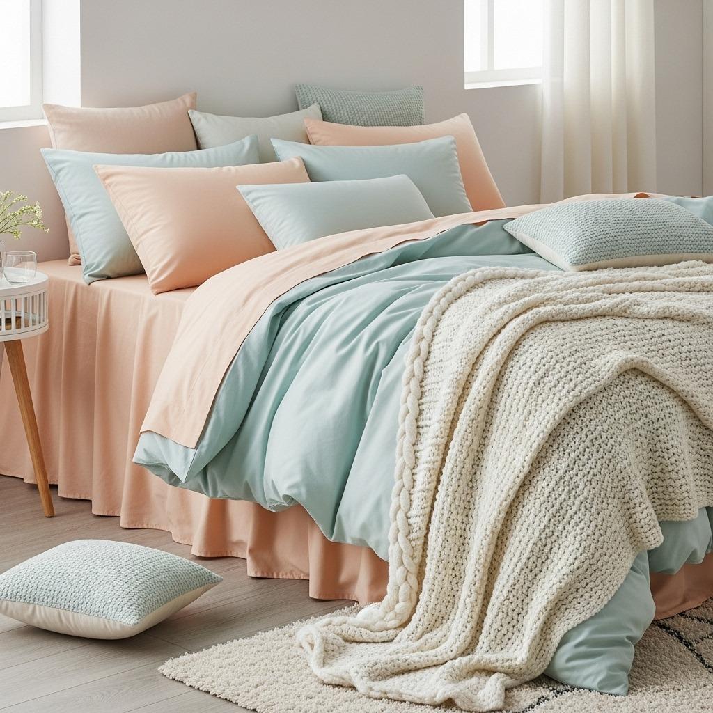
Start with high-quality sheets in a neutral or very soft pastel. Then build up with a duvet or comforter in a slightly bolder pastel shade. I’m talking about layering a pale yellow duvet over white sheets, or a mint green comforter over cream-colored linens. This creates subtle contrast without jarring the eye.
Throw pillows are where you can have fun mixing patterns and textures. Try combining solid pastels with subtle prints – maybe a gingham check in soft colors, or a delicate floral that incorporates multiple pastel shades. Just keep the overall vibe cohesive by sticking to your chosen color family.
A chunky knit throw in a complementary pastel adds both visual interest and practical warmth. Drape it casually across the foot of your bed rather than folding it perfectly. This lived-in styling approach makes the space feel more inviting and less staged.
3. Bring in Natural Textures to Ground the Palette
Pastels can sometimes feel like they’re floating if you don’t anchor them with natural materials. Wood, rattan, linen, and jute all provide the grounding that keeps a pastel bedroom from feeling too precious or overly sweet.
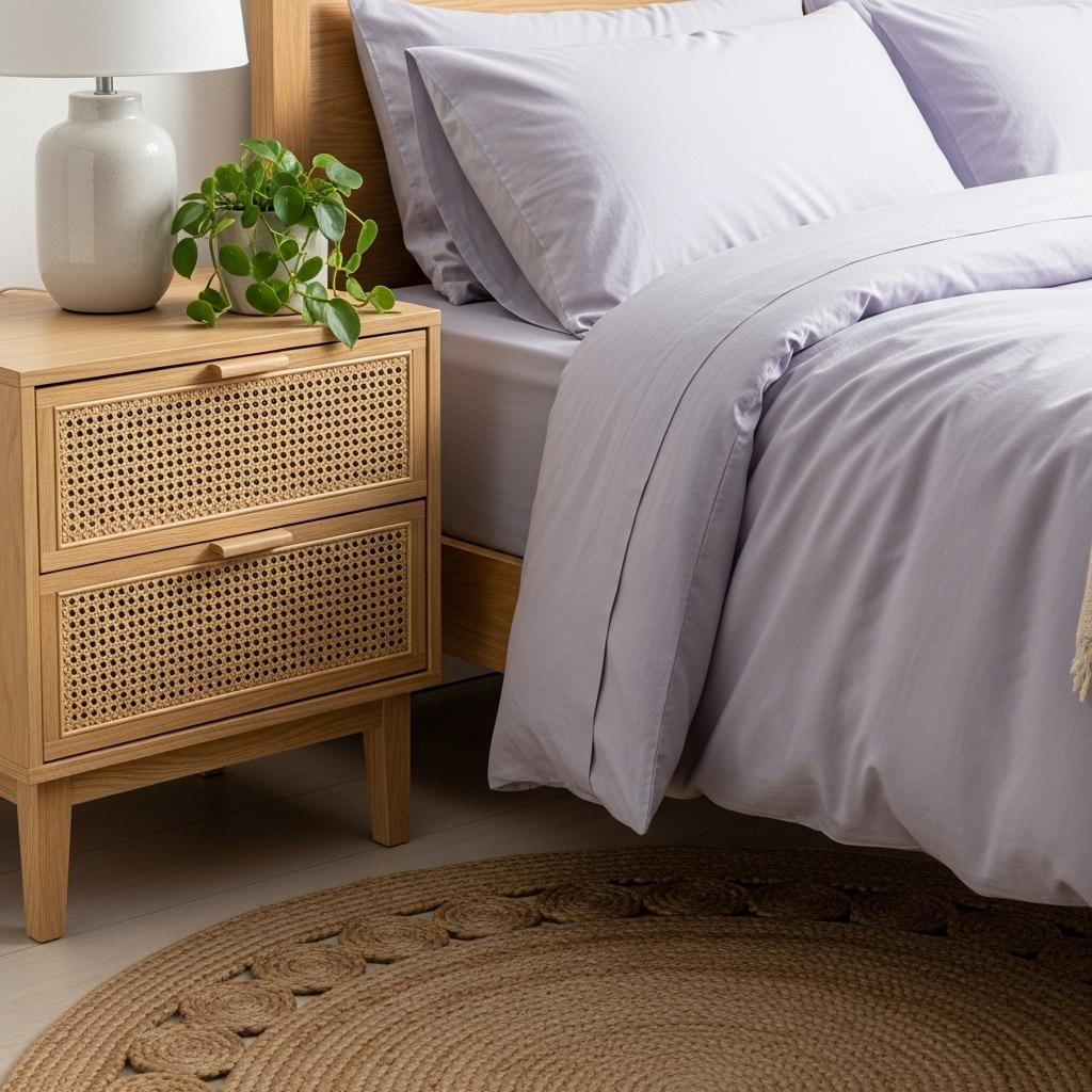
A wooden bed frame in a natural or light wash finish works beautifully with any pastel palette. The grain and organic texture of wood adds warmth and prevents the space from feeling cold or sterile. If you’re working with an existing darker wood piece, consider lightening it with a whitewash or natural wood stain.
Rattan or wicker furniture has made a major comeback, and it’s perfect for pastel bedrooms. A rattan headboard, nightstand, or even just a mirror frame introduces texture and a casual, beachy vibe. These pieces also photograph incredibly well for Pinterest, which is probably why they’re everywhere right now.
Don’t forget about your flooring and window treatments. A natural jute or sisal rug adds earthy texture underfoot, while linen curtains in cream or white soften the light without blocking it completely. These natural elements create balance and keep your pastel paradise feeling grown-up and sophisticated.
4. Choose the Right Lighting for Your Pastel Retreat

Lighting can make or break a pastel bedroom. These soft colors need proper illumination to really shine, otherwise they can look washed out or dingy. You want layers of light at different heights and intensities.
Natural light is your best friend with pastels. If you have the option, keep window treatments minimal and sheer. White or cream curtains diffuse harsh sunlight while still letting that gorgeous glow fill the room.
For artificial lighting, skip the harsh overhead fixture and opt for softer, more ambient options. A statement pendant or semi-flush mount in brass, white, or even a pastel finish adds style while providing general illumination. Make sure the bulb temperature is warm (around 2700-3000K) to complement your soft color scheme.
Task lighting matters too. Bedside lamps with fabric shades create pools of warm light perfect for reading. Consider ceramic or glass bases in complementary pastels for a cohesive look. Dimmer switches are worth the investment – they let you adjust the mood from bright and energizing in the morning to soft and sleepy at night.
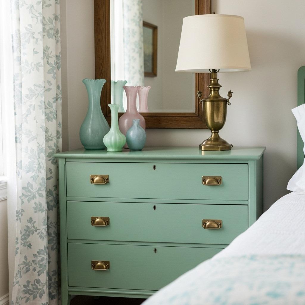
5. Incorporate Pastel Accent Furniture
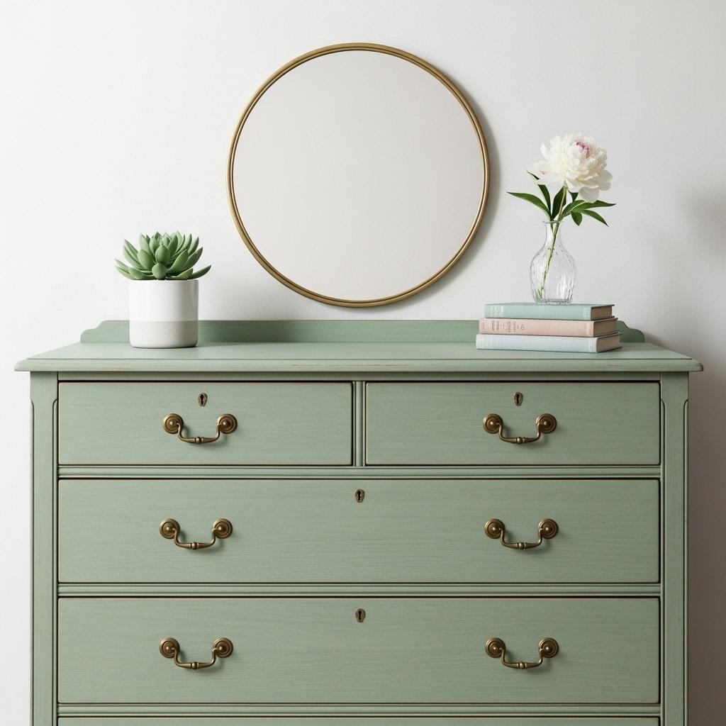
You don’t need to commit to a full pastel wall to embrace this trend. Accent furniture in soft shades can be equally impactful and much easier to change if you get tired of the look. A painted dresser or nightstand becomes an instant focal point.
Vintage furniture painted in pastels has that perfect shabby chic vibe that Pinterest users adore. You can often find solid wood pieces at thrift stores or estate sales and transform them with chalk paint in your chosen pastel. A mint green dresser or a pale pink vanity adds character and a touch of whimsy.
If DIY isn’t your thing, plenty of retailers now offer furniture in pastel finishes. Look for pieces with interesting details – scalloped edges, turned legs, or decorative hardware – that elevate the look beyond basic. These details photograph beautifully and give your bedroom more visual interest.
Remember that not every piece needs to be pastel. In fact, mixing in some neutral or natural wood furniture keeps the space from feeling like a candy store. One or two pastel accent pieces combined with neutral basics creates a more sophisticated, colorful minimalist bedroom aesthetic.
6. Add Pastel Artwork and Wall Decor
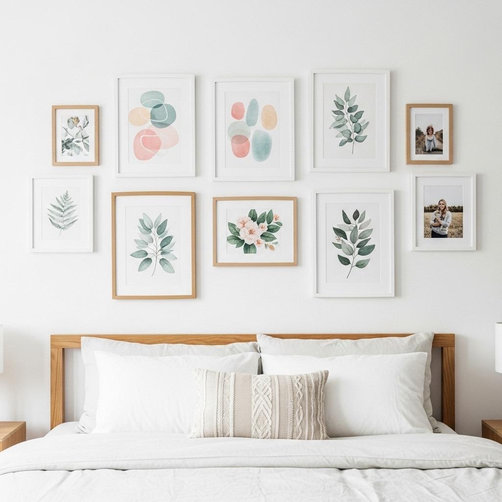
Bare walls can make even the prettiest bedroom feel unfinished. Artwork in pastel tones ties your color scheme together while adding personality. The trick is choosing pieces that feel intentional rather than matchy-matchy.
Abstract art in soft watercolor washes is perfect for pastel bedrooms. These pieces often incorporate multiple colors from your palette, creating cohesion across the room. Look for artwork that has some white space or breathing room – solid blocks of even pastel colors can feel heavy on the wall.
Photography prints in muted, soft-filtered tones work beautifully too. Think dreamy landscapes, botanical prints, or architectural details captured in gentle light. Black and white photography with soft contrast can also complement pastels without competing with them.
For a more personal touch, create your own gallery wall with a mix of prints, photographs, and small decorative objects. Vary the frame styles but keep them in similar tones – all white, all natural wood, or a mix of white and light wood. This collected-over-time look feels more authentic than a pre-packaged gallery wall set.
7. Style with Pastel Accessories and Decor
This is where you can really have fun and experiment without major commitment. Pastel accessories are easy to swap out seasonally or whenever your taste evolves. Small touches can make a big impact.
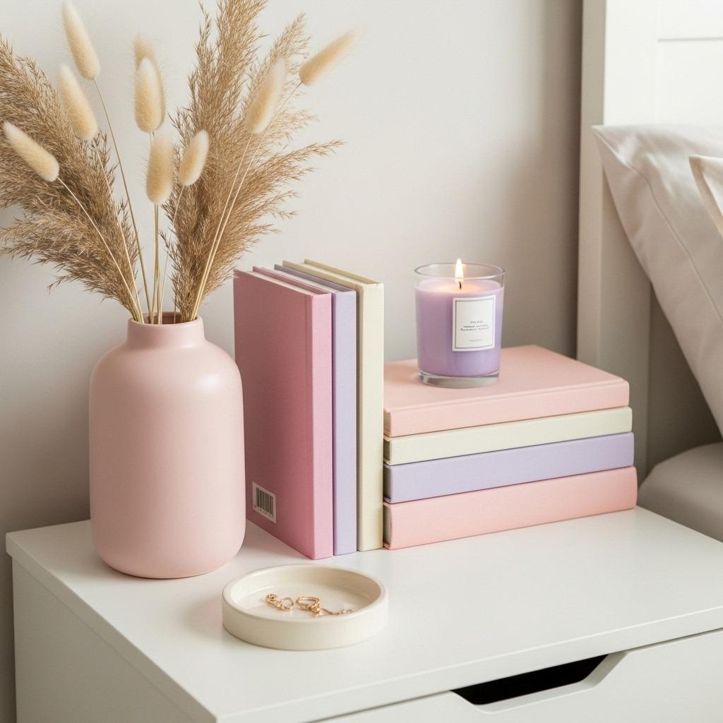
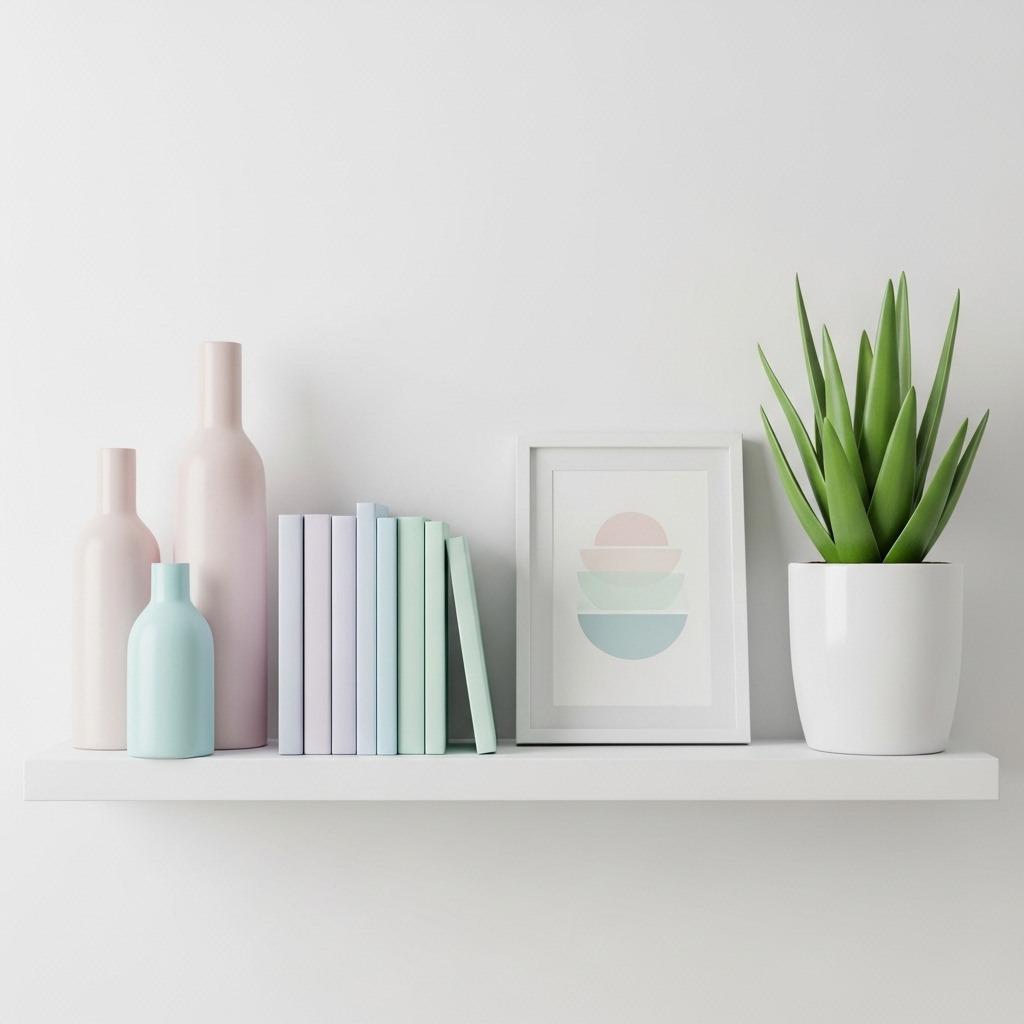
Throw pillows are the obvious starting point, but don’t stop there. Consider pastel vases, picture frames, candle holders, or decorative trays. These small items catch the eye and reinforce your color palette throughout the space. Group similar items together for more visual weight – three small pastel vases look more intentional than one.
Books can be surprising decor elements. If you’re a reader, organize some of your books by color and display spines in complementary pastels on nightstands or shelves. This brings your color scheme into unexpected places and makes your space feel more lived-in.
Fresh flowers or plants in pastel planters add life and natural beauty. Even if the blooms aren’t pastel, a mint green pot or blush pink planter integrates your theme while bringing in organic elements. Dried florals in soft tones are also having a moment and require zero maintenance.
8. Mix Pastel Patterns for Visual Interest
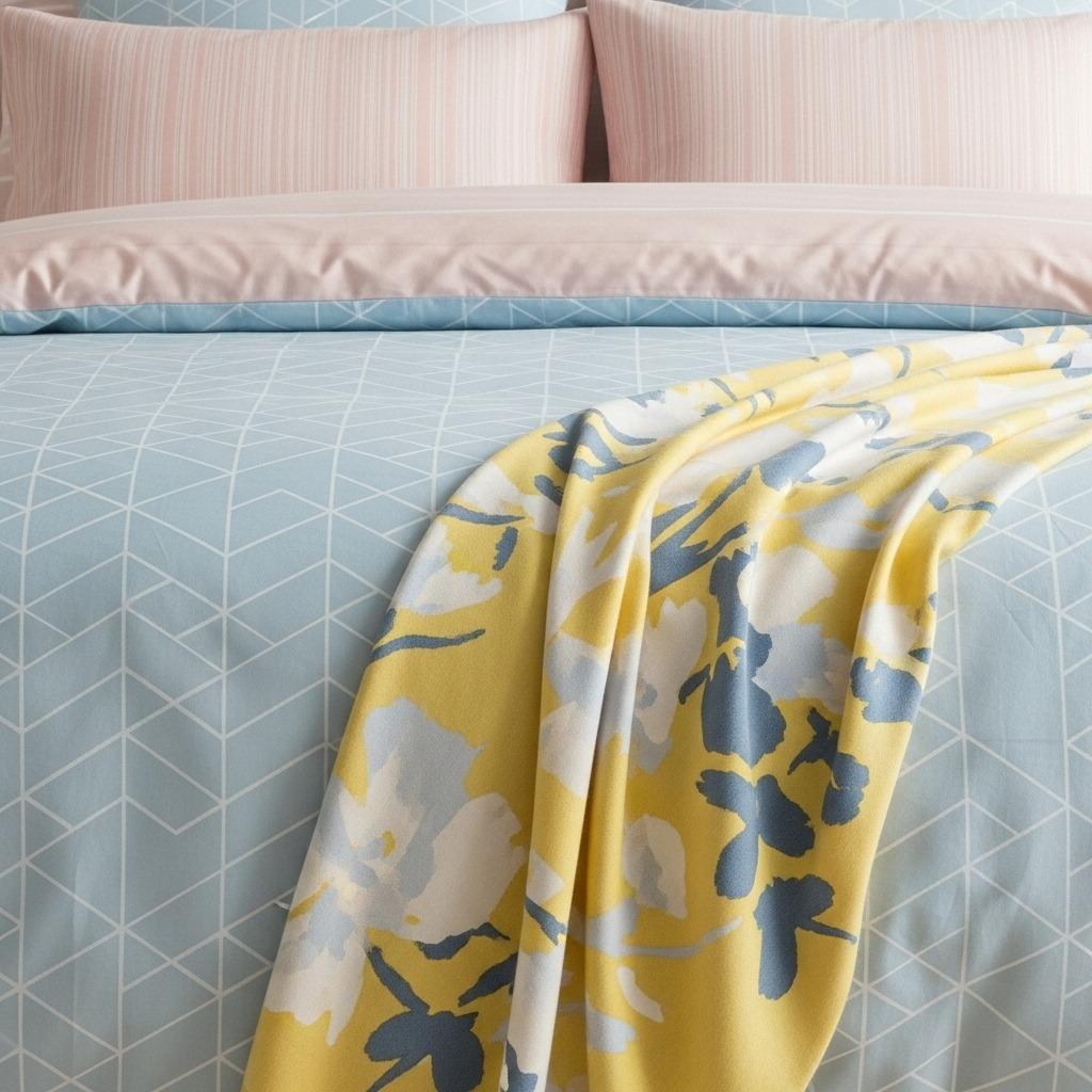
Solid pastels are beautiful, but mixing in patterns prevents your bedroom from feeling flat or one-dimensional. The key is choosing patterns that share your color palette while varying in scale and style.
Florals are a natural choice for pastel bedrooms, but opt for modern interpretations rather than dated chintz. Look for oversized blooms, abstract florals, or botanical prints with clean lines. These feel fresh and current while still bringing that soft, romantic vibe.
Geometric patterns in pastels create a more modern, structured feel. Think soft chevrons, subtle stripes, or contemporary shapes in your chosen colors. These work especially well if your room leans more Scandinavian or minimalist – they add interest without feeling busy.
Don’t be afraid to mix pattern types in the same space. A floral duvet can absolutely work with striped pillows and a geometric throw, as long as they share similar colors and the scale varies. Generally, pair one large-scale pattern with smaller, more subtle patterns for balance.
9. Create a Cozy Reading Nook in Pastel Tones
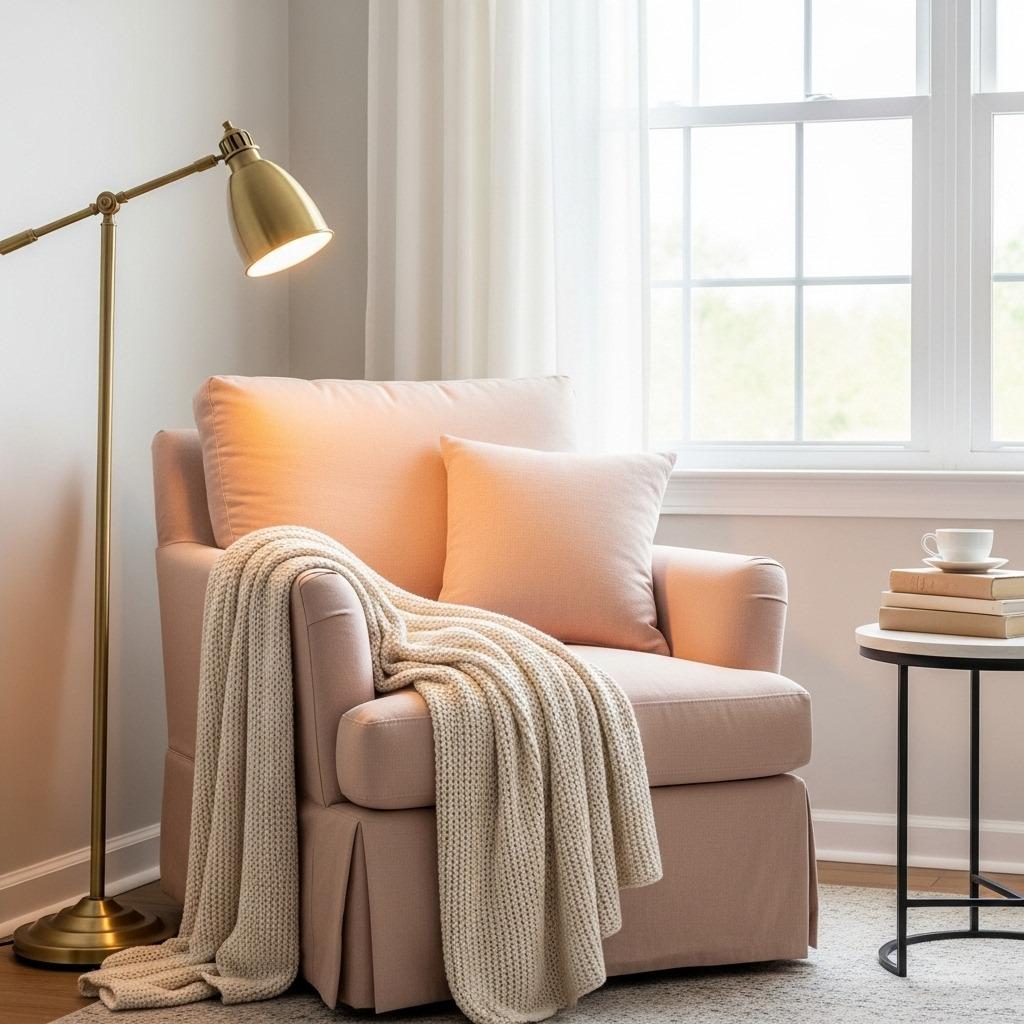
A dedicated corner for relaxation takes your pastel bedroom from just pretty to actually functional. If you have the space, a reading nook becomes your favorite spot to unwind with a book or morning coffee.
Start with a comfortable chair – maybe a vintage accent chair reupholstered in a soft linen, or a modern armchair in a complementary pastel. Add a small side table for your drink and current read. This doesn’t need to be matchy with your other furniture; in fact, a slightly different style adds character.
Layer in softness with cushions and a throw blanket. This is where you can introduce a slightly bolder pastel or a fun texture. A chunky knit blanket in butter yellow or a velvet pillow in dusty rose adds luxury without breaking the serene vibe.
Good lighting is essential for a reading nook. A floor lamp with an adjustable arm or a table lamp with warm light makes this corner actually usable. Add a small plant, a stack of your favorite books, and maybe a scented candle. Now you’ve created an Instagram-worthy corner that you’ll actually use.
10. Balance Pastels with Crisp White Accents
Too much pastel can sometimes feel overwhelming or saccharine. White acts as a palate cleanser, giving your eyes somewhere to rest and making the pastels feel more intentional and sophisticated.
White bedding as a base layer lets you play with pastel accents on top. Crisp white sheets under a pastel duvet feel hotel-luxe and are easy to wash. White also reflects light beautifully, keeping your bedroom feeling bright and airy.
Architectural elements in white – like trim, crown molding, or window frames – create clean lines that define the space. If you’re painting walls a pastel shade, keeping the trim bright white adds contrast and makes the color feel more deliberate. This classic combination has staying power beyond trends.
White furniture pieces mixed with pastel ones create breathing room in the design. A white dresser next to a pastel nightstand, or white bedside lamps with pastel pillows – these combinations feel balanced and curated. Don’t forget smaller touches like white picture frames, white planters, or white ceramic accessories.
11. Embrace Vintage and Thrifted Pastel Finds
Some of the best pastel bedroom pieces come from unexpected places. Vintage and thrifted items often have that perfectly worn-in patina that new furniture can’t replicate. Plus, mixing old and new creates a collected-over-time aesthetic that feels personal.
Mid-century modern furniture in original pastel finishes has become highly sought after. Those characteristic atomic age colors – seafoam green, coral pink, sunshine yellow – fit perfectly in a pastel bedroom. Even if pieces need some TLC, the bones are often solid and worth the investment.
Vintage textiles are another goldmine. Old quilts, embroidered linens, or crocheted blankets in soft colors add instant charm and history. These handmade pieces tell a story and bring warmth that mass-produced items often lack. Layer a vintage quilt over modern bedding for that perfect high-low mix.
Don’t overlook vintage accessories. Old glass vases, ceramic lamps, decorative mirrors, or picture frames from decades past often feature beautiful pastel glazes and finishes you can’t find today. These pieces become conversation starters and give your bedroom unique character that’s impossible to replicate.
12. Design a Pastel Headboard Feature
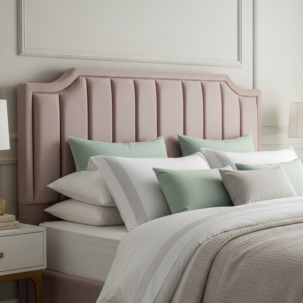
Your headboard is prime real estate for making a statement in your pastel bedroom. Whether you buy, build, or DIY, a pastel headboard becomes an instant focal point that anchors your entire design.
Upholstered headboards in pastel velvet or linen feel incredibly luxurious. Velvet catches light beautifully, adding depth and richness to soft colors. If you’re handy, DIY upholstered headboards are surprisingly doable with plywood, foam, batting, and fabric. Countless tutorials exist online, and the custom look costs a fraction of retail prices.
Painted wood headboards offer a more casual, cottage-style vibe. You could paint an existing headboard in your chosen pastel, or create a simple plank-style headboard from scratch. Distressing the paint slightly gives that coveted shabby chic look that photographs so well.
For a less permanent option, consider creating a headboard effect with paint, wallpaper, or wall paneling behind your bed. An accent wall in a slightly deeper pastel or a coordinating wallpaper pattern creates the same visual anchor without committing to a physical headboard. This works especially well in small spaces or rental bedrooms.
13. Incorporate Soft Lighting with Pastel Lamp Shades
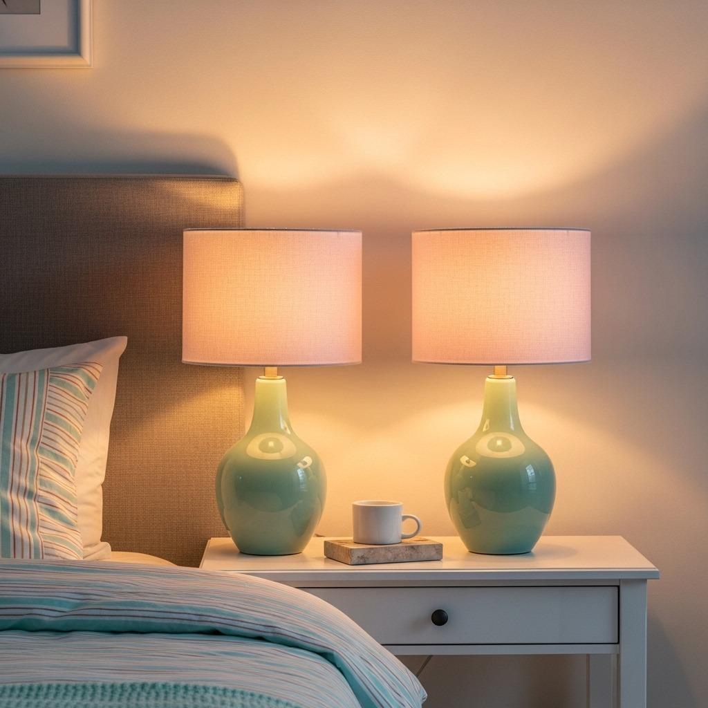
Lamp shades are an often-overlooked opportunity to reinforce your pastel palette while creating beautiful ambient light. The right shade doesn’t just diffuse light – it actually tints it, casting a gentle colored glow.
Pastel fabric lamp shades on your bedside table lamps create the softest, most flattering light for bedtime reading. When the lamp is on, the light filtering through a pale pink or butter yellow shade creates a warm, cozy atmosphere. During the day, the shades themselves become decorative accents.
Ceramic or glass lamp bases in pastel tones paired with white or cream shades offer another styling option. This combination is slightly more subtle – you get the pop of color from the base, but the light itself remains neutral. This works well if you’re using multiple light sources and want more control over the light color.
Consider pendant lights or chandeliers with pastel elements too. A white fixture with soft pink crystals, or a pendant with a pale blue shade, draws the eye upward and adds a layer of sophistication. These pieces become jewelry for your room, especially impactful in bedrooms with higher ceilings.
14. Style Your Windows with Soft Pastel Treatments
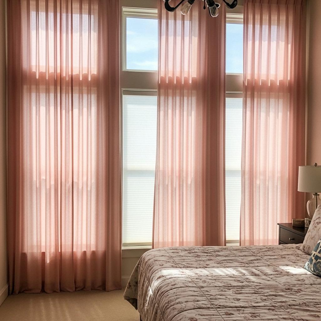
Window treatments frame your view and control light – both crucial for bedroom comfort. Pastel curtains or shades can be subtle or statement-making depending on how you approach them.
Sheer curtains in pastel tones filter light beautifully while maintaining privacy. Soft pink or lavender sheers catch morning light and create an ethereal glow. Layer these over white blinds or shades for privacy control without sacrificing the dreamy pastel effect.
Heavier curtains in pastel linen or cotton work well for bedrooms that get intense sunlight or for better sleep. These can be paired with white sheers underneath for a layered look. Floor-to-ceiling curtains in a soft pastel make windows appear larger and ceilings higher – a designer trick that works in any size bedroom.
If curtains aren’t your style, consider roman shades or roller shades in coordinating pastels. These provide a cleaner, more modern look while still introducing your color palette. They’re also practical for smaller windows where curtains might overwhelm the space.
15. Add a Pastel Area Rug to Define the Space
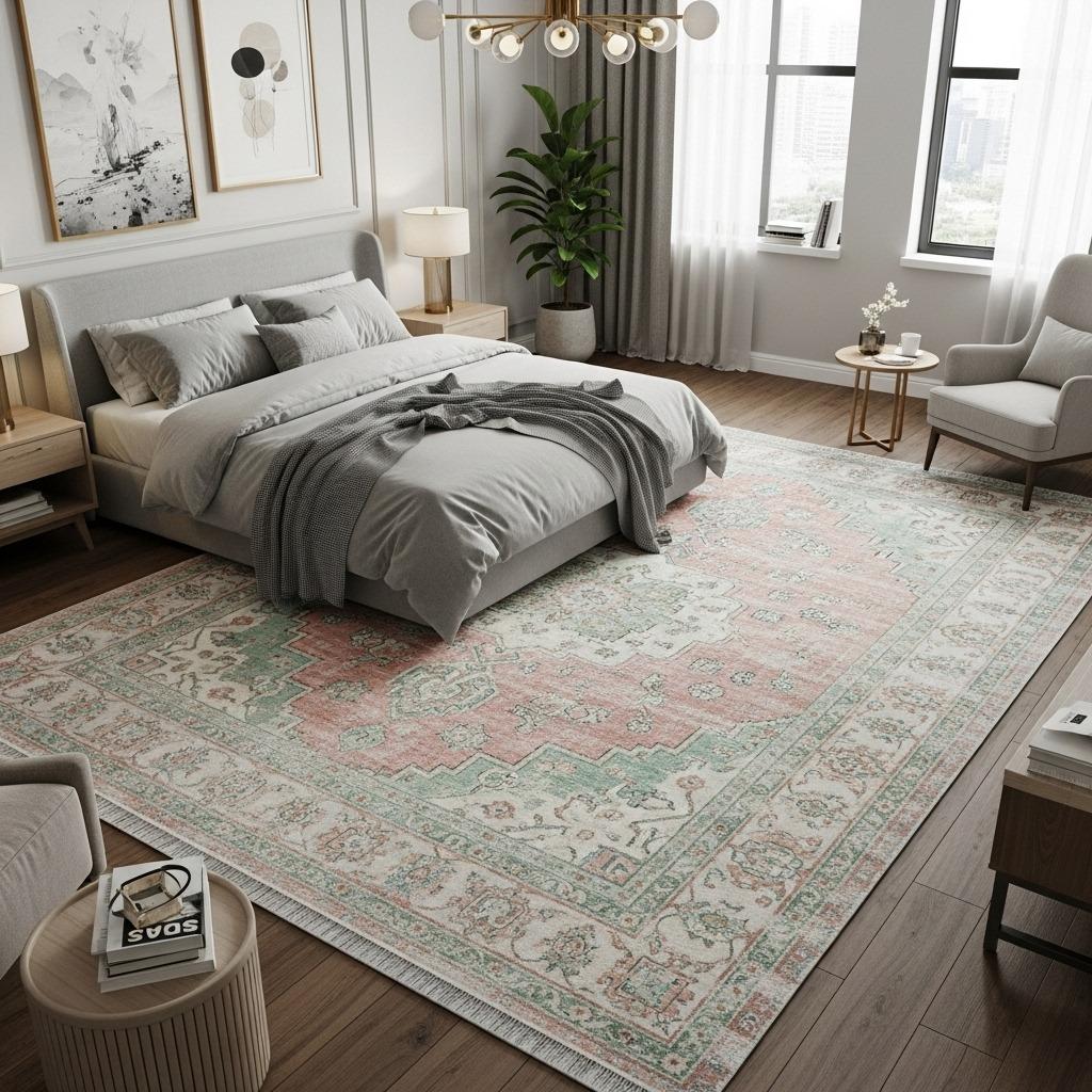
An area rug anchors your bedroom furniture and defines the sleeping zone. A pastel rug introduces color at foot level, quite literally grounding your design scheme. Plus, it feels amazing on bare feet when you get out of bed.
Solid pastel rugs in plush materials like wool or faux fur create a luxe, monochromatic foundation. A pale pink shag rug under your bed, for instance, makes the entire space feel softer and more inviting. These work especially well in minimalist bedrooms where you want color without pattern.
Vintage-inspired rugs in faded pastels bring character and pattern to your bedroom. Think Turkish kilims or Persian rugs in sun-faded pinks, blues, and creams. These pieces have movement and history, adding visual interest without feeling busy. They also hide wear and tear better than solid rugs.
Geometric or abstract patterns in pastel colorways offer a more contemporary approach. These rugs can bridge different furniture styles and add structure to an otherwise soft room. Look for rugs where the pastel colors graduate or blend into each other for a watercolor effect.
16. Create Depth with Varying Shades of Pastels
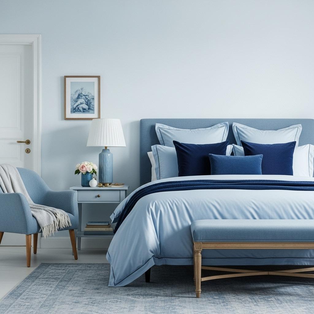
A monochromatic pastel bedroom isn’t just one flat color – it’s multiple tones of the same color family creating subtle depth and sophistication. This approach feels cohesive while avoiding the monotony of exact color matching.
Start with your lightest shade on the walls, then gradually introduce darker values through furniture, textiles, and accessories. For example, if you love pink, use barely-there blush on walls, a slightly deeper rose for curtains, and dusty mauve for accent pillows. Each shade relates to the others while creating visual layers.
This technique works beautifully because it mimics how light naturally creates shadows and highlights in a room. The variation gives your eye something to explore without introducing competing colors. It’s restful yet interesting – exactly what you want in a bedroom design.
Don’t stress about perfect color matching. In fact, slight variations between shades often look better than exact matches, which can read as too matchy-matchy. As long as colors share the same undertones (all warm or all cool), they’ll work together harmoniously.
17. Style Shelves and Surfaces with Pastel Displays
Open shelving, bookcases, or even just dresser tops become opportunities to showcase your pastel aesthetic through thoughtful styling. These vignettes add personality and make your bedroom feel curated rather than decorated.
Group items in odd numbers for the most pleasing arrangements. Three pastel candles, five small vases, or a stack of three books feels more natural than pairs. Vary heights and shapes to create visual interest – a tall vase next to a short stack of books next to a medium-height frame.
Color-coordinated book spines make surprisingly beautiful displays. If you have books with pastel covers or spines, arrange them by color on open shelves. Intersperse with small decorative objects in complementary pastels. This looks intentional without feeling staged.
Remember the principle of negative space. Don’t crowd every surface with items. Leave breathing room between groupings, and keep some surfaces relatively clear. This prevents your pastel paradise from feeling cluttered or overwhelming. Sometimes what you don’t display is as important as what you do.
18. Introduce Metallic Accents for Sophistication
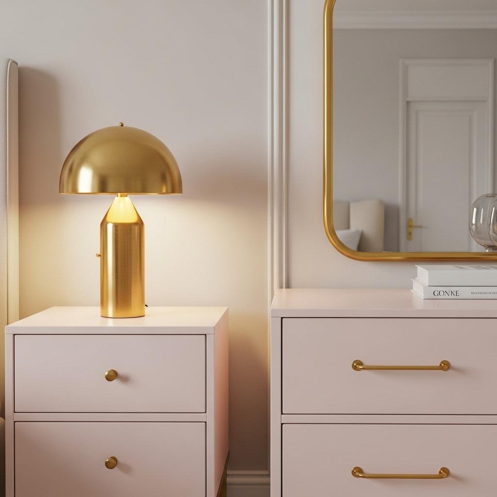
Metallic touches elevate pastel bedrooms from sweet to sophisticated. Gold, brass, copper, or even silver add a bit of shine and luxury that keeps the space feeling grown-up and intentional.
Brass hardware on pastel furniture creates beautiful contrast. Gold-toned drawer pulls on a mint dresser, brass table lamps on white nightstands, or a copper clothing rack against blush walls – these combinations feel current and curated. The warm metallics especially complement warmer pastels like peach, pink, and yellow.
Don’t go overboard – a little metallic goes a long way. Choose one metal finish and stick with it throughout the room for cohesion. Mixing too many metal finishes can look chaotic, though brass and gold or copper and bronze are similar enough to work together.
Mirrors with metallic frames serve double duty – they reflect light to brighten the space while adding that sophisticated gleam. A large brass-framed mirror over a dresser or a collection of small gold-framed mirrors creates a focal point that’s both functional and beautiful.
19. Design a Pastel Ceiling for Unexpected Charm
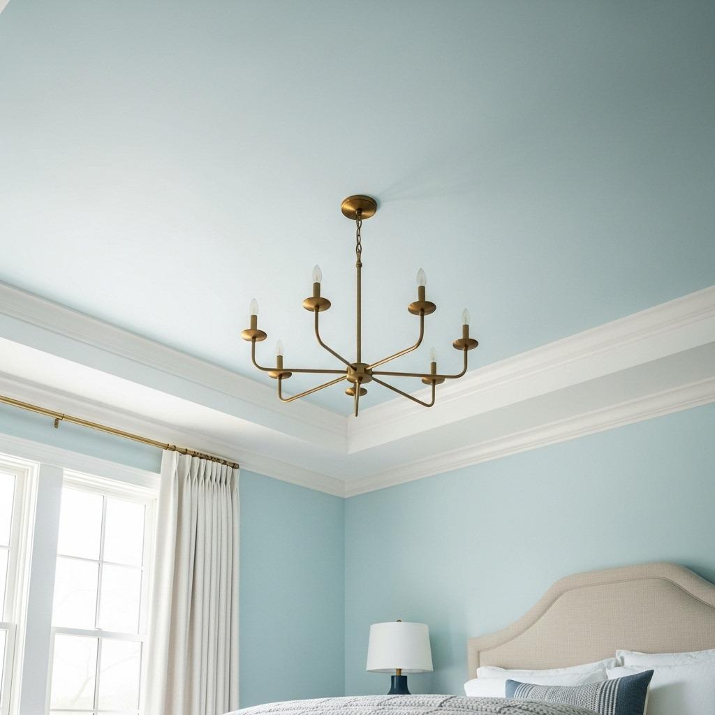
Most people forget about the fifth wall – the ceiling. Painting your ceiling a soft pastel creates an unexpected design moment that completely transforms how the room feels. It’s bold yet subtle at the same time.
Pale blue ceilings create the illusion of open sky, making your bedroom feel larger and airier. This classic southern porch ceiling color translates beautifully indoors, especially in bedrooms with good ceiling height. It draws the eye upward and adds architectural interest.
Soft pink or peach ceilings cast the most flattering light throughout the day. As light bounces off the ceiling, it picks up that warm tint and creates a glowing effect. This is especially magical during golden hour when natural light combines with your ceiling color.
If a colored ceiling feels too risky, consider just painting crown molding or ceiling beams in a pastel shade. This introduces the color in a more controlled way while still creating visual interest overhead. You can always take it further later if you fall in love with the effect.
20. Personalize with Pastel Memories and Collections
Your bedroom should tell your story, not just follow trends. Personal items displayed thoughtfully make your pastel retreat feel like yours rather than a showroom.
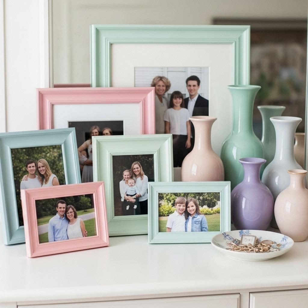
Family photos in pastel-toned frames or with soft-filtered editing create a gallery that’s cohesive with your color scheme. Black and white photos in pastel frames work beautifully too. Display these on walls, shelves, or dresser tops where you’ll see them daily.
Collections become meaningful decor when styled intentionally. Maybe you collect vintage teacups in pastel florals, or pottery in soft glazes, or seashells that naturally come in gentle colors. Group these items together rather than scattering them throughout the room for more impact.
Sentimental items deserve space in your design. That quilt your grandmother made, travel souvenirs in complementary colors, or artwork from friends and family can all work within your pastel palette. If something you love doesn’t quite match, find creative ways to incorporate it – maybe mat colorful art with pastel mats, or place bright objects against neutral backgrounds.
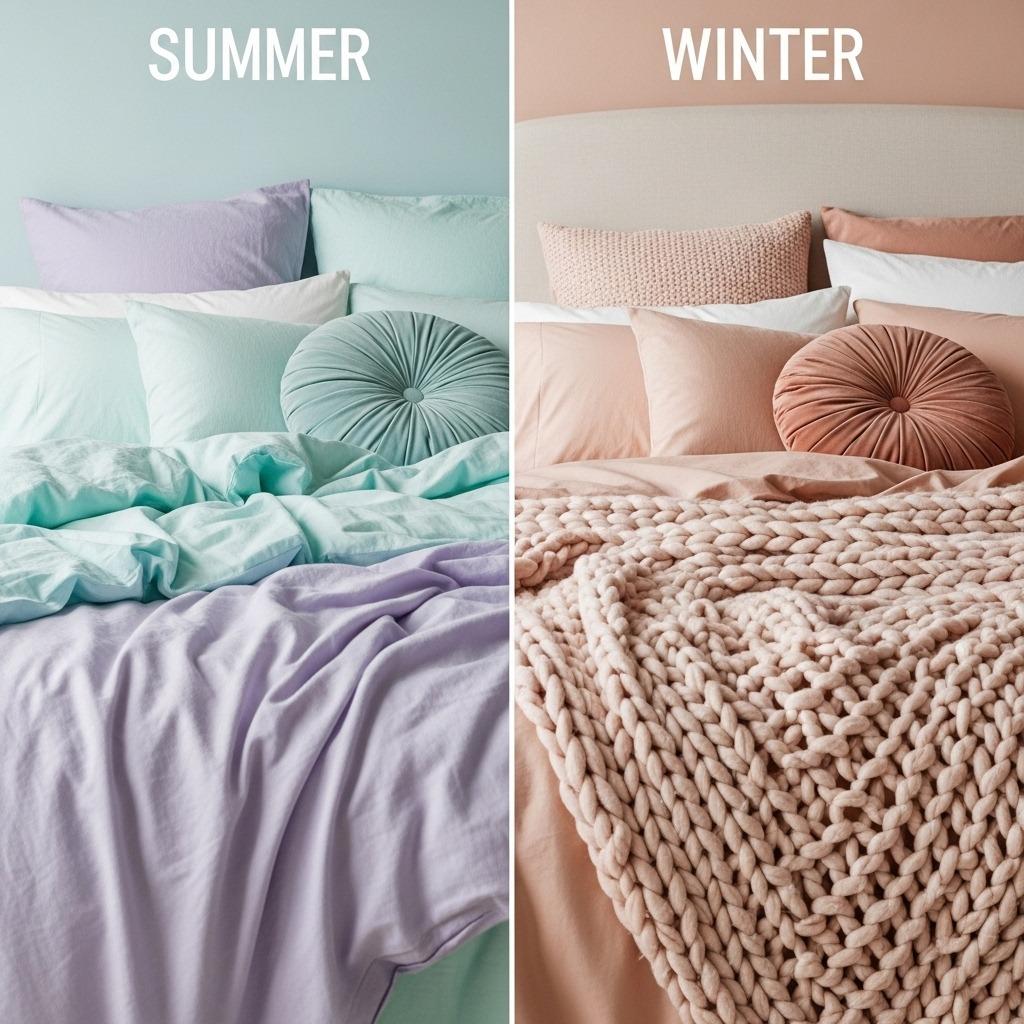
21. Consider Seasonal Pastel Swaps
One advantage of working with pastel bedroom decor is how easily you can shift the feel seasonally. Small changes keep your space feeling fresh without requiring major overhauls.
Spring and summer call for cooler pastels – think mint, lavender, powder blue, and soft lemon. These colors feel lighter and airier, perfect for warmer weather. Swap in lightweight cotton or linen bedding in these shades, add fresh flowers in pastel tones, and maybe switch out heavier curtains for breezier sheers.
Fall and winter welcome warmer pastels – blush pink, peach, butter yellow, and soft coral. These colors feel cozier and more enveloping as temperatures drop. Layer in chunky knit throws, velvet pillows, and perhaps swap to heavier curtains. The same room shifts from fresh to cozy with relatively minimal effort.
This seasonal approach keeps your space interesting without feeling like you’re constantly redecorating. Store off-season items and rotate them back in when the time feels right. It’s sustainable, budget-friendly, and gives you something to look forward to with changing seasons.
Finding Your Perfect Pastel Balance
Creating a pastel bedroom that feels serene rather than saccharine comes down to balance and personal taste. There’s no single right way to embrace these soft colors. Some people thrive in an all-pastel environment, while others prefer pastels as accents against neutral backgrounds.
The beauty of this aesthetic is its flexibility. You can start small – maybe just pastel bedding tips and a few accessories – and gradually add more color as you gain confidence. Or you can dive in fully with painted walls and furniture. Your bedroom should evolve with you, not follow rigid rules.
Remember that your bedroom is deeply personal. What looks stunning in someone else’s home might not work for your lifestyle, lighting, or preferences. Trust your instincts about what feels calming and beautiful to you. After all, you’re the one waking up in this space every morning.
What matters most is creating a retreat that helps you unwind and recharge. If soft bedroom colors do that for you, lean into them fully. If you need more contrast or different elements, adjust accordingly. The goal isn’t Pinterest perfection – it’s a space where you genuinely want to spend time.

