
You walk into a room and something feels off. The furniture’s fine, the layout works, but the space just doesn’t feel like home. Nine times out of ten, it’s the wall color. Or worse, the lack of intention behind how colors work together.
I’ve repainted more rooms than I care to count, and here’s what I’ve learned: picking one paint color is easy. Creating a cohesive color scheme that flows through your entire home? That’s where the magic happens. The right combination can make a cramped bedroom feel spacious, a cold kitchen feel inviting, or a bland living room suddenly feel pulled together.
This isn’t about following strict rules or copying someone else’s Pinterest board. It’s about understanding which colors naturally complement each other and how to use them in ways that reflect your style. Whether you’re planning a small space renovation or just want to refresh a single room, these 18 combinations have worked in real homes with real people.
Let’s look at schemes that actually transform spaces, not just cover walls.
1. Soft Sage and Warm White
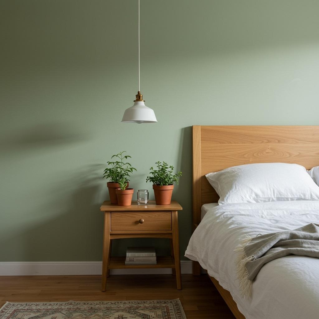
There’s something naturally calming about pairing muted green with creamy white. Sage brings just enough color to feel intentional without overwhelming a space. I’ve seen this combination work beautifully in bedrooms where you want that peaceful, almost spa-like feeling.
The key is choosing a sage that leans slightly gray rather than yellow. Pair it with a warm white (not stark white) on trim and adjacent walls. This creates subtle contrast without harsh lines. It’s one of those paint color schemes that photographs well but feels even better in person.
This works particularly well in Scandinavian living room designs where natural materials and minimal clutter let the colors breathe. Add some natural wood tones and linen textures, and you’ve got a space that feels effortlessly put together.
2. Navy Blue and Brass Accents

Navy has become one of those trendy wall colors that actually stands the test of time. Unlike lighter blues that can feel cold, navy adds depth and sophistication. When you pair it with warm brass fixtures and hardware, you get this rich, layered look that feels both classic and current.
I’ve used this in dining rooms and home offices where you want the space to feel grown-up and intentional. The darkness of navy makes rooms feel more intimate, while the brass prevents it from feeling too heavy. Just make sure you have enough natural or artificial light, otherwise the room can feel cave-like.
One thing to consider: navy works differently depending on the light in your room. Test samples on multiple walls and observe them at different times of day. What looks perfect in morning light might feel too dark by evening.
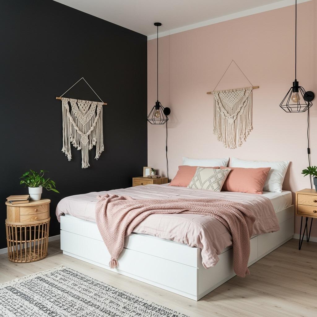
3. Blush Pink and Charcoal Gray

This combination might sound risky, but hear me out. Soft blush pink paired with a sophisticated charcoal creates this modern, almost Parisian vibe. The pink keeps things from feeling too masculine or stark, while the charcoal grounds the space and prevents it from feeling too sweet.
This is one of those best interior paint ideas for bedroom ideas where you want something romantic but not overly feminine. Use the blush on three walls and the charcoal on one accent wall behind the bed. Or reverse it if you’re feeling bolder.
The beauty of this pairing is how it plays with temperature. The cool gray and warm pink create visual interest without clashing. Add some matte black fixtures and white bedding, and you’ve got a space that feels curated without trying too hard.
4. Warm Terracotta and Cream

Terracotta brings that earthy, sun-baked warmth that instantly makes a space feel cozy and lived-in. Paired with a soft cream, it creates this Mediterranean-inspired look that’s having a moment right now. But unlike some trends, this one feels timeless because it’s rooted in natural earth tones.
This color scheme works particularly well in kitchen and dining ideas where you want the space to feel warm and inviting. The terracotta adds personality without being overwhelming, especially when you use it on just one or two walls.
I’ve found this combination looks best with lots of natural textures. Think woven baskets, ceramic dishes, and wooden cutting boards. The colors themselves are pretty forgiving and work with both modern and rustic styles.
5. Deep Forest Green and Natural Wood Tones
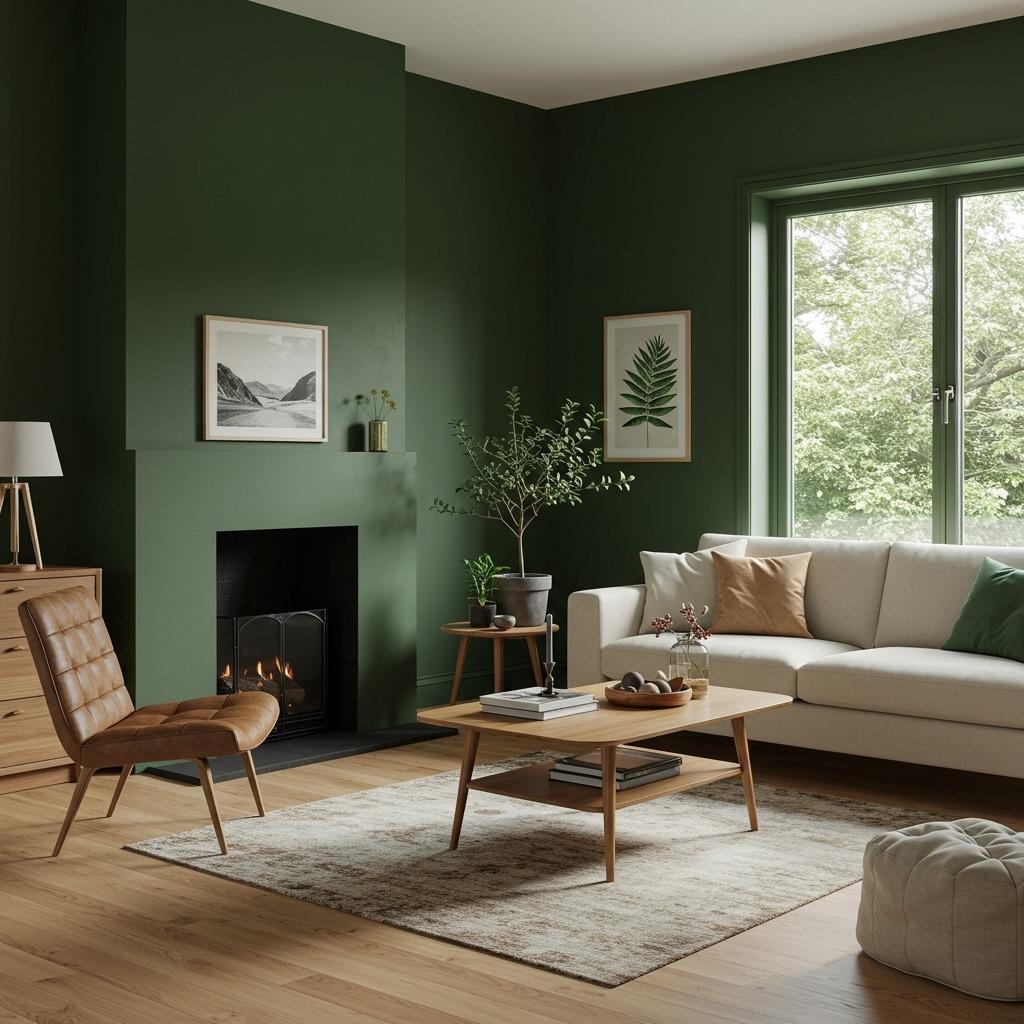
Forest green has this grounding quality that few other colors can match. It’s rich enough to make a statement but nature-inspired enough to feel calming. When you pair it with natural wood tones in furniture and flooring, you create a space that feels connected to the outdoors.
This is perfect for living room ideas where you want something more dramatic than neutral but not as bold as black. The green provides a beautiful backdrop for artwork and lets natural materials really shine. Just avoid pairing it with too many other colors, let the green and wood be the stars.
What’s interesting about forest green is how it changes throughout the day. Morning light makes it feel fresh and energizing, while evening light brings out the deeper, cozier tones. It’s basically like having two different rooms depending on the time of day.
6. Pale Blue and Soft Gray
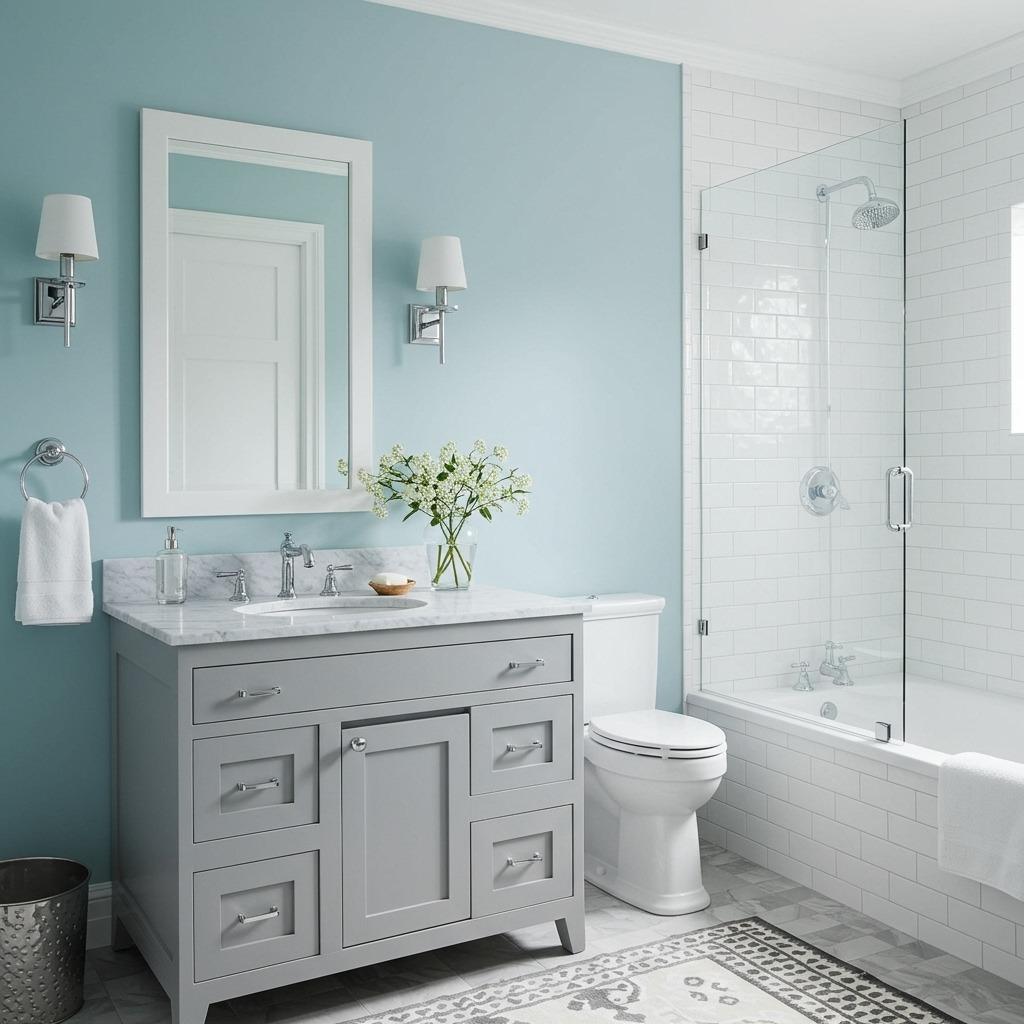
This combination is practically foolproof. Pale blue brings a sense of calm without reading as overtly “themed,” while soft gray adds sophistication and keeps things from feeling too baby-nursery. Together, they create one of those paint color schemes that works in almost any room.
I’ve seen this used effectively in bathroom ideas where you want that spa-like atmosphere. The blue feels clean and fresh, while the gray grounds the space. It’s also forgiving with different lighting situations, unlike some blues that can look greenish or purple depending on the light.
The trick is getting the right balance. Too much blue and it feels cold, too much gray and it loses its character. Try the blue on the main walls and the gray on trim, or use gray on lower cabinets and blue on upper walls.
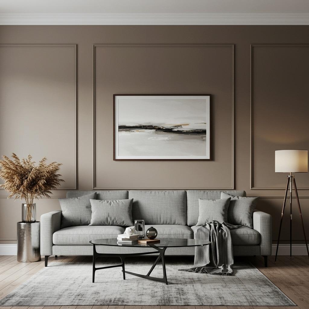
7. Warm Beige and Soft Black

Beige gets a bad reputation, but pair it with the right black and suddenly it feels intentional and modern. This isn’t your builder-grade beige, we’re talking warm, creamy beige with just a hint of brown or pink undertones. The soft black (not true black, but a very dark charcoal) provides contrast without harshness.
This is one of those color combinations that works beautifully in open-concept spaces where you need cohesion.
Use the beige as your main color and the soft black strategically on an accent wall, kitchen island, or built-in shelving. This creates visual interest while maintaining that neutral, versatile foundation. It’s sophisticated without being stuffy.
8. Dusty Rose and Sage Green
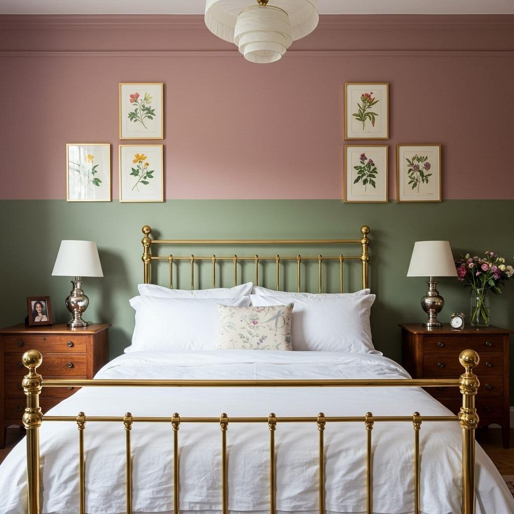
This combination feels like stepping into a vintage botanical illustration. Dusty rose brings warmth and softness, while sage green adds that natural, earthy element. Together, they create something romantic but not saccharine, perfect for artistic bedroom ideas.
What makes this pairing work is the muted quality of both colors. They’re not competing for attention, they’re complementing each other. Use the dusty rose on the main walls and sage on an accent wall, or vice versa depending on which mood you’re going for.
This scheme pairs beautifully with vintage or antique furniture. Add some brass accents, maybe some botanical prints, and you’ve got a space that feels collected over time rather than designed in a day. It’s one of those best interior paint ideas that ages well.
9. Charcoal and Warm White
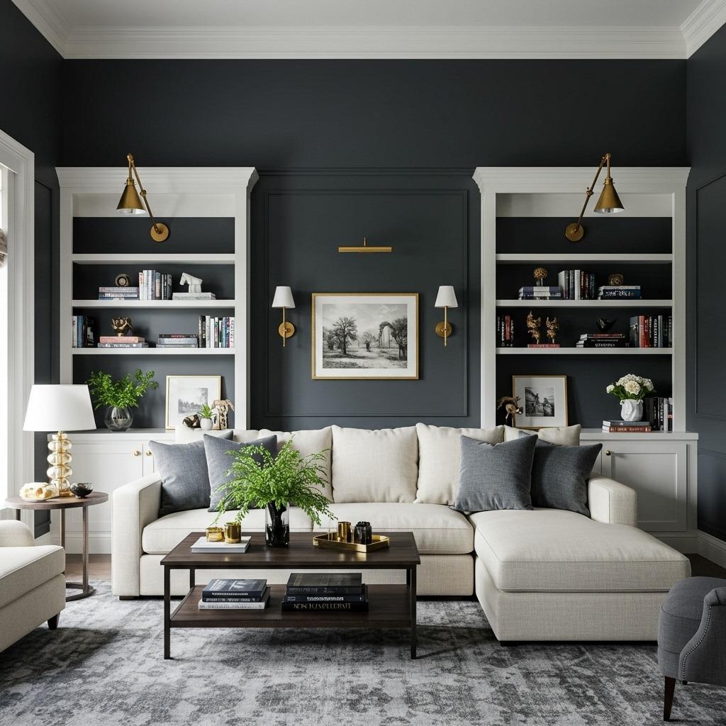
Sometimes the most dramatic transformations come from the simplest combinations. Charcoal and warm white create instant architecture, even in rooms with zero interesting features. The dark walls make the white trim pop, giving the illusion of more detailed molding and structure.
I’ve used this in cozy small living room spaces where traditional wisdom says to use all light colors. But here’s the thing: the dark walls actually make the room feel more intentional and pulled together, which can make it feel less cramped than boring beige.
The key is balance. You need enough white to prevent the room from feeling like a cave, use it on the ceiling, trim, and maybe one accent wall. Add plenty of warm lighting and light-colored furniture to keep the space feeling inviting rather than oppressive.
10. Soft Peach and Dove Gray
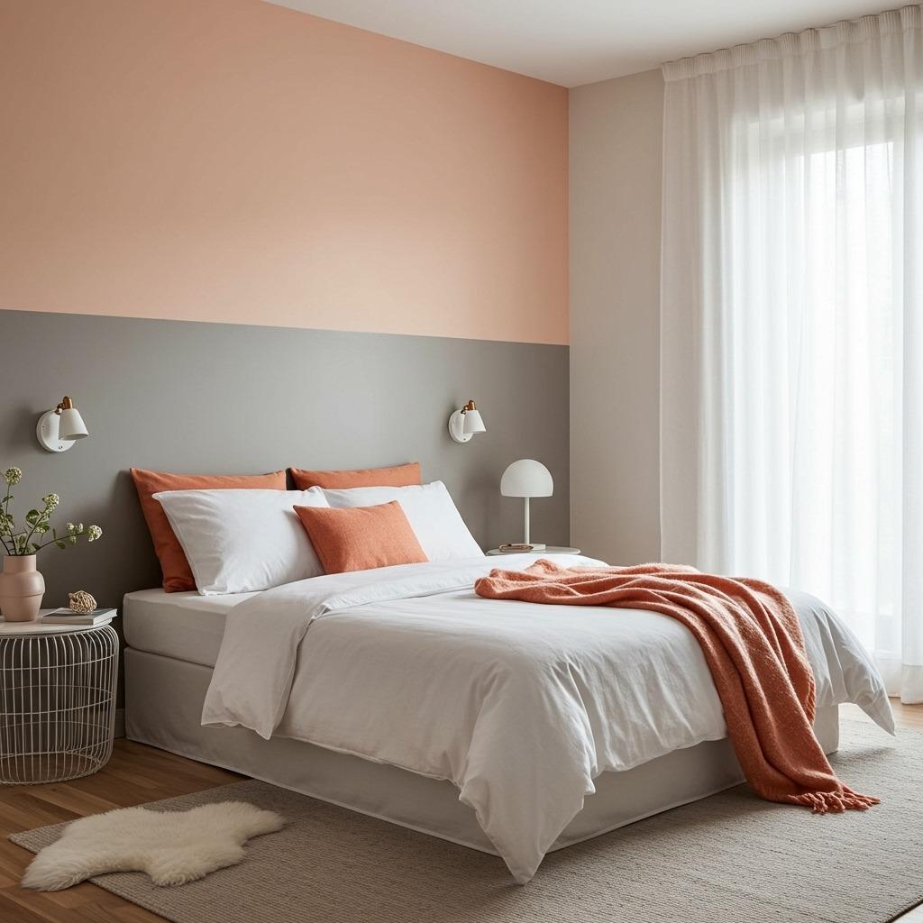
Peach can be tricky, too orange and it’s overwhelming, too pink and it feels dated. But get that soft, muted peach right and pair it with a cool dove gray, and you’ve got something special. This combination feels fresh and modern while still being warm and inviting.
This works particularly well in home improvement ideas focused on creating more inviting spaces. The peach adds personality and warmth, while the gray keeps things grounded. It’s one of those trendy wall colors that doesn’t scream “I’m trendy.”
Try the peach on the main walls and the dove gray on lower cabinets, an accent wall, or even the ceiling if you’re feeling adventurous. The combination photographs beautifully and looks even better in person, especially in rooms with good natural light.
11. Rich Burgundy and Cream
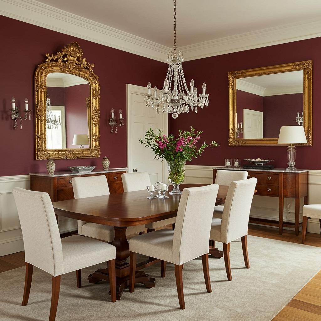
Burgundy is having a comeback, and for good reason. It’s dramatic without being dark, warm without being orange, and sophisticated without being stuffy. Paired with a soft cream, it creates one of those paint color schemes that feels both classic and unexpected.
This combination works beautifully in dining rooms or farmhouse style living room designs where you want something more interesting than standard neutrals. The burgundy makes a statement, while the cream prevents the space from feeling too heavy or Victorian.
Use the burgundy sparingly, maybe on one or two accent walls, and let the cream do most of the work. This creates drama without overwhelming the space. Add some gold or brass accents, and you’ve got a room that feels expensive without actually being expensive.
12. Sky Blue and Butter Yellow

This combination might feel a bit retro, but there’s something undeniably cheerful about it. Sky blue and butter yellow together create a space that feels optimistic and energizing. It’s not for everyone, but if you want a room that makes you smile, this is it.
I’ve seen this work wonderfully in kitchens and breakfast nooks where you want that morning energy. The key is using both colors in fairly muted, soft versions. Bright sky blue and bright yellow can feel overwhelming, but softer versions create something more livable.
This is one of those color combinations that benefits from lots of white. Use white on cabinets, trim, and ceiling to give your eyes a rest between the colors. Add some natural wood and greenery, and you’ve balanced the sweetness with earthier elements.
13. Moody Plum and Soft Pink
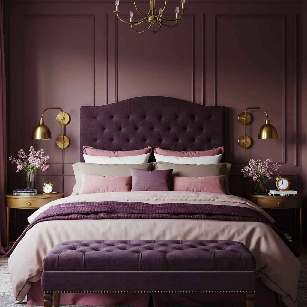
Plum is one of those colors that can either look incredible or terrible, there’s not much middle ground. But pair it with a soft, barely-there pink, and you create this layered, sophisticated look that feels both moody and feminine. It’s perfect for luxury master bedroom designs.
The plum provides depth and drama, while the soft pink keeps things from feeling too heavy or dark. This combination works best in rooms with good natural light during the day and layered artificial lighting at night. Without proper lighting, the plum can make the space feel smaller.
Use the plum on one accent wall and the soft pink on the remaining walls. Or if you’re braver, flip it and use mostly plum with pink on just one wall. Either way, you’ll want to incorporate gold or brass accents to warm up the cool tones.
14. Warm Taupe and Crisp White
Taupe doesn’t get enough credit. It’s not gray, not beige, but something in between that works with almost everything. Paired with crisp white, it creates a clean, modern backdrop that lets your furniture and decor shine. This is one of those paint color schemes that ages beautifully.
What I appreciate about this combination is its versatility. It works in modern minimalist living room designs where you want a neutral backdrop, but it’s also warm enough for more traditional or cozy spaces. The taupe prevents the starkness that all-white rooms can have.
The key is choosing a taupe with the right undertones for your space. If your room gets warm light, go with a taupe that leans slightly gray. If it gets cool light, choose one with warmer brown undertones. The white should be crisp and clean, not cream or ivory.
15. Deep Teal and Coral Accents
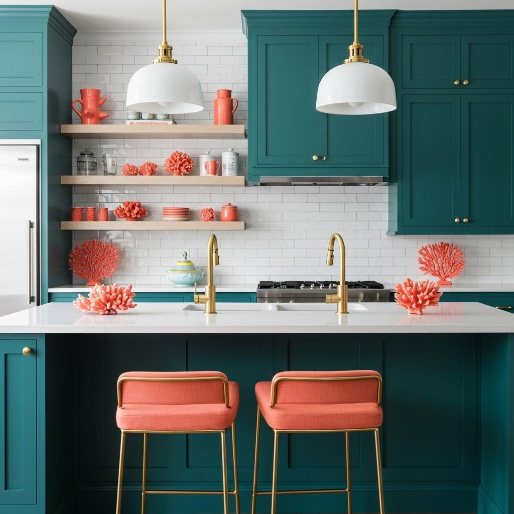
Teal brings that jewel-tone richness that makes any room feel more finished and intentional. Paired with coral accents (not coral walls, just touches of coral in decor), you get this vibrant, energetic combination that feels fresh and modern. It’s one of those trendy wall colors that actually has staying power.
This works particularly well in bold kitchen color schemes where you want something more personality-filled than white or gray. The teal provides a dramatic backdrop, while coral accents add warmth and prevent the space from feeling too cool or serious.
Just remember: the coral should be an accent, not a primary color. Think throw pillows, artwork, or small decor items. Too much coral can overwhelm the sophisticated teal and make the space feel busy.
16. Greige and Soft Olive
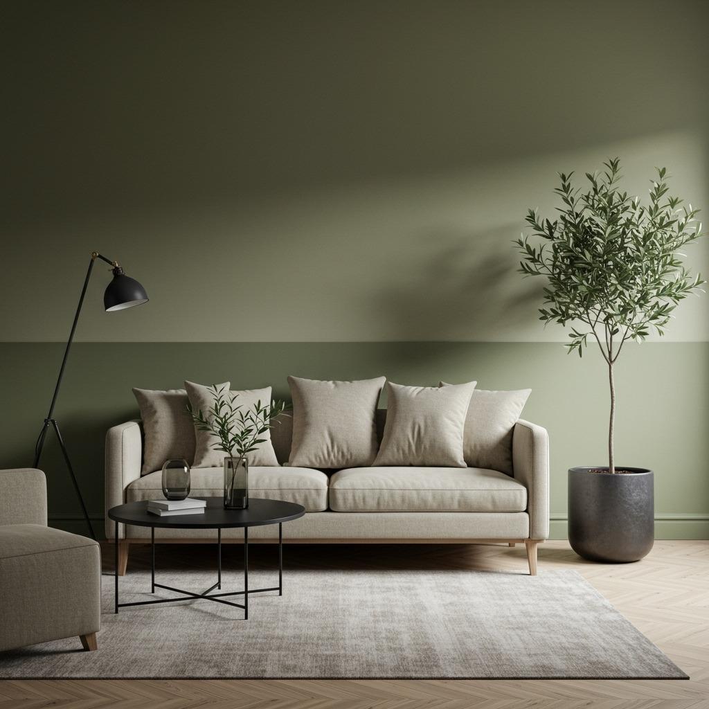
Greige (that perfect gray-beige hybrid) paired with soft olive creates a nature-inspired palette that feels current without being trendy. Both colors have this grounding, earthy quality that makes a space feel calm and put-together. It’s perfect for modern accent wall ideas.
What makes this combination special is how the colors interact. The greige provides a neutral foundation, while the olive adds just enough color to feel intentional. It’s subtle but effective, the kind of scheme that grows on you over time rather than overwhelming you initially.
This pairing works beautifully with natural materials like wood, stone, and linen. Add some black accents for contrast, and you’ve got a space that feels cohesive and thoughtfully designed. It’s one of those best interior paint ideas for people who want color but don’t want to commit to anything too bold.
17. Slate Blue and Warm Honey
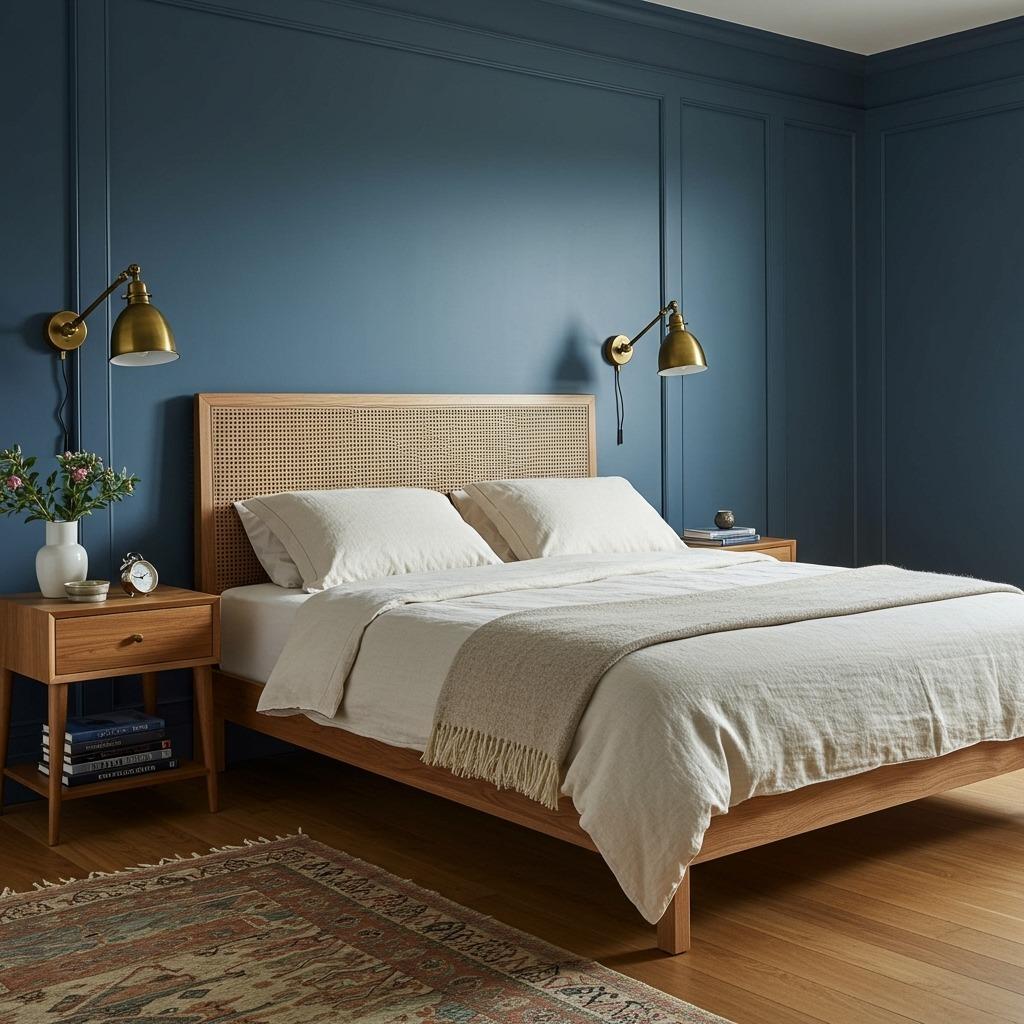
Slate blue has this cool, calming quality that works in almost any room. Paired with warm honey tones (in wood furniture, floors, or accents), you create a beautiful balance of cool and warm that feels lived-in and intentional. This combination photographs beautifully for those Pinterest-worthy moments.
I’ve used this in bedroom lighting focused designs where you want the walls to enhance the ambiance created by warm lighting. The slate blue looks completely different under warm bulbs versus cool daylight, giving you essentially two rooms depending on the time of day.
Use the slate blue on all walls for a cocoon-like effect, or just on accent walls if you want something less dramatic. The warm honey tones should come through naturally in wood furniture, floors, or deliberate brass and gold accents.
18. Charcoal and Blush
This might be the most surprising combination on the list, but it works. Charcoal provides drama and sophistication, while blush adds warmth and softness. Together, they create something modern and feminine without being overly sweet. It’s one of those paint color schemes that feels both bold and approachable.
This combination works particularly well in boho style bedroom designs where you want to mix edgy with soft. The charcoal keeps the blush from feeling too precious, while the blush prevents the charcoal from feeling too dark or masculine.
Try charcoal on one accent wall with blush on the remaining walls. Add white bedding, natural wood furniture, and some greenery to balance the color. The result is a space that feels curated and intentional without being overly designed.
How to Choose the Right Paint Color Schemes for Your Space
Picking colors from a list is one thing, making them work in your actual home is another. The same combination that looks stunning in a sun-filled California bungalow might fall flat in a north-facing New York apartment. Light changes everything, and I mean everything.
Start by observing your space throughout the day. Notice where natural light falls, when the room feels brightest, and when it gets darker. This will tell you whether you need warmer or cooler tones. Rooms with limited natural light generally benefit from warmer color combinations that reflect light, while sun-drenched rooms can handle cooler, deeper tones.
Consider what the room is used for. Bedrooms generally benefit from calming color combinations like sage and white or slate blue and honey. Kitchens and dining areas often work better with energizing or appetite-stimulating colors like terracotta and cream or warm taupe and white. Living rooms can go either way depending on whether you want energizing or relaxing vibes.
Don’t forget about what you already have. If you’ve invested in a colorful sofa or artwork, choose paint color schemes that complement rather than compete with those pieces. Sometimes the best color scheme is one that lets your existing furniture be the star.
Testing Before Committing
Here’s something I learned the hard way: paint samples on those tiny cards at the store look nothing like they will on your walls. The lighting is different, the scale is wrong, and you’re making decisions in a completely different environment than where you’ll actually live with the color.
Buy sample sizes and paint large swatches directly on your walls. Not just one wall, multiple walls to see how the color looks in different light conditions. Live with these samples for at least a few days, observing them in morning light, afternoon light, and artificial evening light.
Pay attention to how the colors make you feel at different times of day. A color that feels energizing in the morning might feel harsh in the evening when you’re trying to wind down. This is especially important in multifunctional spaces like open concept kitchen living room layout designs.
If you’re testing multiple color combinations, paint the samples next to each other so you can see how they interact. Sometimes two colors that look great separately don’t work well together. Better to discover that with a $5 sample than after painting your entire room.
Final Thoughts on Transforming Your Space with Color
Color is powerful, it affects mood, perception of space, and even how we use a room. But it shouldn’t be intimidating. The worst that can happen is you paint over it, and honestly, that’s not the end of the world. I’ve repainted rooms multiple times before landing on the right combination.
What matters most is choosing paint color schemes that reflect how you want to feel in your space. Not what’s trending on Pinterest, not what your friend did in their house, but what makes sense for your life and your home. These 18 combinations are starting points, not rules.
Trust your instincts, test thoroughly, and remember that paint is one of the most affordable ways to completely transform a room. Even if you start with something safe like warm taupe and white, you can always get bolder with time. Your home should evolve with you.
The rooms that feel most like home are rarely the ones that followed all the rules. They’re the ones where someone took a chance on a color combination that spoke to them, even if it didn’t make logical sense on paper.

