There’s something undeniably elegant about walking into a space where every element feels intentional, refined, and harmonious. A monochrome living room strips away the noise of competing colors and lets you focus on what really matters – texture, form, and the way light plays across different surfaces throughout the day.
If you’ve been scrolling through Pinterest wondering how to achieve that gallery-like sophistication without making your space feel cold or sterile, you’re in the right place. The beauty of working with a minimal color palette is that it actually gives you more creative freedom, not less. When you’re not worrying about whether colors clash, you can experiment with patterns, materials, and proportions in ways that feel surprisingly liberating.
What I find most compelling about this approach is how timeless it feels. Trends come and go, but black and white decor never looks dated. Whether you’re starting from scratch or reworking what you already have, these sleek lounge ideas will help you create a living room that feels both current and classic – the kind of space that photographs beautifully but also feels genuinely comfortable to live in.
Why Monochrome Living Rooms Work So Well
The power of a monochrome palette lies in its simplicity and versatility. When you limit yourself to blacks, whites, and the infinite range of grays between them, you’re forced to think more carefully about proportion, scale, and texture. It’s like learning to cook with fewer ingredients – you become more attuned to quality and technique.
I’ve noticed that people often worry a monochrome space will feel boring or one-dimensional. But the opposite is usually true. Without the distraction of color, your eye naturally picks up on subtle details – the grain of wood, the weave of fabric, the way different materials reflect or absorb light. These nuances create visual interest in a more sophisticated way than simply adding more colors ever could.
Another practical advantage? It’s remarkably forgiving when you’re mixing furniture from different sources or eras. That vintage chair you inherited doesn’t need to “match” your new sofa because they’re already coordinated through their shared palette. This makes decorating more accessible and budget-friendly, especially if you’re gradually building your space over time like most of us are.
The psychological impact shouldn’t be overlooked either. Monochrome spaces tend to feel calmer and more focused than their colorful counterparts. There’s a reason so many minimalist
living rooms lean into this aesthetic – it creates a mental clarity that’s increasingly valuable in our overstimulated world.
Layout #1: The Symmetrical Sanctuary
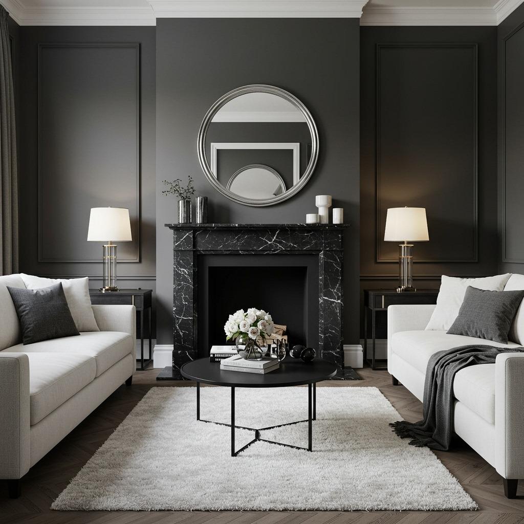
Symmetry creates instant harmony. This layout works particularly well in formal living rooms or spaces where you want to establish a sense of order and calm. Start by identifying your room’s natural focal point – usually a fireplace, large window, or architectural feature – and build your furniture arrangement around it.
Place matching sofas or seating pieces directly across from each other, creating a conversational square or rectangle. The key is maintaining visual weight on both sides. If you have a black leather sofa on one side, balance it with something of similar visual heft on the other – perhaps a pair of dark gray armchairs or another substantial seating piece.
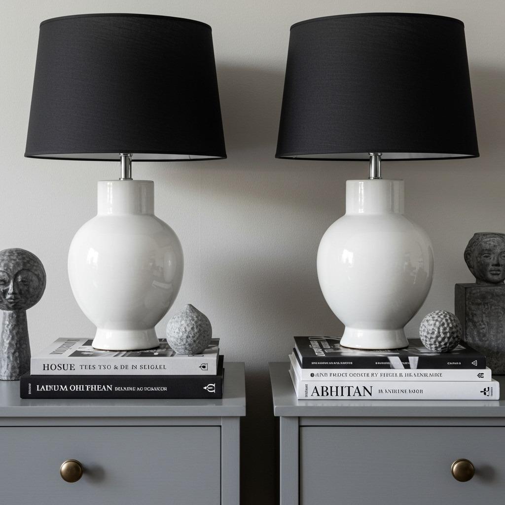
Side tables and lighting should mirror each other too. Two identical table lamps create a finished, intentional look that says you know what you’re doing. Don’t worry if this feels a bit formal – you can loosen things up with organic textures like a chunky knit throw or a natural fiber rug that softens the precision.
The beauty of this approach in a monochrome scheme is that symmetry feels elegant rather than stuffy. When everything shares a similar tonal range, the repetition becomes soothing instead of redundant. This layout is perfect if you’re drawn to Scandinavian living room aesthetics but want something with a bit more dramatic contrast.
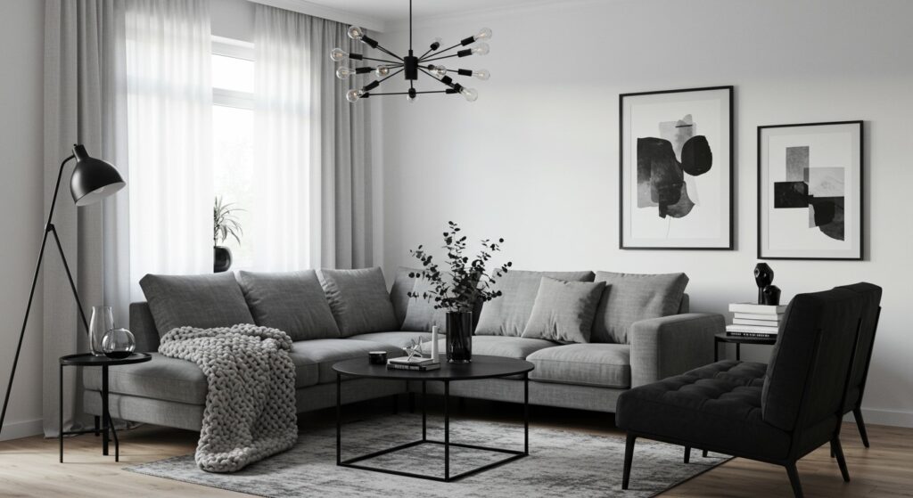
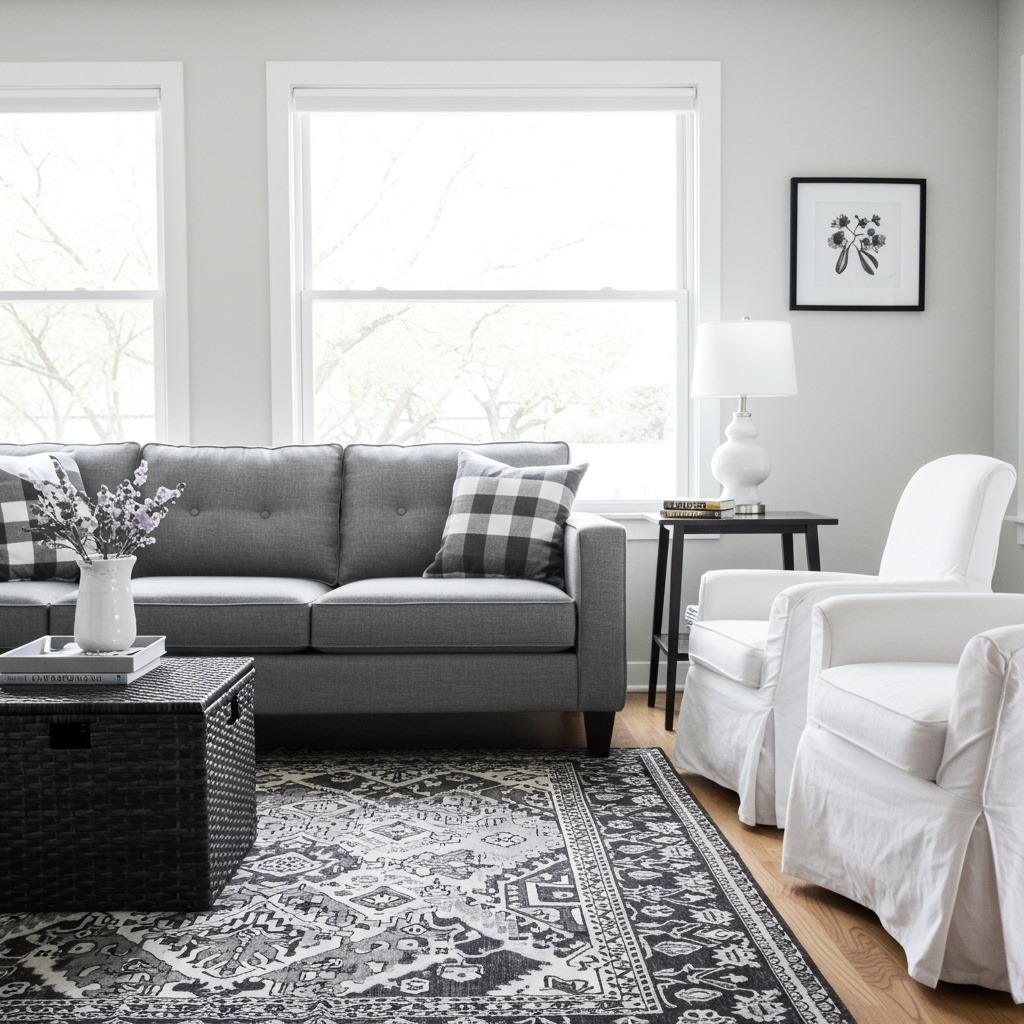
Layout #2: The Layered Lounge
Sometimes perfect symmetry isn’t what you’re after. The layered lounge embraces a more collected, lived-in feel while maintaining the sophistication of a monochrome palette. This layout is all about creating depth through multiple layers of furniture, textiles, and accessories at varying heights.
Start with a substantial sofa – ideally in a medium to dark gray – positioned to anchor the room. Rather than matching pieces, layer in different seating options: a sleek black accent chair here, a white ottoman there, maybe even a small bench tucked into a corner. The variety keeps things interesting while the shared color story holds everything together.
Textiles are where this layout really comes alive. Stack pillows in different sizes and fabrics – smooth leather, nubby boucle, soft velvet, crisp linen. Drape a chunky knit throw over the sofa arm. Layer a smaller geometric rug over a larger neutral one. Each layer adds visual and tactile interest without introducing color.
This approach works beautifully in cozy small living rooms because the monochrome palette prevents the layering from feeling cluttered. Even with lots of elements, the space reads as cohesive and intentional rather than chaotic.
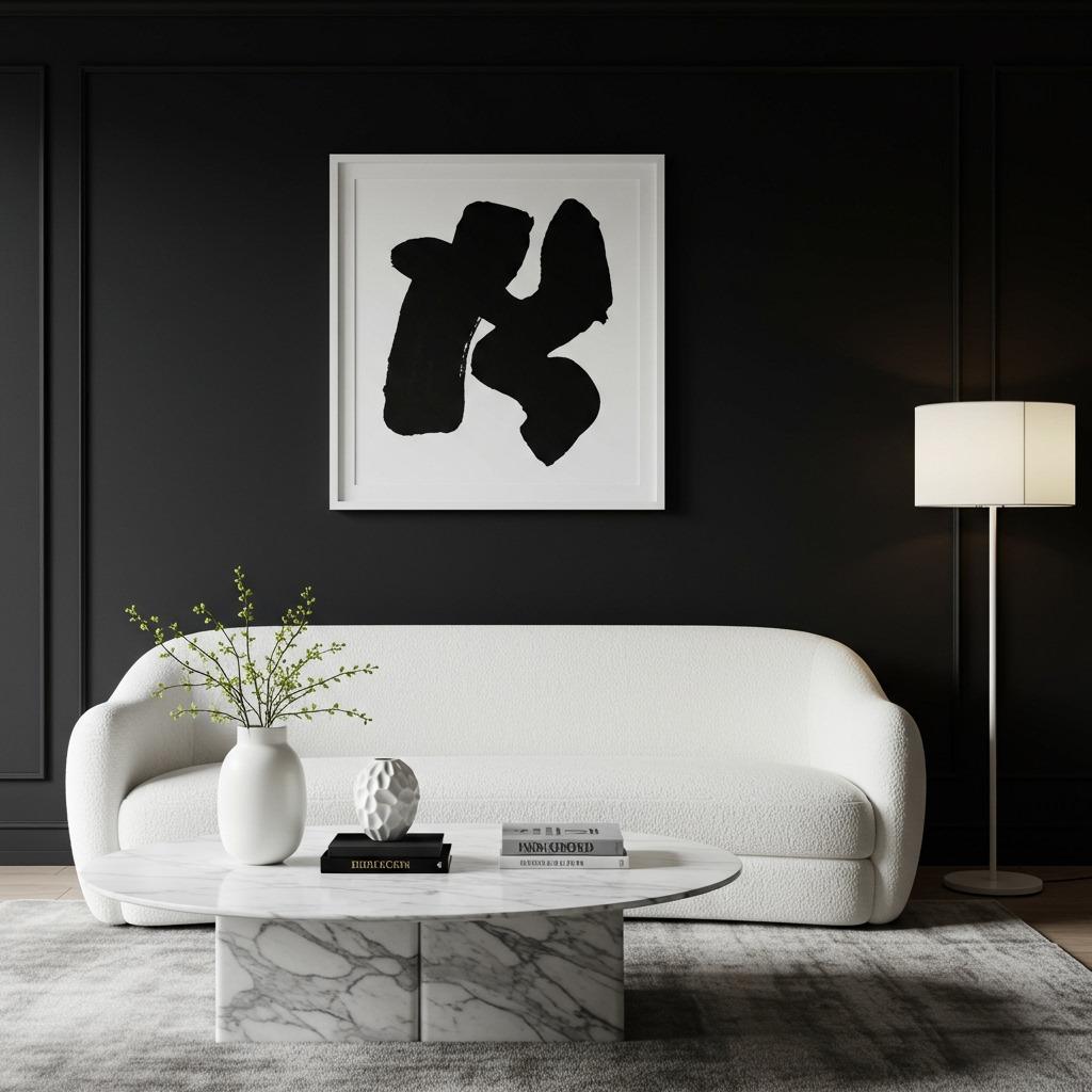
Layout #3: The Minimalist Marvel
If you’re someone who finds peace in empty space, this layout might be your perfect match. The minimalist approach to a monochrome living room is about carefully editing down to only the most essential pieces. Every item needs to earn its place through either function or exceptional beauty.
Choose a streamlined sofa with clean lines – nothing overly cushioned or ornate. A low-profile design in white or light gray typically works best because it doesn’t visually divide the room. Pair it with a single standout coffee table. In a minimalist space, this table becomes more important than usual since there’s less competing for attention. Consider something sculptural in black or with interesting materiality like marble or glass.
Resist the urge to fill every corner. One stunning piece of art can have more impact than an entire gallery wall. A single floor lamp provides necessary light while serving as a sculptural element. Maybe one carefully chosen plant in a simple black or white pot. That’s it. The restraint is the point.
This layout shares DNA with broader living room ideas but pushes the concept of “less is more” to its logical conclusion. It’s particularly effective in smaller spaces or open-concept homes where you want to maintain visual flow without interruption.
Layout #4: The Texture-Forward Retreat
When color takes a back seat, texture moves to center stage. This layout is perfect for people who love sensory richness and want their living room to feel warm despite the cool palette. The strategy here is to combine as many different materials and surface treatments as possible within your monochrome scheme.
Start thinking about texture categories: rough versus smooth, matte versus glossy, soft versus hard. A velvet sofa pairs beautifully with a jute rug. Smooth leather accents contrast nicely with chunky knit throws. A glossy black lacquer coffee table becomes even more interesting next to a rough-hewn wooden bowl or woven basket in charcoal tones.
Don’t forget about architectural texture too. If you have exposed brick, consider painting it white rather than covering it – you maintain the visual interest while staying within your palette. Wood beams, shiplap, or textured wallpaper in subtle gray patterns all add dimension without introducing color.
The lighting in this layout deserves special attention. Different textures respond to light in distinct ways – velvet absorbs it, creating depth, while lacquer reflects it, adding sparkle. Position your light sources to highlight these qualities. This approach creates a living room that changes character throughout the day as natural light shifts.
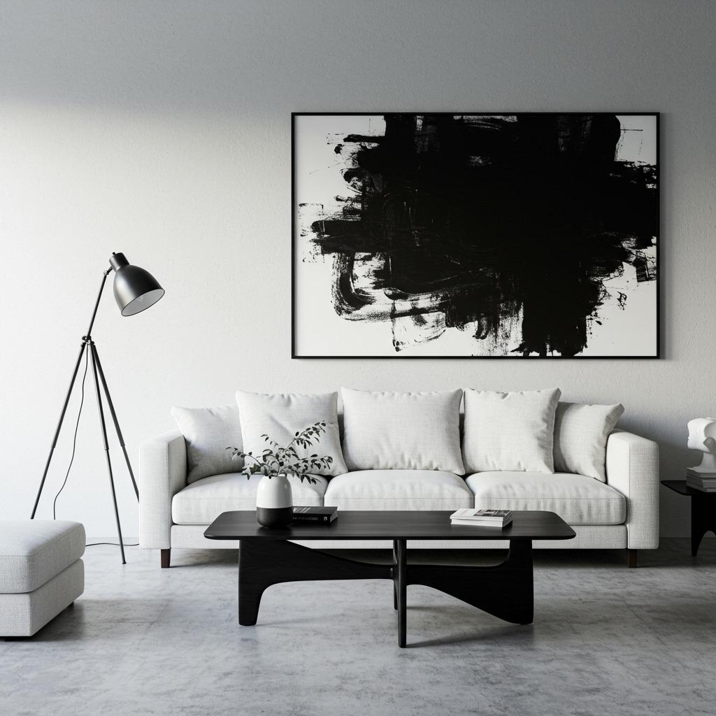
Layout #5: The Graphic Focal Point
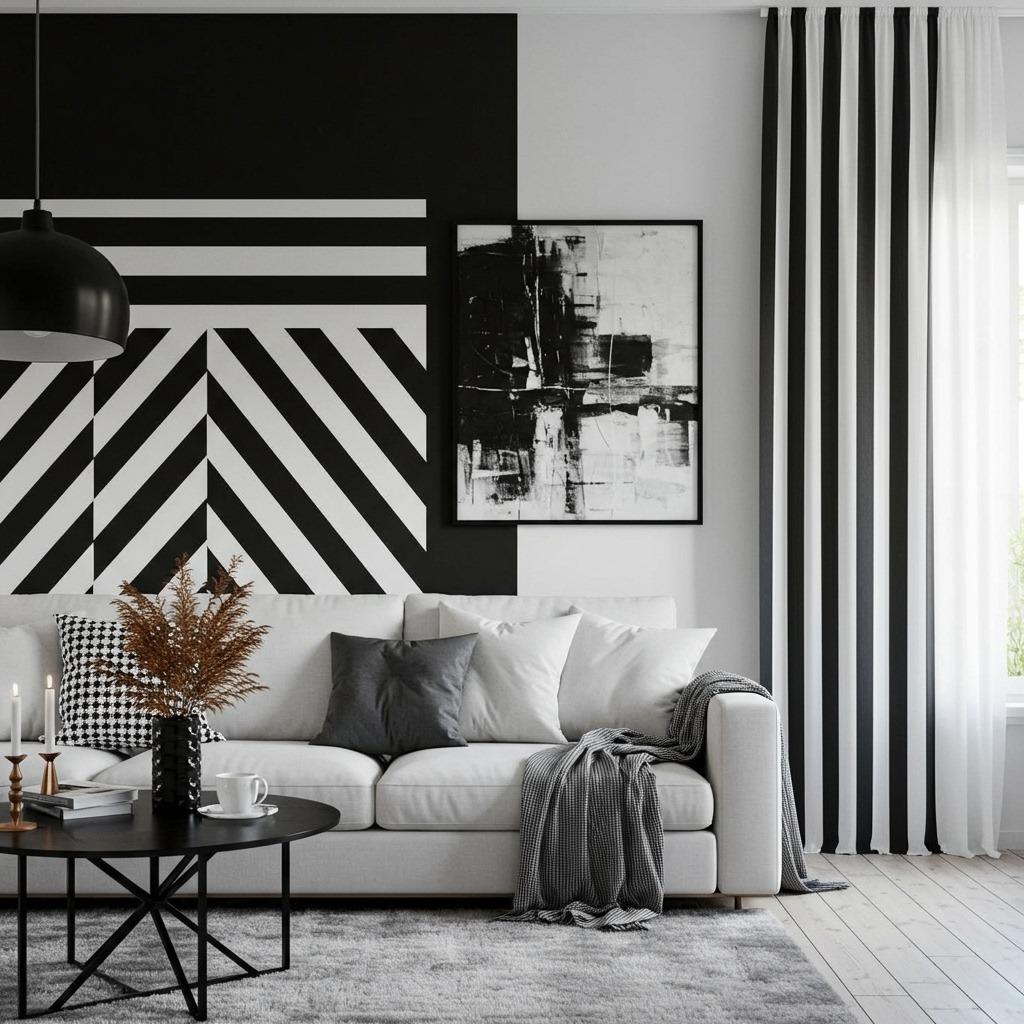
Sometimes the most effective approach is to let one dramatic element do all the heavy lifting. This layout builds the entire room around a single graphic focal point that captures attention immediately. Everything else serves to support and frame that star element.
Your focal point could be a wallpapered accent wall with bold geometric or botanical patterns in black and white. Or perhaps floor-to-ceiling curtains in a striking stripe pattern. Maybe it’s an enormous piece of abstract art or a graphic area rug with an eye-catching pattern. The key is committing fully to one statement rather than competing smaller ones.
Keep furniture simple and understated so it doesn’t fight for attention. A clean-lined sofa in solid white or gray provides a visual resting place. Side tables and accessories should be minimal –
maybe just a lamp and a few carefully chosen objects. You’re creating a supporting cast for your star performer, not an ensemble piece.
This layout works particularly well if you’re working within a tight budget. You can invest in one spectacular wallpaper or piece of art and keep everything else quite basic. The monochrome palette ensures everything looks cohesive even when the price points vary widely. It’s a smart strategy I’ve seen work beautifully in affordable home upgrades that deliver maximum impact.

Layout #6: The Contrast Play
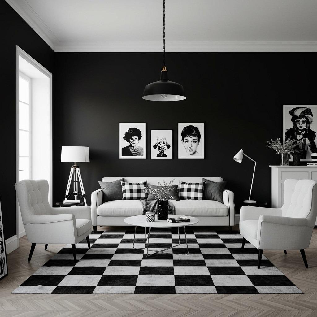
For those who want their living room to make a bold statement, the contrast play layout embraces the full dramatic potential of black and white decor. This isn’t about subtle gradations – it’s about pairing the darkest darks with the brightest whites for maximum visual punch.
Paint walls a deep charcoal or true black, then anchor the space with white furniture. Or inverse it – crisp white walls with a dramatic black sofa and dark wood furniture. The point is creating strong opposition rather than gentle transition. This approach requires confidence, but the results are undeniably striking.
Accessories should maintain this high-contrast philosophy. Black frames on white walls, white vases on black shelves, a checkerboard pattern rug. Even lighting becomes part of the contrast
strategy – consider black pendant lights against a white ceiling or sleek white table lamps on dark surfaces.
One word of caution: this layout needs good natural light to avoid feeling cave-like, especially if you’re going with dark walls. Large windows, sheer white curtains, and strategic mirror placement help bounce light around. The payoff is a space with genuine drama and personality that photographs incredibly well – perfect for anyone building their Pinterest presence.
Layout #7: The Mid-Century Modern Monochrome
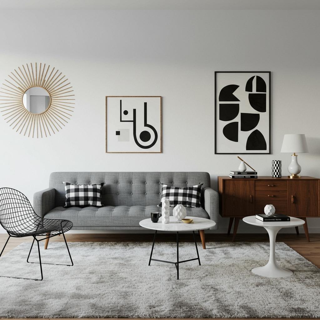
Mid-century design and monochrome palettes are natural partners. The clean lines and sculptural forms characteristic of this style become even more pronounced when color isn’t competing for attention. This layout combines iconic mid-century silhouettes with a strictly monochrome approach for a look that’s both retro and contemporary.
Look for furniture with distinctive mid-century shapes – tapered legs, rounded forms, tufted upholstery. A classic gray sofa with wooden legs pairs perfectly with iconic accent chairs like a wire chair in black or a shell chair in white. The wood tones add warmth without breaking your monochrome commitment since natural wood reads as neutral.
Accessories should nod to mid-century design: geometric patterns, abstract art, sculptural ceramics, and metal accents in black or chrome. A starburst clock or mirror becomes a perfect focal point. Keep patterns graphic and bold rather than ornate – think circles, lines, and abstract shapes.
This layout has strong connections to mid-century modern living room design but with the color stripped away to highlight form and function. It’s an excellent choice if you appreciate vintage aesthetics but want something that feels current and fresh rather than theme-y.

Creating Depth Without Color
One of the biggest challenges in monochrome spaces is avoiding a flat, one-dimensional look. Without color to create visual layers, you need to be more intentional about other elements that establish depth and dimension. The good news? Once you understand these principles, they’re actually easier to manipulate than color relationships.
Lighting becomes your primary tool for creating depth. Layer multiple light sources at different heights and intensities. Ambient overhead lighting provides general illumination, while table lamps create pools of light that define intimate zones. Add accent lighting to highlight artwork or architectural features. The interplay of light and shadow adds dimension that color would normally provide.
Furniture placement also contributes to perceived depth. Rather than pushing everything against walls, float some pieces into the room. A sofa positioned away from the wall with a console table behind it creates layers. Varying the heights of furniture and accessories – low coffee table, medium sofa, tall shelving unit – guides the eye through different planes.
Consider using mirrors strategically to amplify both light and the sense of space. A large mirror reflects your carefully arranged layers, essentially doubling the visual complexity. In monochrome spaces, mirrors become even more valuable because they don’t introduce color that might clash with your palette.
Choosing the Right Shades and Tones
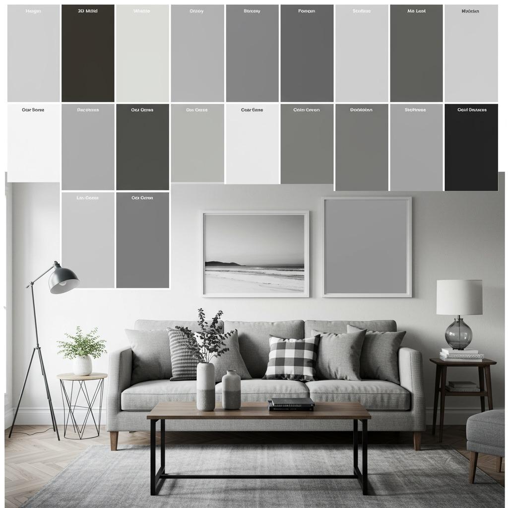
Not all blacks, whites, and grays are created equal. The specific shades you choose will dramatically impact your room’s mood and functionality. This is where many people struggle because the subtle differences become very apparent once everything is in place.
Start by considering undertones. Some grays lean warm (with brown or beige undertones), while others read cool (with blue or purple undertones). Some whites are crisp and stark, others soft and creamy. These differences matter enormously when you’re putting them all together. I’d recommend getting large paint samples or fabric swatches and living with them in your space for a few days, observing how they look in different lighting conditions.
The ratio of light to dark also shapes the overall feel. A room that’s 70% white and light gray with 30% black accents will feel completely different than one that inverts those proportions. Generally, using lighter shades as your dominant tones with darker colors as accents creates a more spacious, airy feeling – especially important in small space renovation projects.
Don’t forget about pure black and pure white versus their softer cousins. True white walls reflect maximum light but can feel stark. A warm white or very light gray might be more livable. Similarly, charcoal or dark gray often works better than pure black for large surfaces like sofas, as it’s less visually heavy while still providing strong contrast.
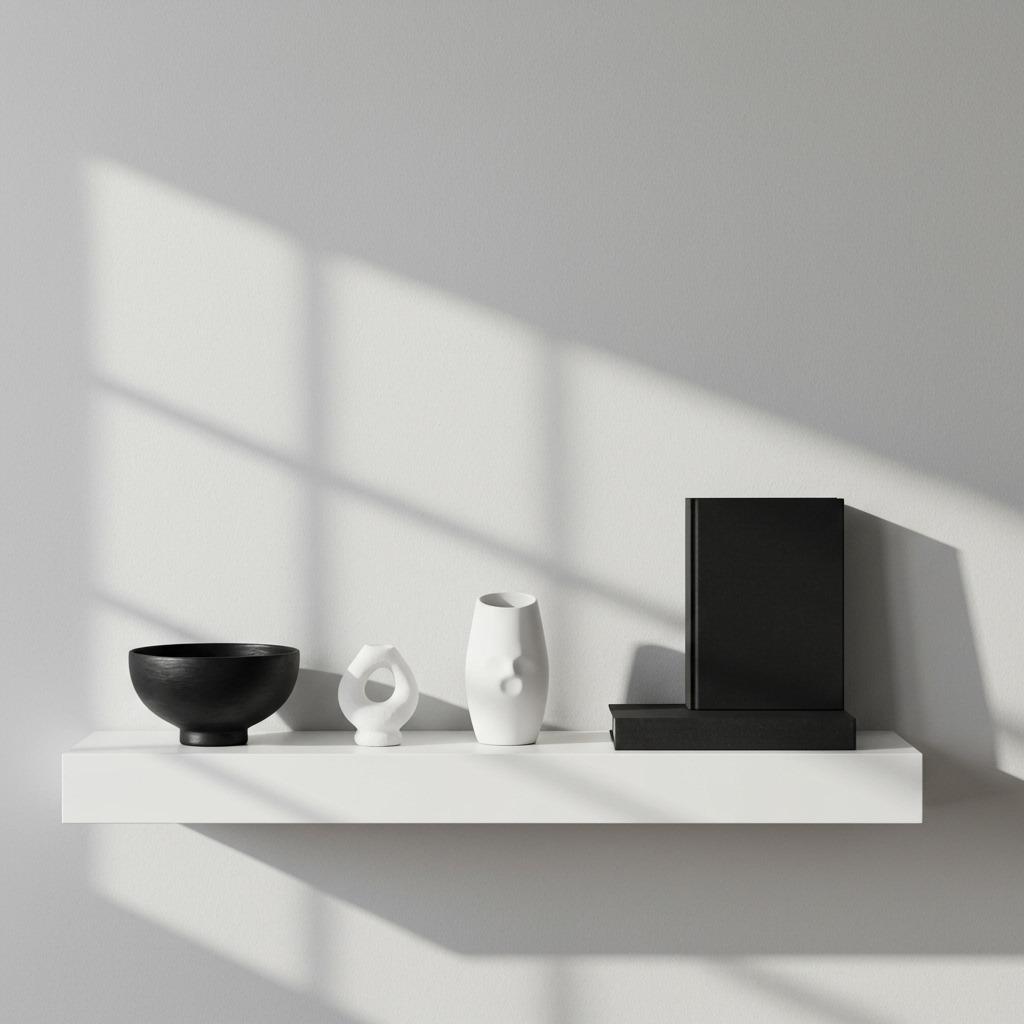
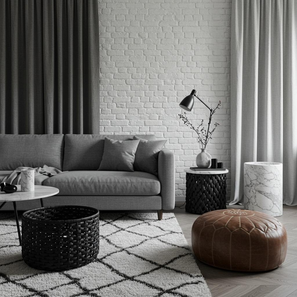
Incorporating Natural Elements
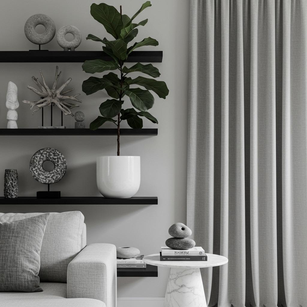
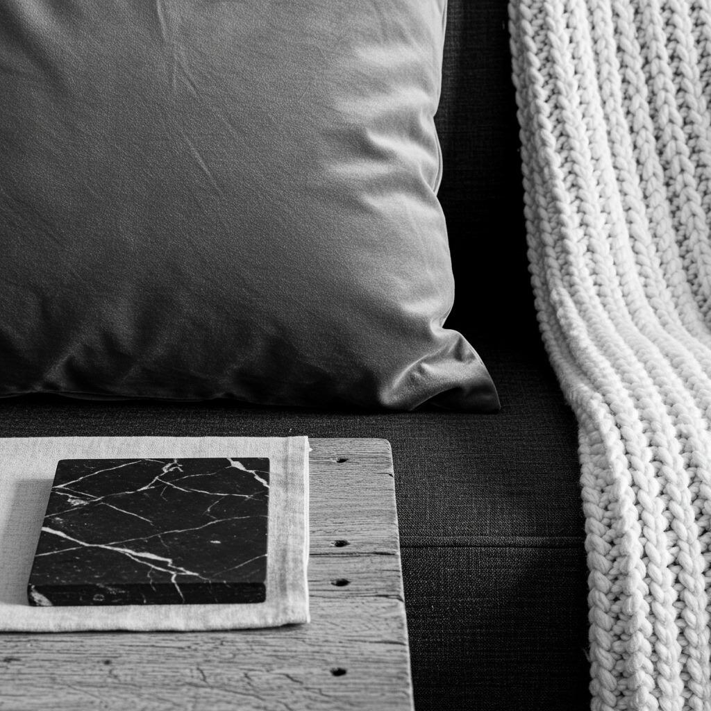
Here’s something I’ve learned: monochrome living rooms benefit enormously from natural elements. The organic irregularity of plants, wood, stone, and natural fibers provides visual relief from the geometric precision that often defines these spaces. You’re still maintaining your minimal color palette, but you’re adding life and warmth.
Plants are the obvious choice, and thankfully, the green of foliage reads as a neutral in monochrome schemes. A large potted tree like a fiddle leaf fig or rubber plant makes a strong statement. Smaller plants grouped on shelves or side tables add softer touches. Choose planters in white, black, or neutral gray to keep them visually cohesive. The organic shapes and living quality of plants prevent monochrome spaces from feeling too austere.
Natural wood adds warmth without technically introducing color. Light woods like ash or oak keep things bright and Scandinavian-feeling, while darker woods like walnut provide richer contrast. Wood furniture, picture frames, or decorative objects bring texture and a connection to nature that grounds the sleekness of a monochrome palette.
Stone and natural textiles also fit beautifully. A marble coffee table, slate coasters, or river rock in a bowl all add earthy texture. Linen curtains, jute rugs, and cotton throws introduce organic weaves that soften the space. These elements are especially effective if you’re inspired by eco house principles and want your design to reflect natural, sustainable materials.
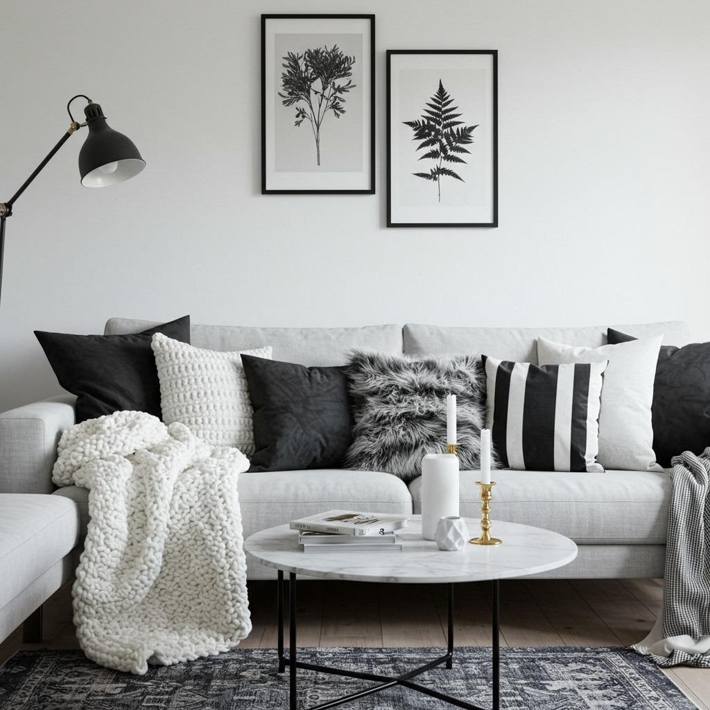
Pattern and Print in Monochrome Spaces

Pattern is where monochrome spaces can really shine. Since color isn’t a variable, you can mix patterns much more freely than you could in a colorful room. The shared palette creates automatic cohesion even when patterns themselves are quite different.
Start by varying the scale of your patterns. Pair large-scale graphics with smaller, more detailed prints. A bold striped rug might anchor a space that includes smaller geometric throw pillows and a medium-scale floral print on curtains. The size variation creates visual interest while the monochrome palette keeps everything harmonious.
Mix pattern types too. Geometric patterns (stripes, chevrons, hexagons) provide structure and modernity. Organic patterns (florals, botanicals, abstract brushstrokes) add softness and
movement. Traditional patterns (damask, toile, houndstooth) bring a classic elegance. Combining these different families creates richness without chaos.
Balance is still important. If you have a heavily patterned rug and patterned curtains, keep the sofa solid. Or if your sofa is patterned, simplify other elements. This gives the eye places to rest. The monochrome scheme is forgiving, but there’s still such a thing as visual overload.
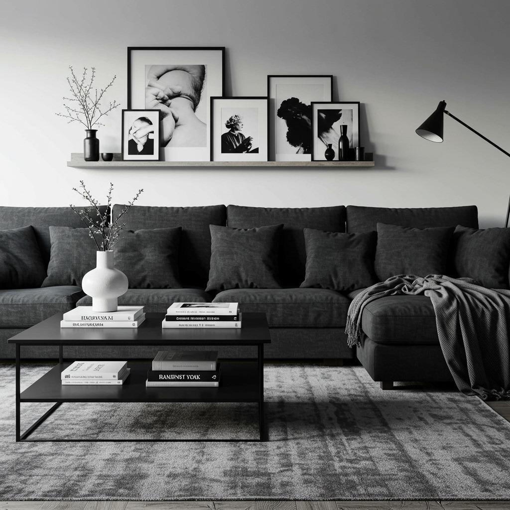
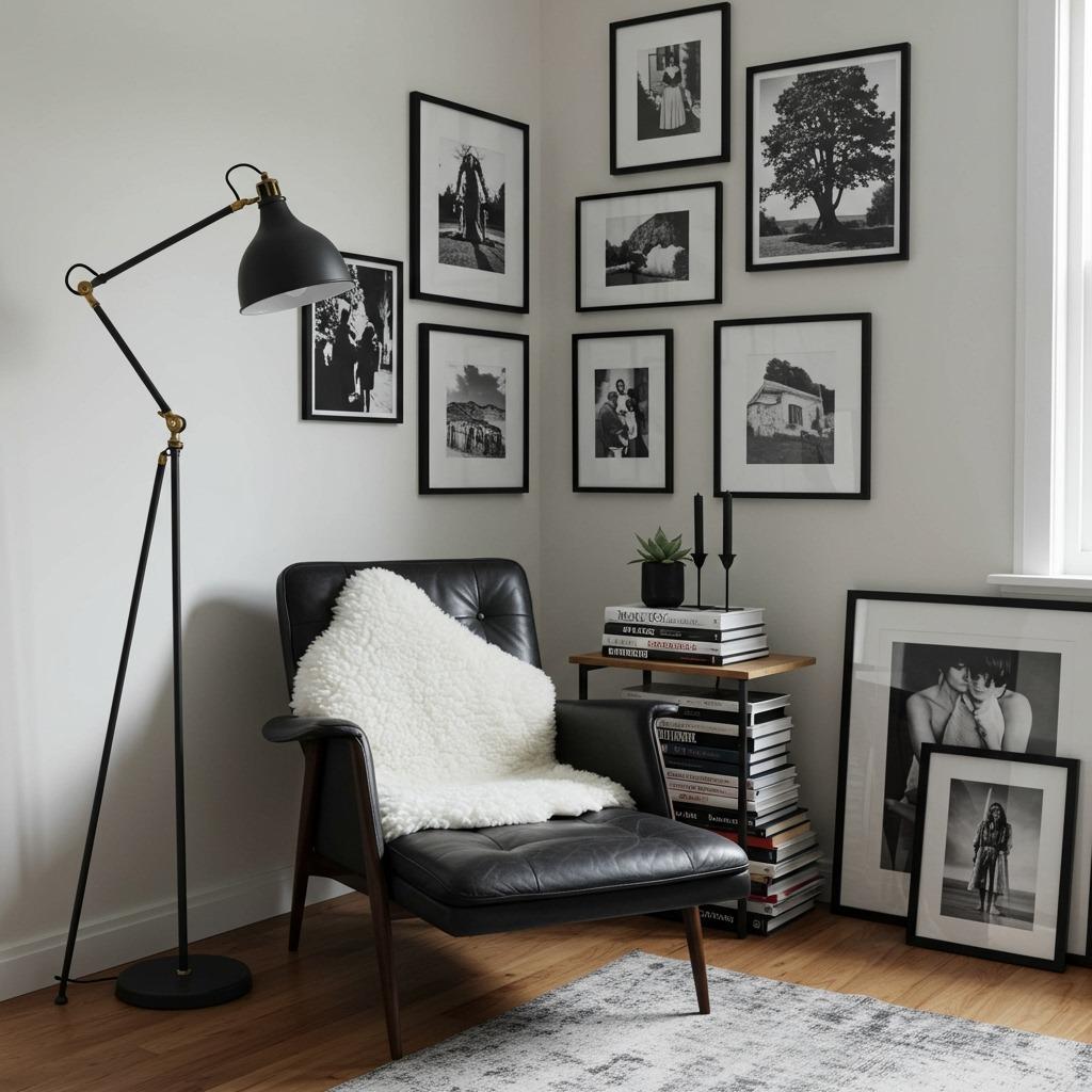
Artwork and Wall Decor Strategies
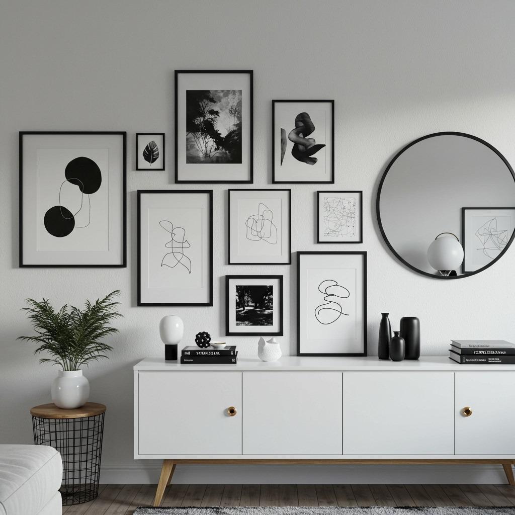
Artwork takes on special significance in monochrome living rooms because it often provides the visual punctuation that color would normally offer. Black and white photography is an obvious choice, but there’s so much more to explore within this palette.
Abstract art in grays, blacks, and whites can be incredibly powerful. Look for pieces with strong gestural marks, interesting textures, or compelling compositions. The absence of color means you’re really seeing the artist’s mark-making and formal decisions. Line drawings and graphic prints also work beautifully, offering visual interest through form rather than hue.
Gallery walls are particularly effective in monochrome spaces. You can mix photography with abstract pieces, prints with original art, different frame styles and sizes – the shared palette creates cohesion even when the individual pieces are quite varied. This is a budget-friendly approach too, since you can build your collection gradually from various sources without worrying about color coordination.
Consider three-dimensional wall art as well. Sculptural pieces, woven wall hangings in natural fibers, or even modern accent wall ideas using architectural elements like board-and-batten painted in your monochrome scheme. These add depth and shadow play that flat art can’t achieve.
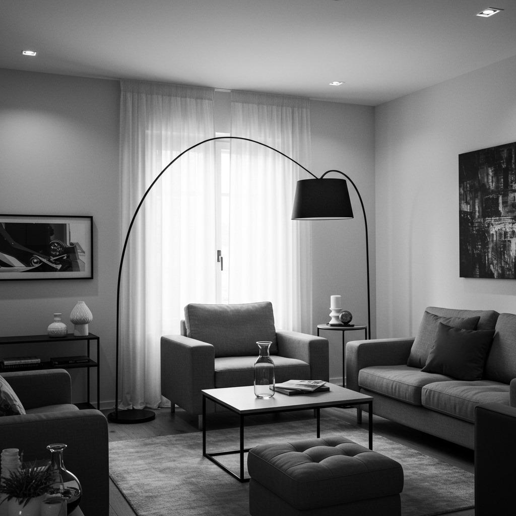
Lighting Design for Monochrome Rooms
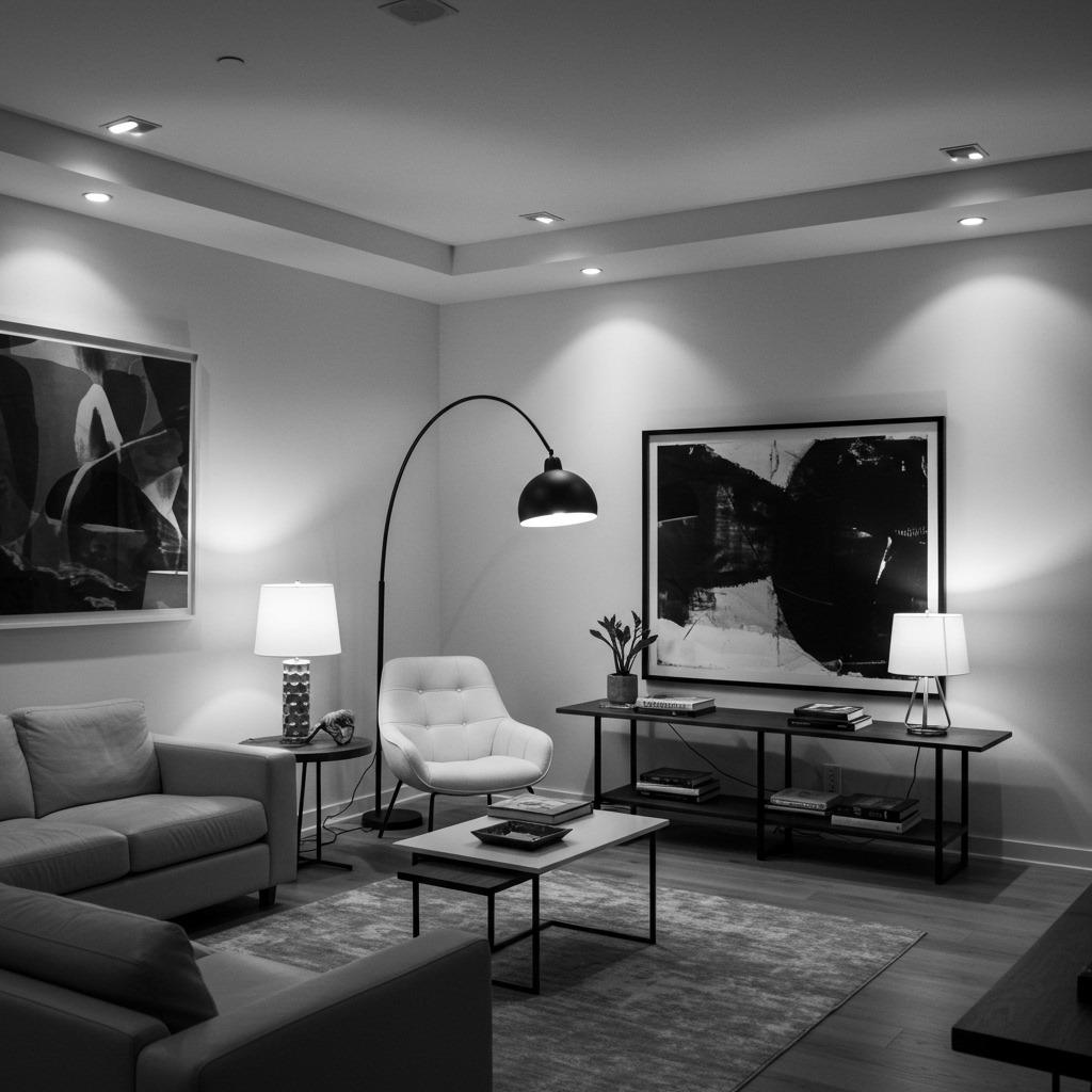
The right lighting can make or break a monochrome living room. Without color to create mood and warmth, lighting carries that responsibility. You need to be more thoughtful about both the fixtures themselves and the quality of light they produce.
Layer your lighting types: ambient (overhead or recessed), task (reading lamps, desk lights), and accent (spotlights on art, uplighting for plants). This creates depth and allows you to adjust the mood throughout the day. Dimmer switches are essential – they let you soften the space in the evening when stark brightness might feel too harsh.
Fixture style contributes to your overall aesthetic. Sculptural modern pendants in matte black, sleek floor lamps with clean lines, or architectural sconces all reinforce the sophisticated feel of
a monochrome space. The fixtures become decorative elements themselves, not just functional necessities.
Pay attention to color temperature of your bulbs. Warm white (2700-3000K) adds coziness and prevents the space from feeling cold, while cool white (3500-4100K) maintains crispness and energy. Many people find a slightly warm white works best in monochrome living rooms, providing enough warmth to feel inviting while still feeling fresh and clean.
Budget-Friendly Monochrome Updates
Achieving a stunning monochrome living room doesn’t require a complete renovation or designer budget. Some of the most effective updates are surprisingly affordable when you’re working within such a defined palette. The constraint actually works in your favor.
Paint is your best friend and your most powerful tool. You can transform existing furniture by painting it white, black, or gray. That builder-grade wood coffee table? Matte black paint makes it look custom. Mismatched side tables? Paint them matching white and suddenly they look intentional. Even painting just one accent wall can dramatically shift your space toward monochrome sophistication.
Textiles offer another budget-friendly update path. Swap colorful throw pillows for black, white, and gray versions. Replace bright curtains with simple white or gray linen panels. Add a black and white patterned rug. These changes can completely transform a room’s feel without touching furniture or walls.
DIY artwork is remarkably effective in monochrome schemes. Create abstract pieces using black acrylic paint on white canvas – texture and gesture matter more than artistic skill. Frame black and white photographs you’ve taken or downloaded. Even a simple collection of black frames on a white wall becomes graphic art.
Common Monochrome Mistakes to Avoid
I’ve seen enough monochrome living rooms go wrong to recognize patterns in what doesn’t work. The most common mistake is going too flat – using only one or two shades without enough tonal variation. If everything is medium gray, nothing has definition. You need the full range from near-white to deep charcoal to create dimension.
Another pitfall is neglecting texture entirely. When people first embrace monochrome, they sometimes focus so much on color elimination that they forget texture is what prevents blandness. Without varied materials and surfaces, even a well-designed monochrome room can feel sterile and unwelcoming.
Going too stark is also problematic. Some people interpret “monochrome” as “cold and minimal” and strip away all warmth. Unless that’s genuinely your aesthetic preference, remember that monochrome doesn’t mean uncomfortable. Soft textiles, warm lighting, and natural elements keep the space livable.
Finally, forgetting about maintenance can be an issue, especially with all-white schemes. White upholstery and light rugs can be impractical if you have kids or pets. Consider performance fabrics, or embrace the beauty of well-worn pieces rather than attempting to maintain pristine white in a space that gets daily use.
Seasonal Adjustments in Monochrome Spaces
One advantage of a monochrome living room is how easily it adapts to seasonal changes without requiring a complete overhaul. Small adjustments in texture and weight can shift the mood from cozy winter retreat to breezy summer space while maintaining your sleek lounge ideas.
For colder months, layer in heavier textures. Chunky knit throws in cream or charcoal, velvet pillows in deep gray, faux fur accents in black and white. These materials feel warmer and more insulating even though you’re not changing the color palette. Switch to heavier curtains if you have them, and maybe add a second rug layer for extra warmth underfoot.
As weather warms, strip back to lighter materials. Replace velvet with linen, heavy knits with lightweight cotton. Remove extra layers of textiles and embrace more negative space. Sheer white curtains instead of heavier panels allow more light and airflow. The monochrome palette stays constant, but the feeling shifts from cocooning to refreshing.
You can also play with the balance of light and dark seasonally. Summer might call for emphasizing whites and light grays with just touches of black, while winter could reverse that ratio for a more grounded, intimate feeling. These adjustments are subtle but effective, keeping your space feeling current without requiring major changes.
Making Monochrome Work With Existing Architecture
Sometimes you’re working with architectural features that you can’t change – wood floors, colored tile, existing trim work. The flexibility of a monochrome palette actually makes it easier to incorporate these fixed elements than you might think.
If you have warm wood floors, they become a neutral base that anchors your black and white scheme. The wood reads as a natural element rather than a color that competes. Similarly, if you have cool-toned tile or stone, it simply extends your gray range. The key is accepting these materials as part of your neutral foundation rather than fighting them.
Existing trim and molding can be painted to support your monochrome vision. White trim creates crisp definition against gray walls. Black-painted trim can be dramatically modern against white walls. If painting isn’t an option, work with what you have – most trim is already white or light-colored, which fits perfectly into monochrome schemes.
Architectural features like fireplaces or built-in shelving become focal points in monochrome rooms rather than problems to solve. A brick fireplace painted white maintains texture while fitting your palette. Built-ins in dark wood create natural contrast without introducing color. Sometimes these existing features actually strengthen your monochrome design by adding character and depth.
Monochrome Living Rooms for Different Lifestyles
Your monochrome living room should reflect how you actually live, not just how you want it to look in photos. The beauty of this palette is that it adapts to various lifestyles without losing its sophisticated edge.
For families with young children, prioritize durability. Performance fabrics in medium grays hide stains better than pure white while maintaining your aesthetic. Washable rugs in black and white patterns camouflage inevitable spills. Storage becomes essential – look for sleek black or white baskets and bins that hold toys but don’t break your visual theme. Similar considerations apply when creating bedroom ideas for kids in a predominantly monochrome home.
If you love entertaining, focus on creating conversation areas with ample seating that still feels cohesive. A large sectional in gray provides plenty of room while maintaining clean lines. Add flexible seating like poufs or small stools in black that can be moved around as needed. Keep surfaces somewhat clear so there’s room for people to set down drinks without disturbing carefully arranged vignettes.
For quiet, contemplative lifestyles, embrace the minimal end of monochrome design. Simple furniture, maximum negative space, and a few carefully chosen objects create a serene environment perfect for reading, meditation, or creative work. This approach aligns beautifully with home office remodel principles if your living room also serves as a workspace.
Transitioning From Color to Monochrome
If you’re coming from a more colorful space, the transition to monochrome doesn’t have to happen all at once. A gradual approach often feels more natural and lets you adjust to the change without commitment anxiety.
Start with the largest elements – walls and major furniture pieces. Painting walls gray or white immediately shifts the space toward monochrome and creates a neutral backdrop for everything else. If you’re replacing a sofa or large seating piece anyway, choose something in your new palette. These big moves establish your direction.
Next, edit out the most obviously colorful items or relocate them to other rooms. Bright throw pillows, colorful art, vibrant accessories – remove these gradually and replace them with monochrome versions. You don’t need to throw anything away immediately; you might discover you want to reintroduce one special colorful object later as an intentional accent.
The final phase involves the details. Switch out lampshades, picture frames, decorative objects, and small textiles. By this point, you’ve lived with the emerging monochrome scheme long enough to know what works and what you miss. Some people find they want one plant with colorful blooms or one special colorful object – and that’s fine. Monochrome doesn’t have to mean rigid adherence to rules.
Beyond Living Rooms: Extending the Palette
Once you’ve created a successful monochrome living room, you might find yourself wanting to extend the palette throughout your home. The cohesion this creates can be incredibly satisfying, making your entire space feel larger, more cohesive, and more intentional.
Black and white bathroom design follows similar principles – mixing materials and textures within your palette to create interest. The moisture-resistant requirements of bathrooms actually pair well with monochrome materials like tile, stone, and porcelain.
Monochromatic bedroom ideas take on special importance since bedrooms need to feel restful and calm. The same layered textiles approach works beautifully, perhaps emphasizing softer grays and more luxurious materials for a space dedicated to rest.
Even kitchen and dining ideas can embrace monochrome aesthetics. White cabinets, gray countertops, black hardware and fixtures – the palette translates well to functional spaces while maintaining sophistication.
The advantage of whole-home monochrome is the visual flow it creates. Moving from room to room feels seamless rather than jarring. Colors don’t compete for attention or clash in unfortunate ways when viewed from adjacent spaces. Your home becomes a cohesive retreat with a strong point of view.
Creating a sophisticated monochrome living room is about finding
the right balance between restraint and richness. It’s not about stripping everything away until you’re left with sterile emptiness, but rather discovering how much beauty and complexity you can create within intentional limitations.
The layouts and strategies we’ve explored offer different entry points depending on your style, space, and lifestyle needs. Maybe you’re drawn to the precision of symmetry, or perhaps the layered, collected approach feels more like home. Some of you will embrace dramatic contrast while others find peace in subtle gradations of gray. There’s no single correct way to interpret monochrome design.
What matters most is that your living room serves your actual life. A beautifully photographed space that makes you anxious about spills or uncomfortable to relax in has failed its primary purpose. The goal is creating a room that looks intentional and sophisticated while still functioning as the gathering place, relaxation zone, or entertainment hub you need it to be.
The monochrome palette gives you a framework – a set of boundaries that paradoxically creates freedom. You’re no longer second-guessing whether colors work together or whether that new purchase will clash with existing pieces. Everything coordinates automatically, which means you can focus on the elements that truly matter: proportion, texture, light, and how the space makes you feel when you walk into it.
As you develop your monochrome living room, remember that perfection isn’t the goal. Some of the most beautiful spaces I’ve seen have one or two unexpected elements that break the rules slightly. Maybe it’s a vintage wood piece that doesn’t perfectly match your aesthetic, or a plant with unusually colorful blooms, or one piece of art that includes a hint of color. These small deviations often add personality and prevent the space from feeling too controlled.
Your monochrome living room will evolve over time, just as any thoughtfully designed space does. You’ll discover which textures you’re drawn to, which balance of light and dark feels right, whether you prefer the drama of stark contrast or the subtlety of tonal variation. Give yourself permission to experiment, adjust, and change your mind. The beauty of working with such a versatile palette is that modifications rarely require starting from scratch.
Whether you’re renovating completely, making gradual updates, or simply rethinking how to arrange what you already own, these principles will guide you toward a space that feels both sophisticated and genuinely yours. A monochrome living room done well isn’t about following trends or impressing visitors – though it will likely do both. It’s about creating a backdrop for your life that feels calm, cohesive, and endlessly appealing, no matter how many times you walk through the door.

