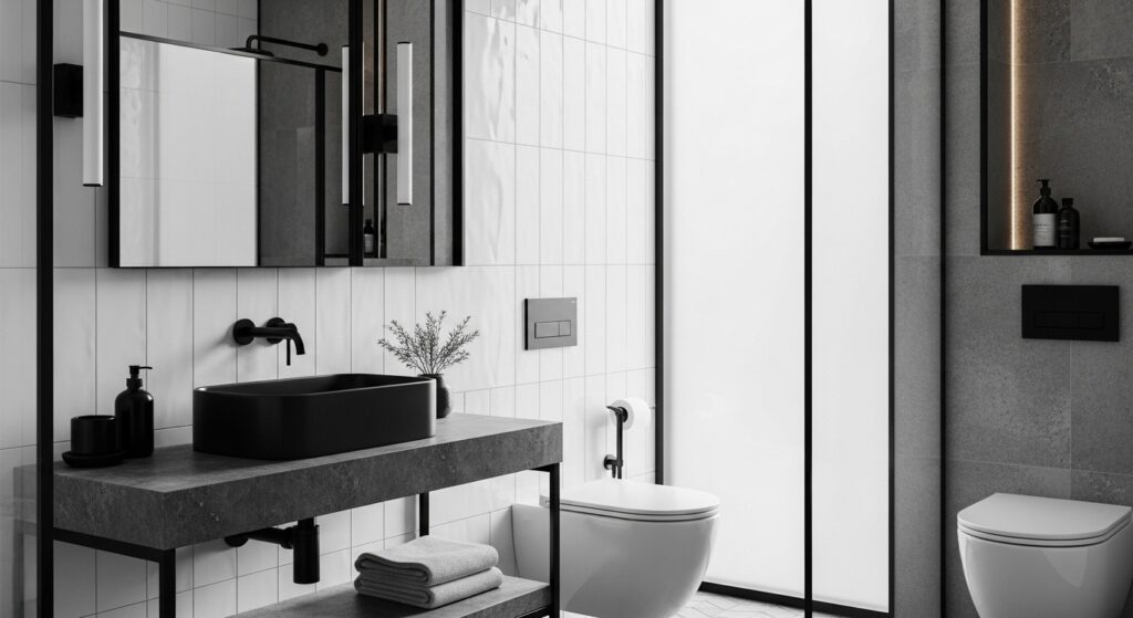
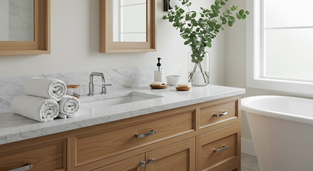
There’s something deeply calming about walking into a bathroom where everything just makes sense visually. A single-color palette doesn’t mean boring – it means intentional. When you strip away competing colors, you’re left with texture, form, and light doing all the talking.
I’ve always found that monochrome spaces feel more expensive than they actually are. Maybe it’s the cohesiveness, or perhaps it’s how your eye travels smoothly around the room without stopping at jarring color transitions. Either way, a well-designed bathroom built around one color family creates an atmosphere that feels both luxurious and peaceful.
The beauty of monochrome design lies in its flexibility. You can go dramatic with bold blacks and crisp whites, or soft with varying shades of grey and cream. The principles remain the same, but the emotional impact shifts entirely based on your choices. Let me walk you through how to nail this look in your own space.
Understanding the Monochrome Approach
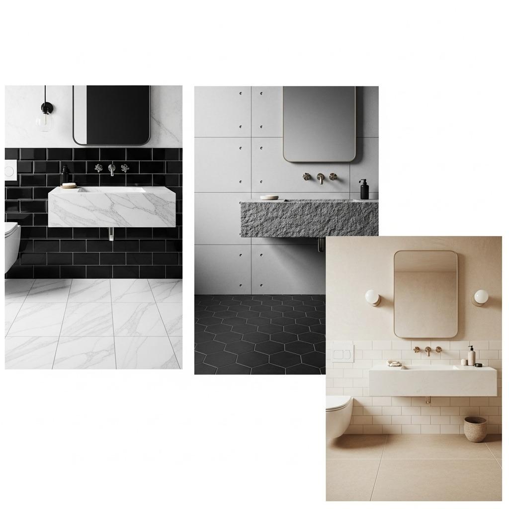
Monochrome doesn’t literally mean one color. It means working within a single color family, using different shades, tints, and tones to create visual interest. Think of it as a conversation where everyone’s speaking the same language but with different accents.
The most popular monochrome bathroom palettes are black and white combinations, all-grey schemes, or variations of beige and cream. Each has its own personality. Black and white feels crisp and architectural. All grey reads modern and sophisticated. Beige and cream schemes bring warmth and serenity.
What makes monochrome design successful is contrast through texture rather than color. A flat grey wall next to glossy grey tile next to matte grey concrete creates depth without introducing new hues. This is where the magic happens, and where most people miss the mark when attempting this style.
1. Start With Your Dominant Shade

Your dominant shade sets the entire mood of the space. This should cover about 60% of your bathroom – typically your walls and largest surfaces. If you want a bright, airy feel, lean toward lighter shades. For drama and intimacy, go darker.
I’ve noticed that medium tones work surprisingly well in smaller bathrooms. They don’t close in the space like very dark colors can, but they also hide imperfections better than stark white. A soft grey or warm greige gives you that sweet spot between practical and beautiful.
Consider your natural light situation carefully here. A north-facing bathroom with limited light might feel cave-like in dark tones, while a sun-drenched space can handle deeper colors without feeling oppressive. Test paint samples at different times of day before committing.
2. Layer Three to Five Shades
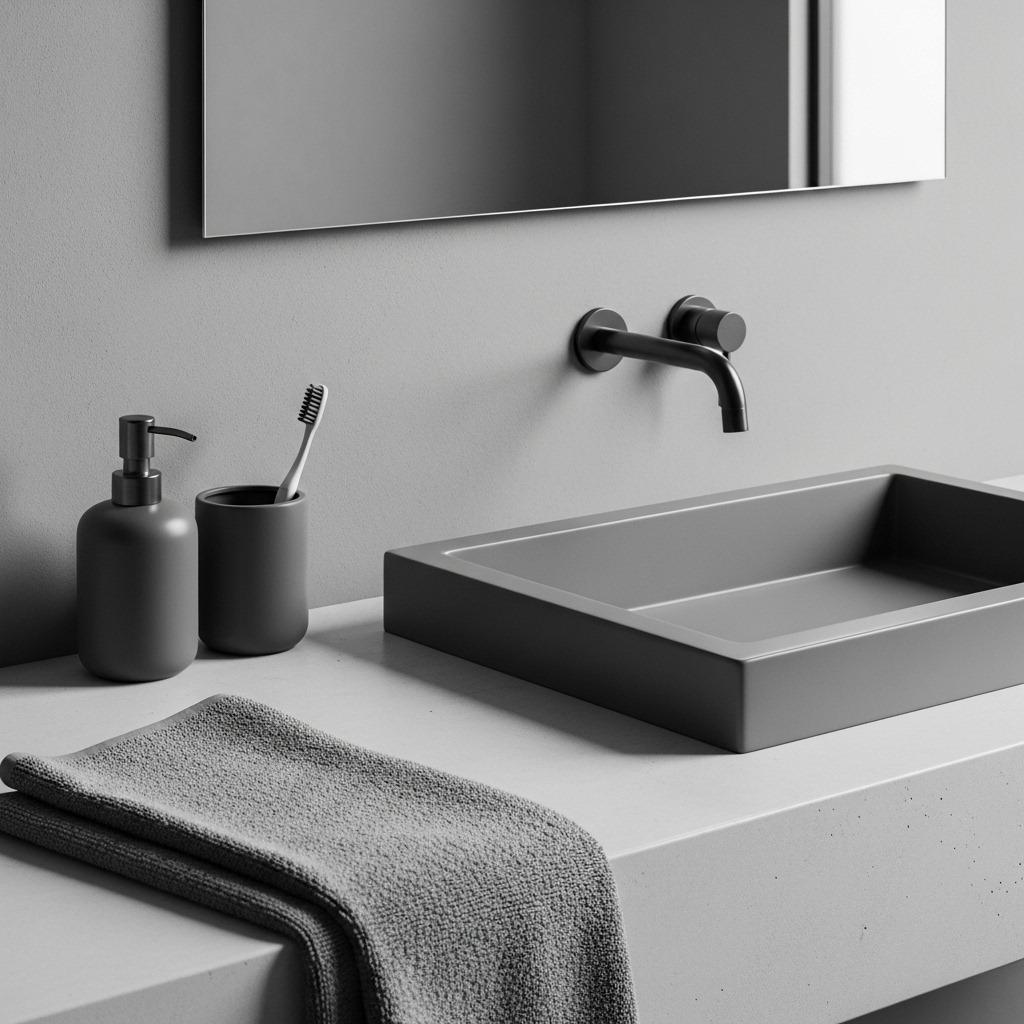
Once you’ve chosen your dominant shade, select two to four additional shades within the same color family. These variations create the visual layers that prevent your bathroom design from feeling flat or one-dimensional.
Think about it like music. A song with only one note would be unbearable, but a song that stays within a key signature while varying the notes creates harmony. Your lightest shade might appear in fixtures or towels, your darkest in hardware or accent tiles.
The spacing between your shades matters too. If all your greys are too similar, they’ll blur together and lose impact. You want enough distinction that each shade is recognizable as its own element while still clearly belonging to the same family.
3. Mix Matte and Glossy Finishes
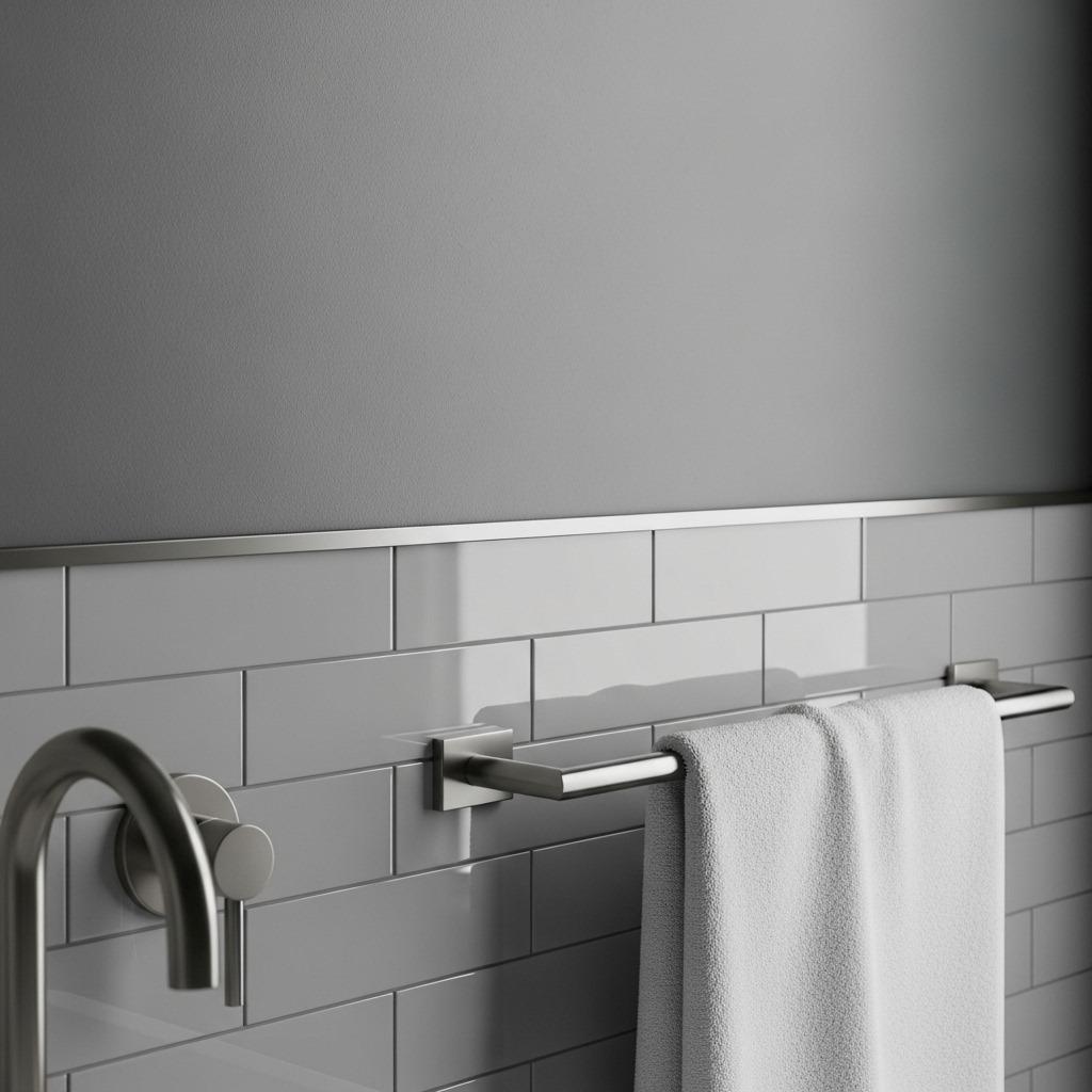
This is hands-down the most important tip for successful monochrome bathrooms. Varying your finishes creates visual texture that compensates for the lack of color variation. A room full of matte surfaces feels dull, while too much gloss can be overwhelming.
Matte finishes absorb light and feel modern and understated. They’re perfect for walls, some tiles, and decorative elements. Glossy finishes reflect light and add energy to a space. They work beautifully on accent tiles, fixtures, and surfaces you want to highlight.
I particularly love the combination of matte walls with glossy subway tiles in a black and white bathroom. The contrast in light reflection creates dimension even when the colors are identical. Satin finishes sit nicely between these two extremes and work well for trim and cabinetry.
4. Incorporate Textured Materials

Texture is your secret weapon in monochrome design. Natural stone, wood, concrete, metal, and fabric all bring their own tactile quality that reads visually even from across the room. These materials add character without disrupting your color scheme.
Consider a textured stone wall as your shower accent, rough concrete for a vanity top, or reclaimed wood shelving stained to match your palette. Each material catches and reflects light differently, creating shadows and highlights that animate the space throughout the day.
Even your tile choice impacts texture. Large format tiles feel sleek and contemporary. Smaller mosaic tiles create pattern and visual movement. Three-dimensional tiles with raised surfaces cast subtle shadows that change as light shifts.
5. Play With Pattern and Scale
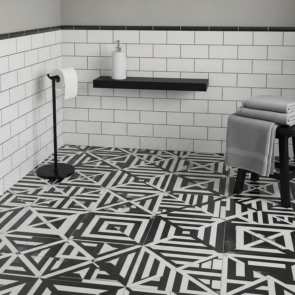
Pattern doesn’t require color. Geometric designs, stripes, checkerboards, and organic shapes all work beautifully in monochrome schemes. The key is varying the scale of your patterns so they don’t compete with each other.
A large-scale geometric floor tile might pair with smaller hexagonal wall tiles and a subtle linear pattern in your window treatment. Each pattern operates at a different visual scale, creating interest without chaos. Think about how patterns interact when you’re standing in different parts of the bathroom.
Avoid using too many busy patterns in a small space. One bold patterned element as a focal point, with simpler supporting patterns elsewhere, usually strikes the right balance. Let your small bathroom renovation breathe between pattern moments.
6. Focus on Statement Fixtures
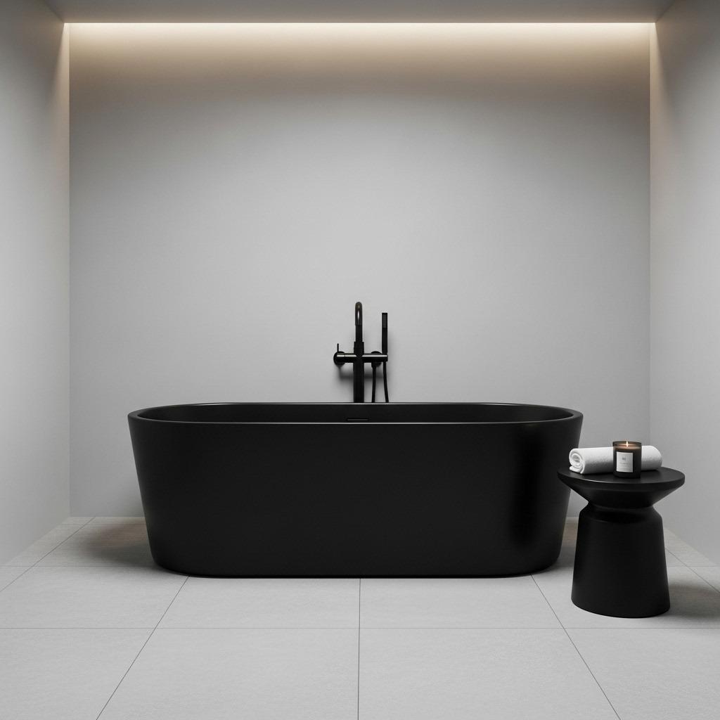
When color isn’t your focal point, fixtures and fittings take center stage. This is where you can justify investing in higher-quality pieces because they’ll command attention in your cohesive space.
A sculptural matte black faucet against a white sink becomes artwork. An oversized rain showerhead in brushed nickel creates a luxury moment. Unique hardware on vanity drawers adds personality. These functional elements become decorative when they’re not competing with bold colors.
Consider mixing metal finishes within your monochrome palette. Matte black, brushed nickel, and polished chrome can coexist beautifully when unified by the surrounding color scheme. Just keep the overall tone cool or warm to maintain harmony.
7. Master the Art of Contrast
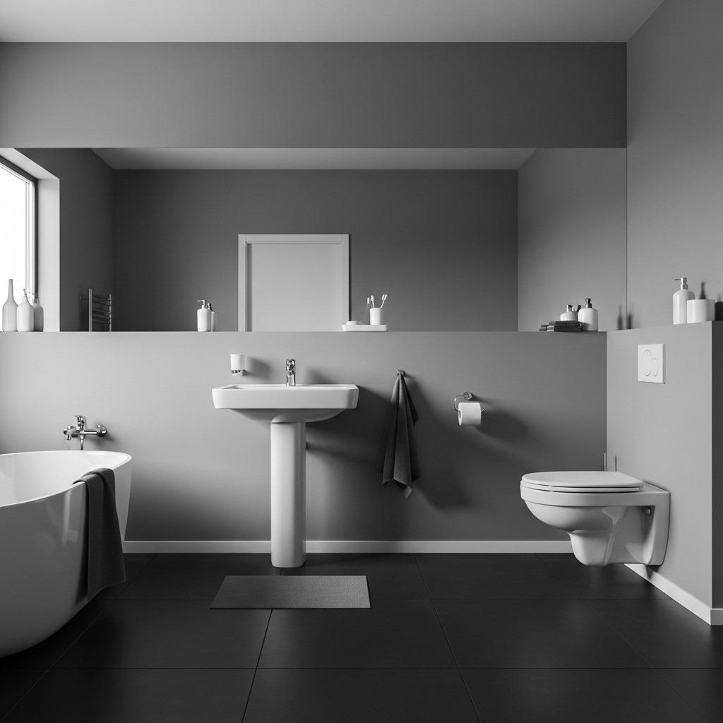
Contrast creates energy and prevents monochrome from feeling washed out. The classic black and white bathroom works because of maximum contrast, but you can achieve impact with subtler variations too.
In an all-grey bathroom, your darkest charcoal elements against your lightest dove grey surfaces create visual punctuation. These high-contrast moments draw the eye and define different zones within the space. Your shower area might be darker, your vanity lighter, establishing clear functional areas.
Don’t distribute contrast evenly throughout the room. Cluster your highest-contrast elements in areas you want to emphasize, like around mirrors or in the shower. Let other areas rest at medium contrast levels. This creates visual hierarchy and guides movement through the space.
8. Bring in Natural Elements
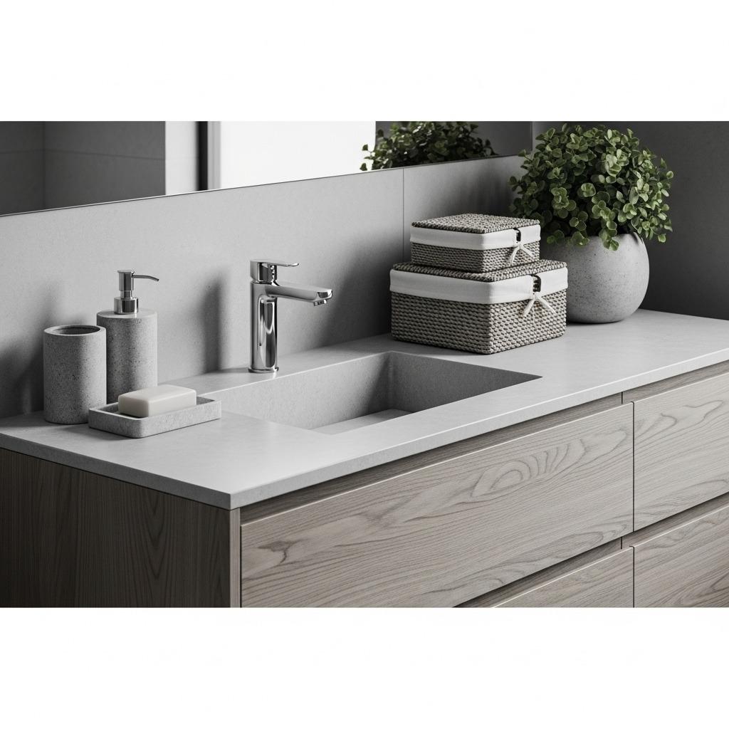
Wood, plants, stone, and natural fibers warm up monochrome schemes and prevent them from feeling sterile. These organic elements add life and softness to what can otherwise read as austere or cold.
A wooden vanity in natural finish or stained to match your palette brings warmth. Woven baskets in grey or cream provide textured storage. Stone vessels or accessories ground the space. Even if these elements are neutral rather than strictly monochromatic, they enhance rather than disrupt your spa-inspired bathroom aesthetic.
Live plants deserve special mention. Their natural green provides just enough color contrast to make your monochrome scheme feel alive without breaking the palette. The organic shapes of leaves soften the hard surfaces typical in bathrooms. If natural light is limited, choose low-light varieties or high-quality faux options.
9. Layer Your Lighting Design
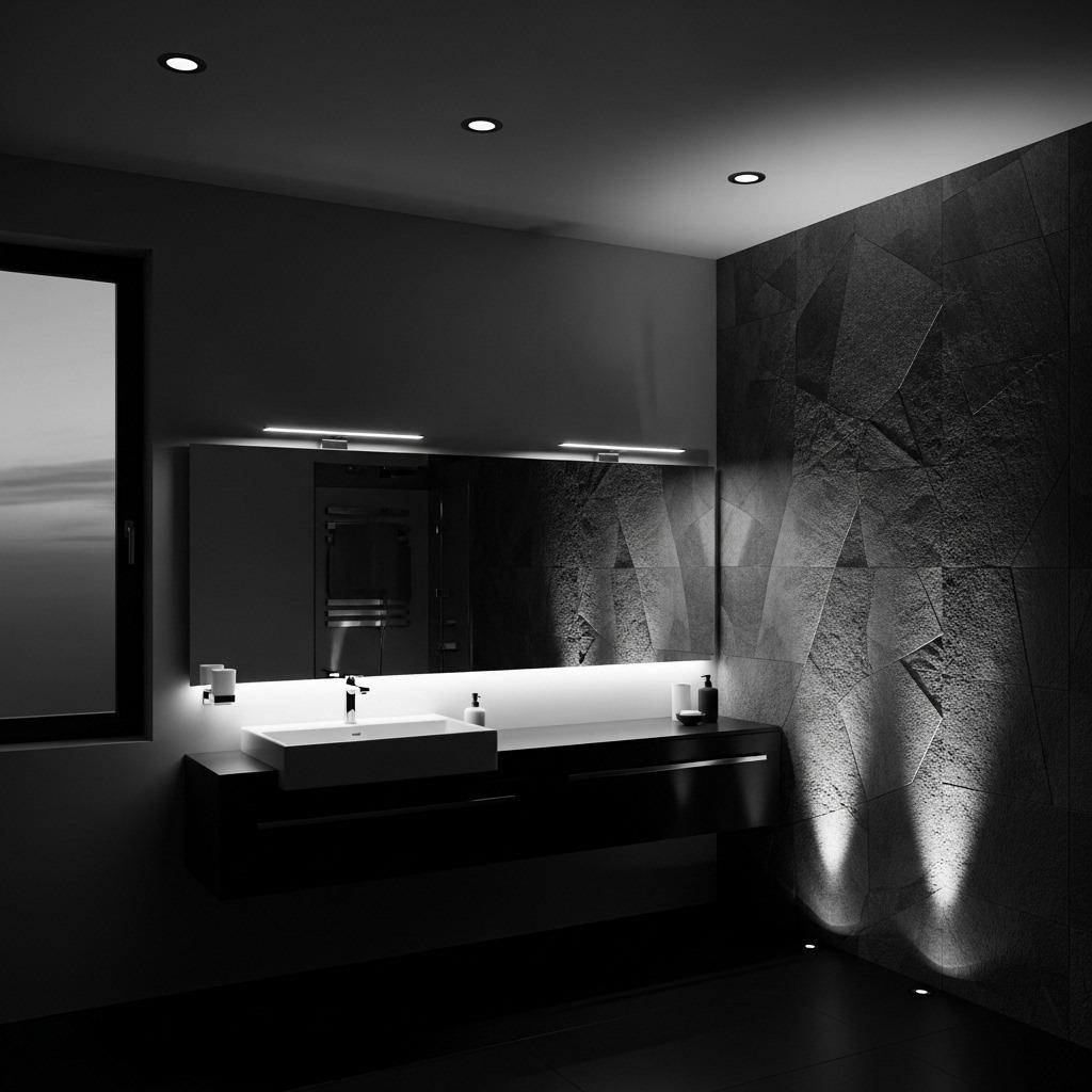
Lighting dramatically affects how monochrome colors appear and how textures read throughout the day. Multiple light sources at different levels create depth and functionality in ways a single overhead fixture never could.
Ambient lighting provides overall illumination. Task lighting around mirrors ensures you can see clearly for grooming. Accent lighting highlights architectural features or textured walls. Decorative lighting adds personality through interesting fixtures that complement your design.
Warm light temperatures (2700-3000K) make greys and beiges feel cozy and inviting. Cool light temperatures (4000-5000K) enhance the crispness of black and white schemes. Dimmers give you control to adjust the mood from energizing morning routines to relaxing evening baths.
10. Choose Your Grout Color Carefully
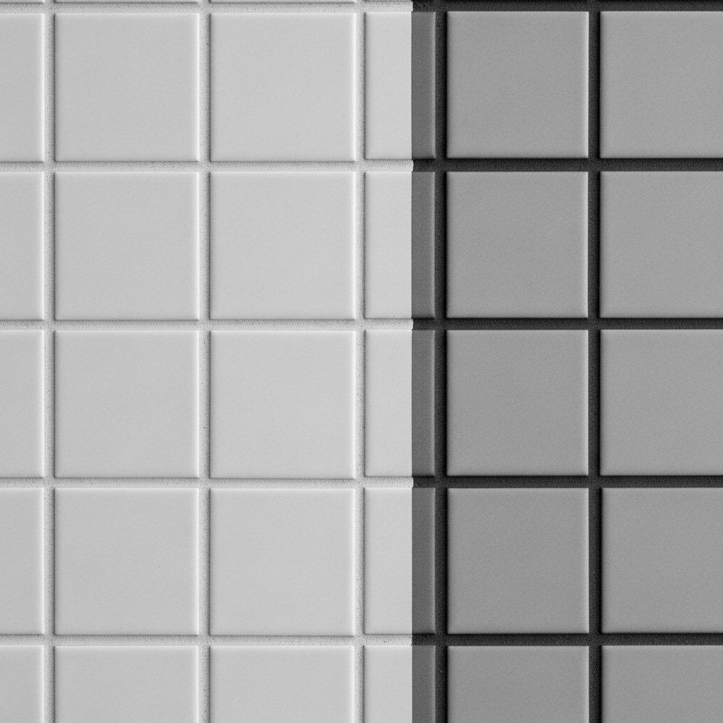
Grout might seem like a minor detail, but it significantly impacts the final look of tiled surfaces. Matching grout creates a seamless, almost grout-free appearance that feels very contemporary. Contrasting grout emphasizes the grid and individual tiles.
In classic black and white bathrooms, white grout with white tile and black grout with black tile keeps things crisp. But don’t overlook grey grout as a bridge option – it can unify mixed tile colors while adding subtle definition.
Consider grout width too. Wider grout lines make your tile pattern more prominent and can handle slight installation imperfections. Narrow grout lines (less than 1/8 inch) create that seamless luxury look but require precise installation. Your choice affects maintenance as well – lighter grout shows staining more readily in high-traffic areas.
11. Design With Negative Space
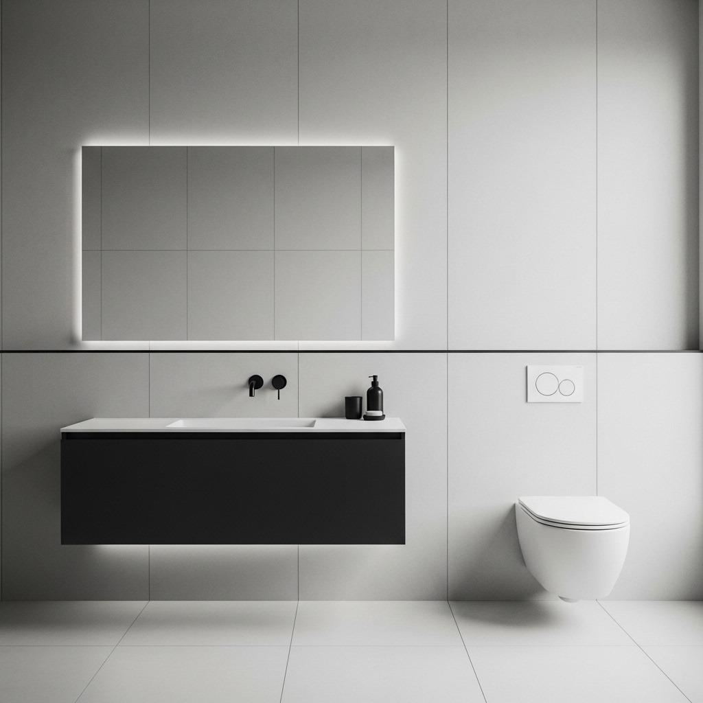
Negative space – the empty, undecorated areas – becomes a powerful design element in monochrome bathrooms. When you’re not using color to define areas, these breathing spaces help compositions feel balanced rather than cluttered.
An expanse of plain wall next to a textured tile feature makes both more impactful. Open floor space between fixtures emphasizes the sculptural quality of a statement tub. Clear countertops punctuated by carefully chosen accessories feel intentional rather than sparse.
This principle extends to storage too. Smart bathroom storage that conceals everyday items maintains visual calm. Display only your most beautiful necessities – those that enhance rather than detract from your monochrome vision.
12. Unify With Consistent Hardware
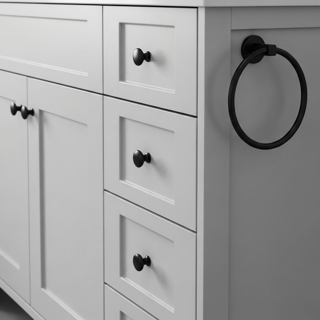
Hardware finishes tie everything together in ways we don’t always consciously notice. Consistent drawer pulls, towel bars, toilet paper holders, and hooks create visual rhythm that reinforces your cohesive design.
Matte black hardware has become incredibly popular in modern monochrome bathrooms, and for good reason. It anchors lighter color schemes and reads as sophisticated rather than trendy. Brushed nickel or chrome works beautifully in cooler-toned grey schemes, catching light and adding subtle shine.
You don’t need to match every single metal element perfectly – slight variations within the same tone family feel collected rather than matchy-matchy. But jumping between warm brass and cool chrome breaks the monochrome harmony you’ve worked to create.
13. Create Depth With Recessed and Protruding Elements
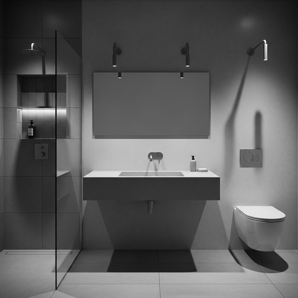
Flat surfaces read flat. Dimensional variety creates visual interest even within a single color. Recessed medicine cabinets, protruding light fixtures, floating vanities, and wall-mounted toilets all add depth through their relationship to the wall plane.
Tile that extends into a niche creates a functional shelf while adding dimensional complexity. A floating vanity casts shadows underneath that change throughout the day. Wall-mounted fixtures free up floor space while creating that sought-after floating effect.
These dimensional choices also affect how light moves through your space. Recessed areas create shadow pockets, while protruding elements catch light. This interplay becomes more noticeable and important when you’re not using color to create focal points.
14. Balance Warm and Cool Undertones
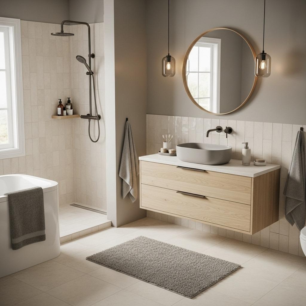
Every neutral has an undertone – either warm (yellow, red, orange based) or cool (blue, green, violet based). Mixing undertones within your monochrome scheme creates muddy, confused results. Staying consistent creates harmony.
If you’re building a grey bathroom, decide whether your greys lean warm (greige, taupe-grey) or cool (blue-grey, charcoal). Test samples next to each other because what appears neutral in isolation often reveals strong undertones in comparison.
This becomes especially important when mixing materials. Your “white” tile might actually be cream (warm), while your “white” fixtures might be true white (cool). These subtle differences become glaring in monochrome spaces where nothing else distracts from them. Many home improvement ideas fail when undertones clash.
15. Add Personality Through Shapes
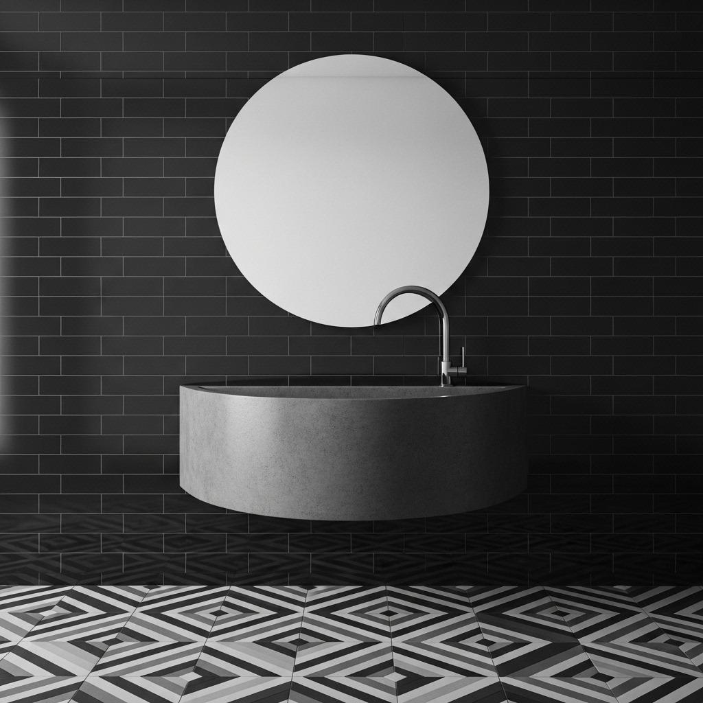
When you remove color as a variable, shapes become much more noticeable. Round mirrors soften angular tile work. Rectangular fixtures provide structure against curved vanities. Geometric patterns introduce visual rhythm.
Mixing shapes prevents monotony. An all-rectangular bathroom can feel rigid, while too many curves might lack definition. The interplay between shapes creates visual conversation that keeps your eye moving around the space.
Consider the shapes within your tile patterns too. Subway tiles suggest traditional style, hexagons feel transitional, and large format rectangles read contemporary. Your tile shape communicates design intent as clearly as your color palette.
16. Maintain Visual Weight Distribution
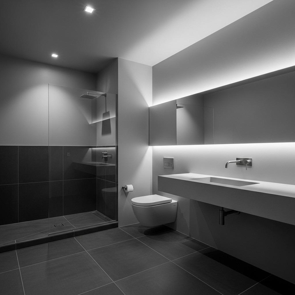
Visual weight refers to how “heavy” elements appear and where they sit in your room composition. Dark colors carry more visual weight than light ones. Solid surfaces feel heavier than transparent or reflective ones.
In a monochrome bathroom, distribute visual weight so the space feels balanced. If your floor is very dark, balance it with some darker elements on upper walls or ceiling. An all-white room with a single black vanity will feel bottom-heavy and off-kilter.
Transparency helps redistribute weight without adding color. A glass shower enclosure or clear acrylic accessories let you see through to the colors beyond, maintaining your palette while keeping things light. This technique works particularly well in small space renovations where every inch matters.
17. Perfect Your Accessory Curation
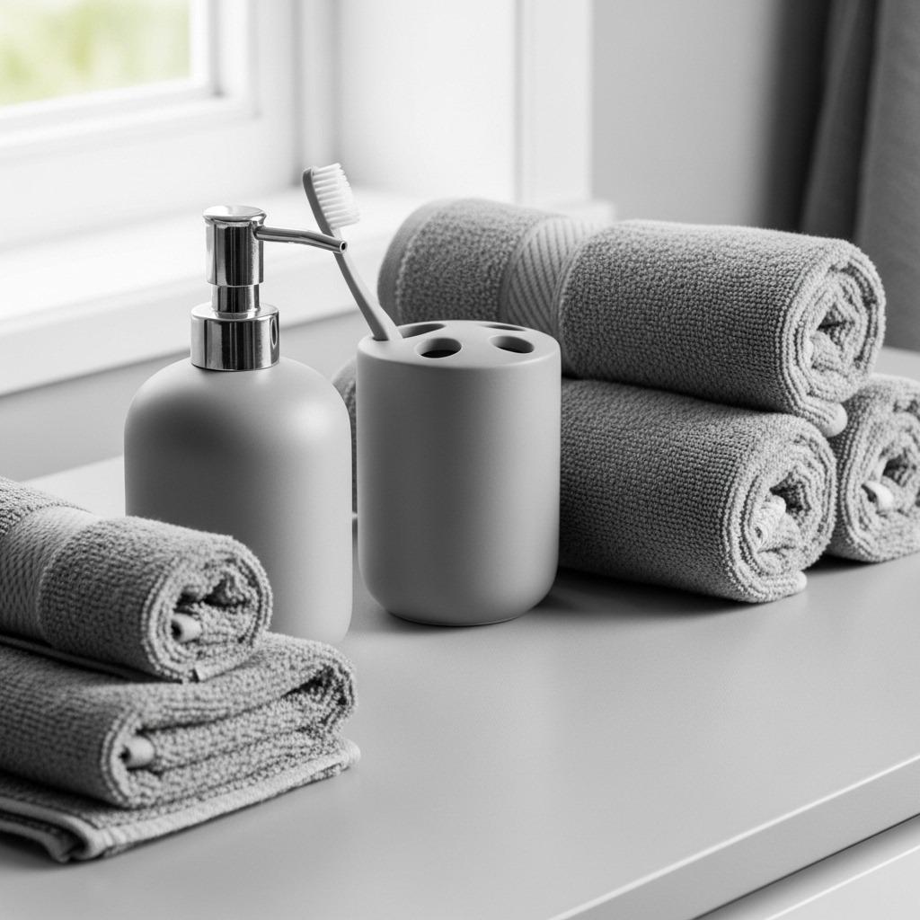
Accessories are the final layer that either completes your monochrome vision or undermines it. Every visible item should earn its place through beauty, function, or both. This isn’t about deprivation – it’s about intention.
Choose towels, bath mats, soap dispensers, and storage containers that align with your palette. White towels in a grey bathroom, black accessories in a black and white scheme, tonal variations in an all-grey space. Quality matters here because there’s nowhere for mediocre items to hide.
Resist the urge to introduce that “pop of color” everyone always suggests. A carefully executed monochrome bathroom makes a stronger statement than one diluted with accent colors. If you crave variety, rotate accessories seasonally within your color family – winter whites transitioning to summer creams, for example.
Bringing It All Together
A successful monochrome bathroom feels cohesive without being boring, sophisticated without being cold, and simple without being sparse. It’s about making deliberate choices at every turn, understanding that when color steps back, everything else steps forward.
The real beauty of this approach is its timelessness. Color trends come and go, but well-executed monochrome design remains relevant. You’re investing in a classic bath design that won’t feel dated in five years, which matters when bathroom renovations are so significant.
Start with your dominant shade and build from there. Layer your tones thoughtfully. Mix your textures generously. Balance your contrasts strategically. And remember that rules are guides, not laws – your personal style should always shine through, even within a single-color palette.
Your monochrome bathroom can be dramatic or serene, modern or traditional, bold or understated. The framework is the same, but the story you tell within it is entirely yours.

