
There’s something quietly powerful about walking into a bedroom that whispers rather than shouts. A space where every shade belongs to the same color family, creating this seamless, almost meditative flow. That’s the magic of monochromatic bedroom ideas – they’re not about boring sameness, but about depth, texture, and a kind of visual calm that feels increasingly rare.
I used to think single-color palettes would feel flat or sterile. Turns out, I was completely wrong. When you strip away competing colors, you suddenly notice everything else – the way light plays across different fabrics, how shadows add dimension, the subtle beauty of varied textures working together. It’s like your bedroom finally learned to breathe.
Whether you’re drawn to the drama of an all-black sanctuary or the serenity of layered whites, these ideas will help you create a space that feels both sophisticated and deeply restful. No design degree required.
Why Monochromatic Bedrooms Work So Well
The beauty of working within a single-color palette isn’t just about aesthetics – though that’s definitely part of it. These spaces have this uncanny ability to make even small rooms feel more spacious and intentional. When your eye isn’t jumping between contrasting colors, the room reads as one cohesive, calming environment.
There’s also something forgiving about this approach. You know how sometimes you buy a throw pillow that looked perfect in the store but clashes horribly at home? That basically doesn’t happen with monochromatic schemes. As long as you’re staying within your chosen color family, new additions tend to blend in naturally rather than stick out awkwardly.
Plus, if you’re someone who struggles with color coordination (no judgment – it’s genuinely tricky), this simplifies things considerably. Instead of worrying about complementary colors or whether navy and black can coexist, you’re just thinking about lighter and darker versions of the same hue. Much less stressful.
Starting With Your Base Color Choice
Choosing your hero color is probably the most important decision you’ll make. I’d suggest thinking beyond just “what’s my favorite color” and considering how different shades make you actually feel in a bedroom setting. Cool grays might feel modern and sophisticated, but do they make you feel cozy when you’re trying to fall asleep?
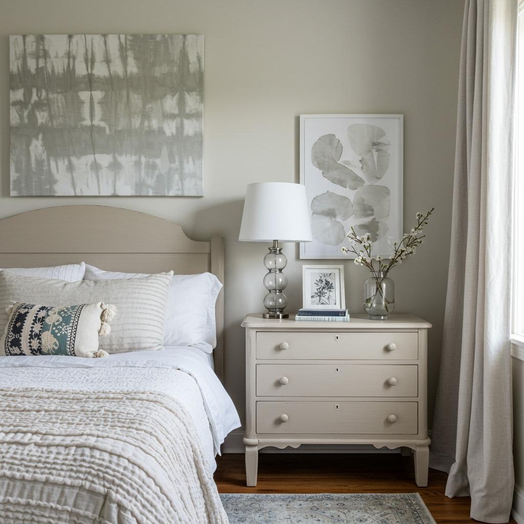
Whites and creams remain popular for good reason – they’re versatile, timeless, and work beautifully in rooms with limited natural light. But don’t overlook warmer options like terracotta, sage green, or even dusty rose. These can create surprisingly sophisticated monochromatic bedroom ideas that feel less predictable than the usual suspects.
If you’re renting or hesitant to commit, start with neutrals. Beiges, taupes, and soft grays give you that sleek, cohesive look while leaving room to shift directions later. You can always add deeper or brighter accent shades through easily changeable items like bedding and artwork. For more inspiration on working with neutral palettes, check out these minimalist bedroom design principles that translate beautifully to sleeping spaces.
Layering Different Shades and Tones
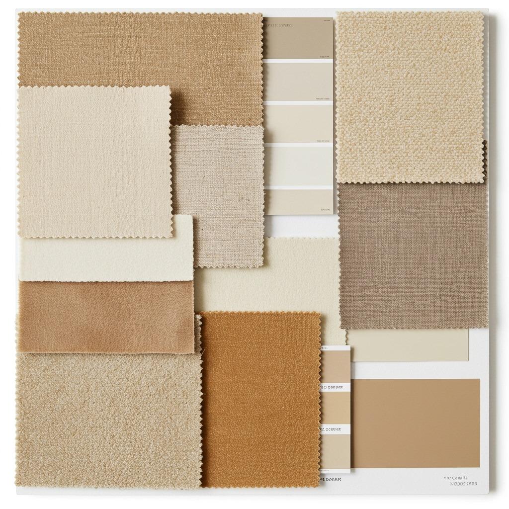
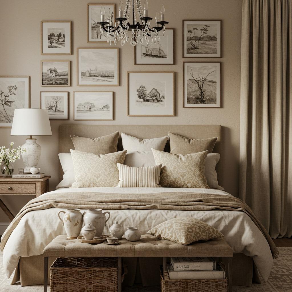
This is where monochromatic design goes from “meh” to “wow.” You want at least 5-7 different tones within your chosen color family. Think of it like a gradient – your walls might be mid-tone, your bedding lighter, your throw blanket deeper, your curtains somewhere in between. Each layer adds visual interest without disrupting the overall harmony.
I’ve found it helpful to physically arrange fabric samples or paint chips in a line from lightest to darkest before committing. You start seeing gaps where you might need an additional shade, or spots where two tones are too similar to create enough contrast. This little exercise has saved me from several expensive mistakes.
The 60-30-10 rule can be loosely adapted here too. Use your medium tone for about 60% of the room (walls, large furniture), lighter or darker shades for 30% (bedding, curtains), and your most dramatic shade for 10% (accent pieces, artwork). It creates balance without feeling formulaic.
Texture Is Your Secret Weapon

Without color variation to add interest, texture becomes absolutely essential. This is non-negotiable in monochromatic bedroom ideas. A room with all smooth, flat surfaces in the same color will feel like a boring hotel room, not a sophisticated sanctuary. You need that tactile variation to create depth.
Mix materials deliberately – pair a chunky knit throw with smooth linen sheets, or combine a velvet headboard with a jute rug. The way different textures catch and reflect light creates natural shadows and highlights that add dimension throughout the day. It’s like built-in visual interest that requires zero effort once it’s in place.
Don’t forget about wall texture either. Grasscloth wallpaper, shiplap, or even just a matte paint beside a glossy trim can add subtle variation. I’ve seen rooms where someone installed wood paneling painted the same color as the walls – sounds crazy, but the texture difference made it look intentional and expensive. Similar texture-heavy approaches work beautifully in modern minimalist living room designs if you’re considering this aesthetic for other spaces.
Playing With Patterns in a Single Color
Patterns can absolutely work in a single-color palette – they just need to be used thoughtfully. Geometric designs, stripes, or organic shapes in varying tones of your chosen color add visual movement without introducing new hues. Think of a charcoal gray duvet with a subtle darker gray chevron pattern, or cream curtains with a tone-on-tone damask design.
The key is varying the scale of your patterns. If you’ve got small-scale geometric throw pillows, balance them with a larger-scale pattern on your headboard or area rug. Too many patterns at the same scale can feel busy, even when they’re all the same color family.
Honestly, this is where monochromatic bedrooms have an advantage over multi-colored spaces. You can be more adventurous with pattern mixing because the unified color palette keeps everything feeling cohesive. It’s harder to clash when you’re working within such a defined color story.
Monochromatic White Bedroom Elegance
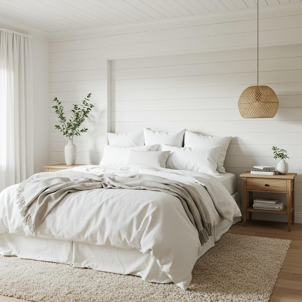
All-white bedrooms get a bad rap for being too clinical or hotel-like, but that usually happens when people skip the layering step. A truly beautiful white monochromatic space includes ivories, creams, off-whites, and bright whites all working together. The variation keeps things from looking flat or sterile.
Natural materials are especially important in white schemes. Raw wood furniture, rattan accents, linen textiles – these add warmth that prevents the space from feeling cold. I’d also suggest incorporating plenty of soft, organic shapes rather than hard geometric lines. Rounded mirrors, curved headboards, and flowing curtains soften the overall look.
Lighting makes or breaks white bedrooms. Warm-toned bulbs (around 2700K) create a cozy, inviting glow rather than that harsh fluorescent feel. Consider dimmer switches too – being able to adjust the light intensity helps the room transition from energizing morning space to relaxing evening retreat. If you’re working on updating other rooms, these affordable home upgrades include lighting improvements that make a huge difference.
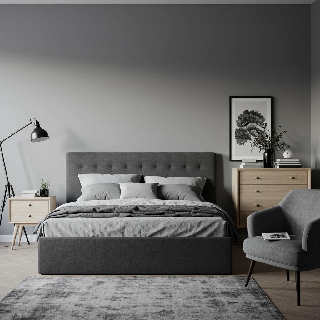
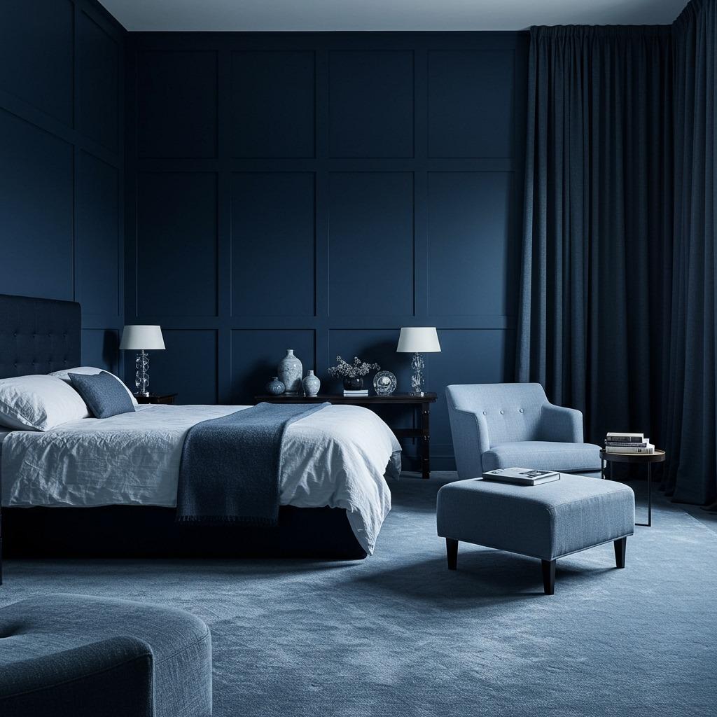
The Drama of All-Black Moody Spaces
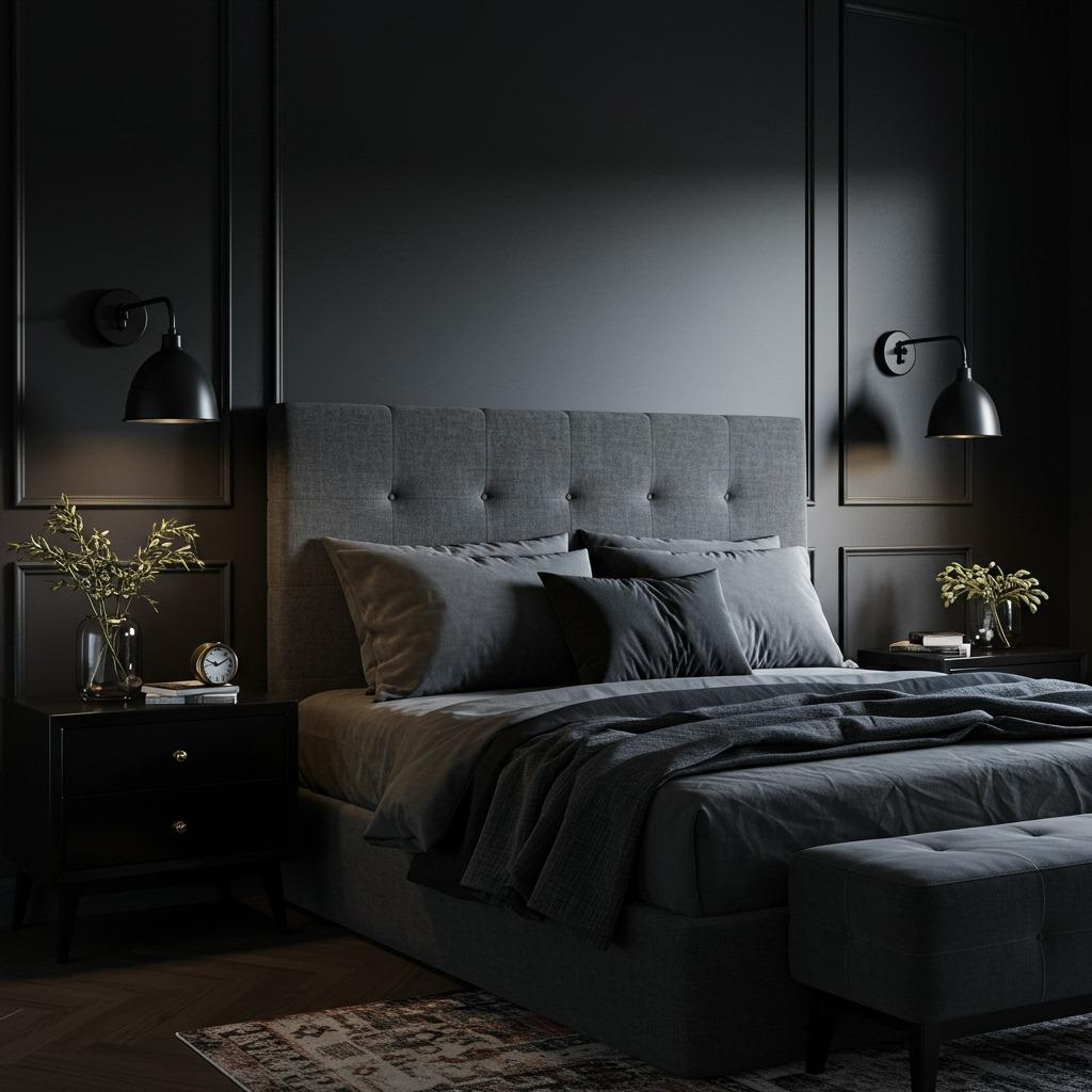
Black monochromatic bedroom ideas aren’t for everyone, but if you’re drawn to drama and intimacy, they’re unbelievably striking. The trick is incorporating enough lighter blacks and charcoals to prevent the room from feeling like a cave. You want moody and cocooning, not depressing and claustrophobic.
Reflective surfaces become especially important here. Mirrors, lacquered furniture, satin-finish fabrics – anything that bounces light around helps balance the darkness. I’ve also noticed that black rooms really benefit from quality lighting layers. You need ambient, task, and accent lighting working together to create depth and prevent flat darkness.
Interestingly, black schemes can actually make small bedrooms feel more intimate rather than smaller. It’s like the walls recede into shadow, creating this cozy, womb-like feeling. Just make sure you’ve got adequate natural light sources or really excellent artificial lighting to keep the space functional during the day.
Warm Monochromatic Palettes (Terracotta, Camel, Rust)
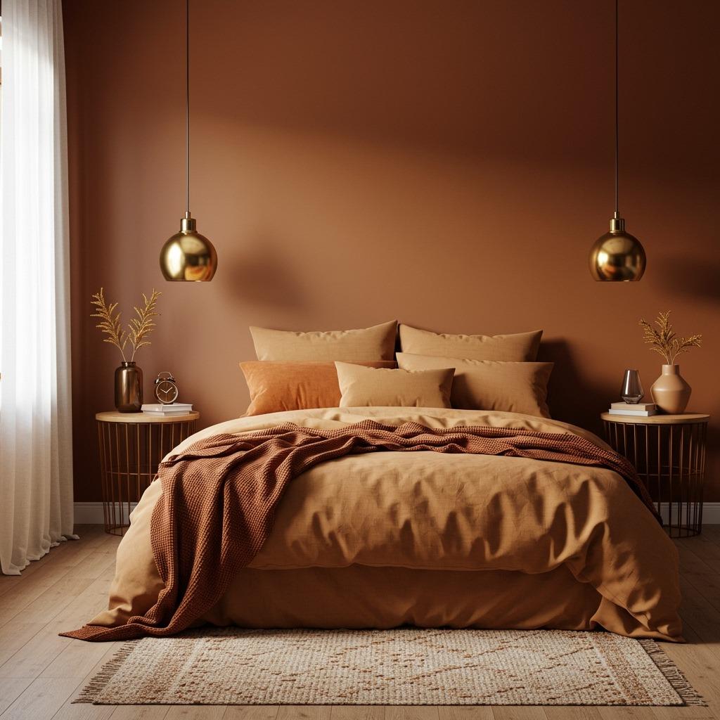
Warm monochromatic bedroom ideas feel criminally underused. There’s something so enveloping about spaces built around terracotta, rust, camel, or warm browns. These tones create an instant sense of coziness that cooler palettes sometimes struggle to achieve, making them perfect for bedrooms where comfort is paramount.
The earth-tone family is also incredibly forgiving when it comes to mixing metals and woods. Gold, brass, copper, and warm woods all play beautifully within these schemes without feeling mismatched. You get a lot more flexibility than you might with cooler gray or blue palettes where metal choices feel more restrictive.
These warmer schemes work particularly well in rooms with good natural light – the sunlight enhances the richness of the tones throughout the day. If your bedroom faces north or gets limited light, you might want to stick to the lighter end of your warm palette (camel, sand, light terracotta) rather than the deeper rusts and chocolates.
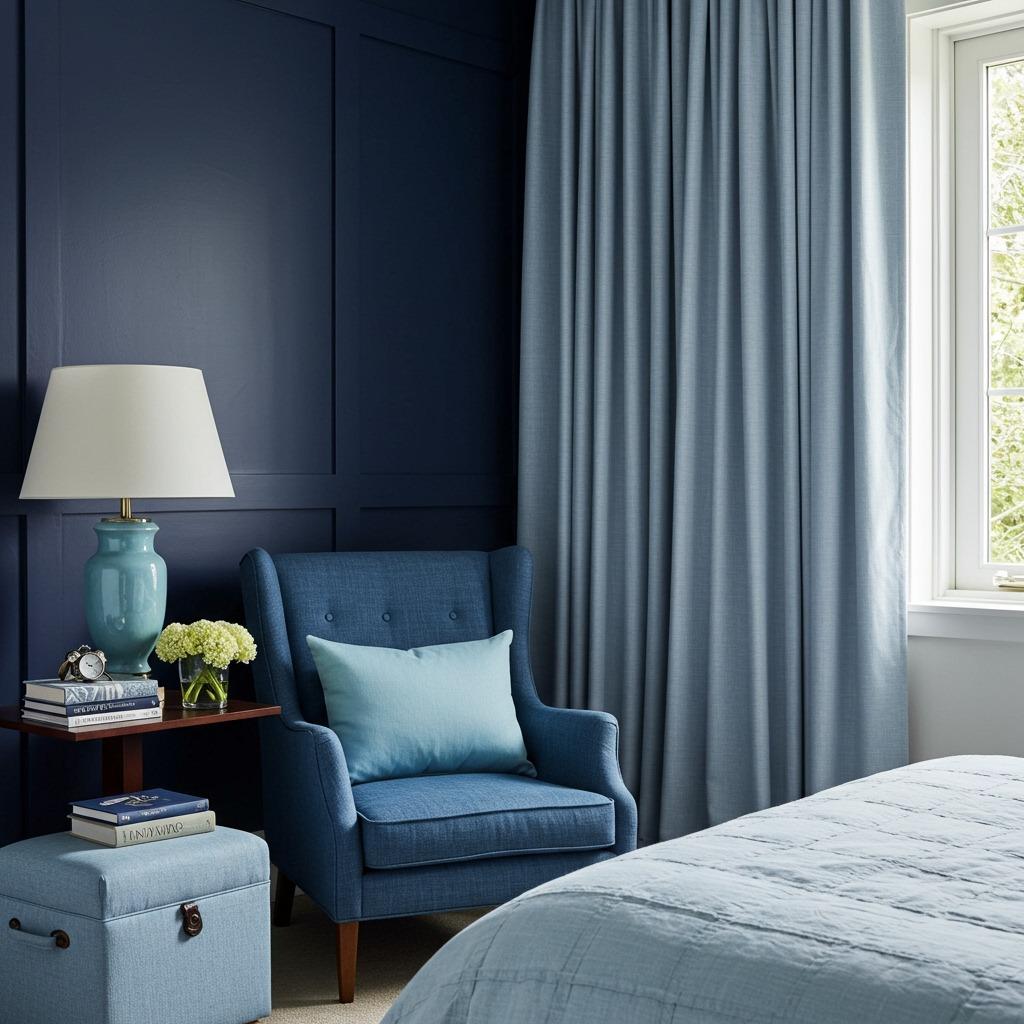
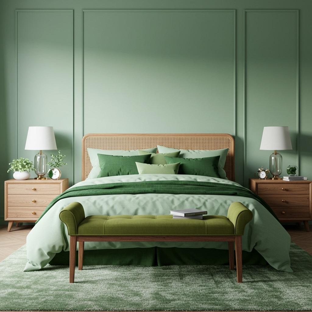
Cool Monochromatic Options (Gray, Blue, Green)
Cool-toned monochromatic bedrooms tend to feel more contemporary and spa-like. Gray remains the most popular choice – it’s essentially the little black dress of interior design, working in virtually any style from industrial to traditional. The range of available gray tones (warm grays, cool grays, blue-grays, greige) means you’ve got tons of options even within this single color.
Blue monochromatic schemes create genuinely calming environments. Science backs this up – blue tones can actually lower blood pressure and slow heart rate. From pale sky blue to deep navy, you’re working with a color that’s hardwired to help us relax. Layer in some white or cream accents if all-blue feels too intense.
Green is having a major moment right now, and sage-based monochromatic bedroom ideas feel both on-trend and timeless. The color bridges the gap between cool and warm, working beautifully with both gold and silver metals, both dark woods and light. It’s also way more forgiving than you’d expect – slightly mismatched greens still read as intentional within a monochromatic scheme. These cooling palettes share similarities with the tranquil approach seen in spa-inspired bathroom designs.
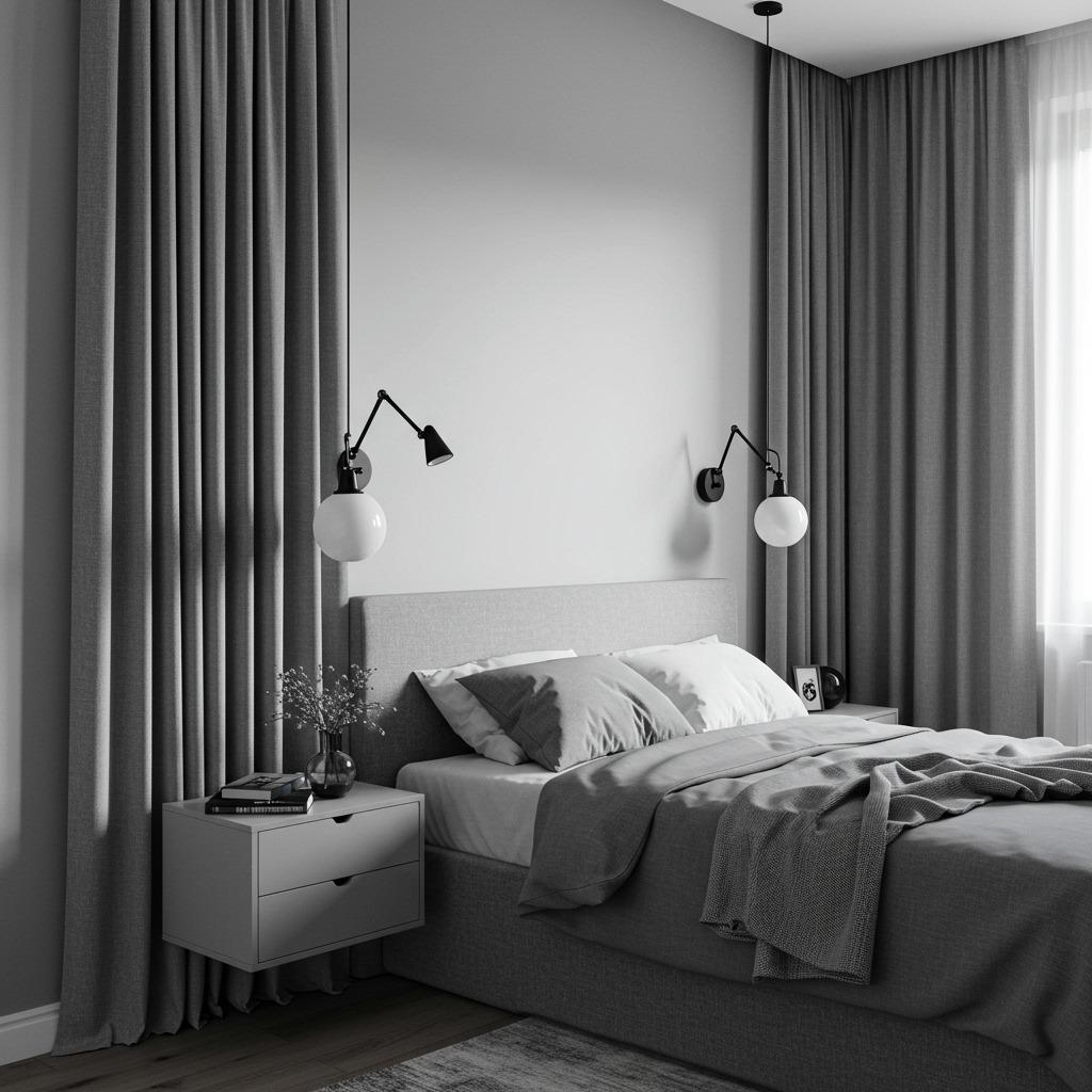
Creating Depth With Lighting Choices
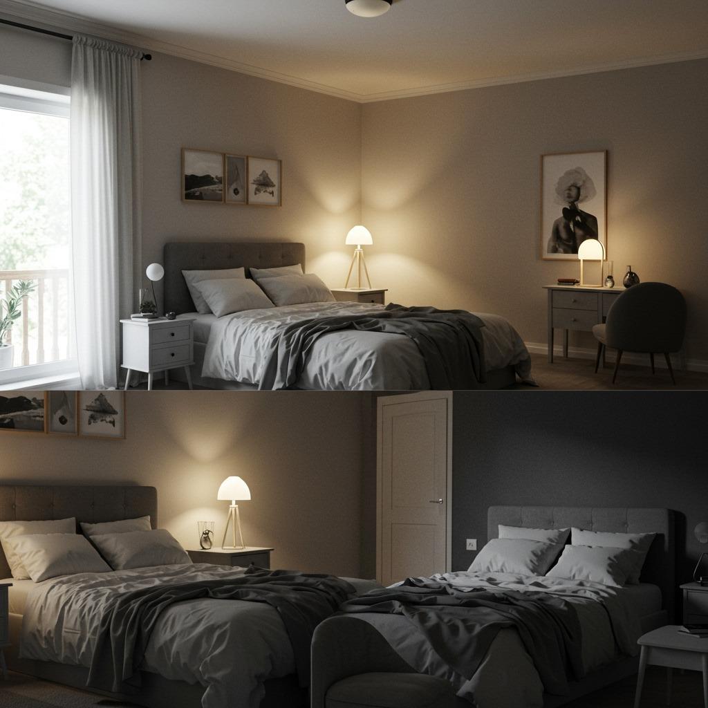
Lighting deserves its own section because it’s that important in monochromatic spaces. Without color contrast, the way light and shadow play across surfaces becomes your primary source of visual interest. You want multiple light sources at different heights creating a layered, dimensional effect rather than one harsh overhead fixture flattening everything.
Consider the color temperature of your bulbs carefully. Warm white (2700-3000K) bulbs enhance warm color schemes and create cozy ambiance, while cool white (3500-4100K) can work well in gray or blue monochromatic bedrooms. Whatever you choose, keep all bulbs in the room at the same temperature – mixing warm and cool lights looks accidental rather than intentional.
Dimmer switches might be the single best investment for monochromatic bedroom ideas. Being able to adjust light intensity throughout the day helps you see all those carefully chosen shades and textures properly. Bright light shows off the details, while dimmed lighting creates that soft, restful atmosphere you want in the evening.
Monochromatic Doesn’t Mean Minimalist
Here’s a common misconception – people assume monochromatic bedroom ideas require a minimalist approach. Not true. You can absolutely have a maximalist bedroom in a single color palette. The difference is in quantity and detail, not color variety. Think layers of patterned textiles, collections of artwork in varying tones, abundant textures, and plenty of decorative objects.
The key is maintaining that tonal cohesion while adding abundance. A gray maximalist bedroom might include dozens of gray items – various gray pillows, gray artwork in different frames, gray books, gray ceramics, gray vintage finds. The repetition of the color family actually helps all these elements feel collected and intentional rather than chaotic.
This approach works particularly well if you love the calm of monochromatic design but find minimalism too stark or impersonal. You get that visual unity and sophisticated single-color palette while still expressing your personality through abundant styling. It’s like having your cake and eating it too, design-wise.
Adding Subtle Contrast With Black and White
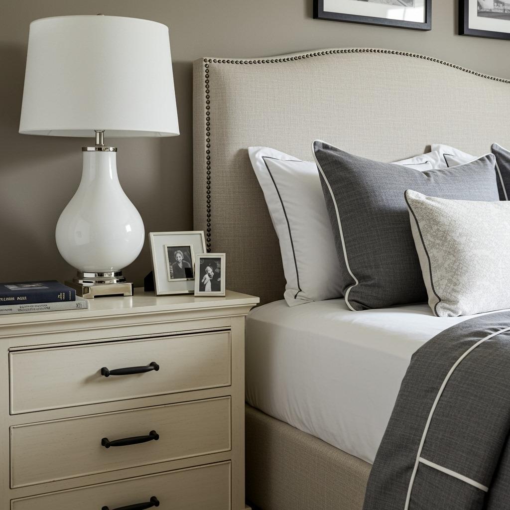
Even in monochromatic bedroom ideas, small touches of black or white can help define spaces and add crispness. I’m not talking about introducing a whole new color scheme – just strategic little moments that make your main color pop. Think black picture frames on a gray wall, or white piping on beige bedding.
These accent touches work especially well at transitions and edges – where walls meet trim, around windows, in light fixtures, or on furniture hardware. They create definition without disrupting your overall color story.
Just keep it minimal. Maybe 5% of your overall design at most. Too much and you’ve crossed over from “monochromatic with definition” into “two-tone design,” which is a different thing entirely. The goal is supporting your main color, not competing with it.
Furniture Selection for Cohesive Flow
Furniture in monochromatic bedrooms should either blend into your color scheme or provide intentional texture contrast. A cream bedroom might include an upholstered cream headboard that melts into the walls, or a natural wood bed frame that adds textural interest while maintaining the warm neutral palette. Both approaches work – it depends on your specific vision.
I’ve found that fewer, larger furniture pieces work better than lots of small items. A substantial bed, one or two nightstands, maybe a dresser and a reading chair – that’s often enough. In monochromatic schemes, furniture becomes sculptural, and you want to appreciate the shapes and silhouettes rather than cluttering the space.
Wood furniture can absolutely work in monochromatic bedroom ideas as long as you’re thoughtful about the tone. Warm woods (walnut, oak, cherry) enhance warm color palettes, while lighter woods (maple, ash, whitewashed finishes) suit cooler schemes. Painted furniture in your chosen color family is always a safe bet if you’re uncertain about wood tones. The furniture selection approach here mirrors principles used in bedroom ideas for creating cohesive, well-designed sleeping spaces.
Artwork and Decor in a Single Palette
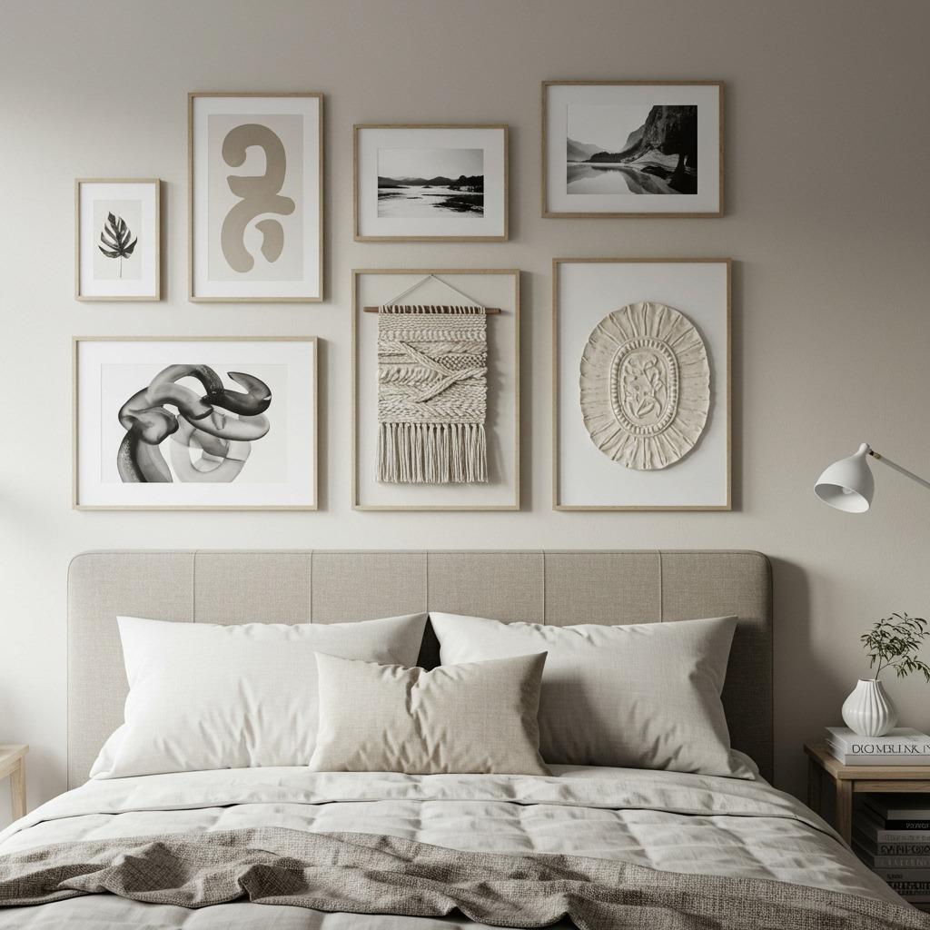
Artwork in monochromatic bedrooms needs to work a bit harder since it can’t rely on color contrast for impact. Look for pieces with interesting compositions, strong lines, or compelling subjects. Black and white photography looks stunning in any monochromatic scheme. Abstract pieces in varying tones of your chosen color create visual interest while maintaining cohesion.
You can also get creative with the frames and matting. In a blue bedroom, different shades of blue frames around similar-toned artwork creates this collected, intentional look. Or go with consistent natural wood frames if your palette leans warm. The repetition of frame style helps unite disparate artwork into a cohesive gallery wall.
Three-dimensional wall art – like ceramic wall sculptures, macrame, or relief artwork – adds that crucial textural element while staying within your color story. I’ve seen gorgeous monochromatic bedrooms where sculptural wall elements provide all the visual interest, with no traditional framed artwork at all. Sometimes the texture is enough.
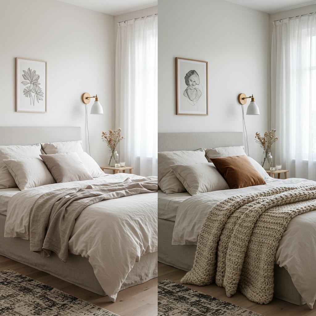
Bedding Layers That Add Dimension
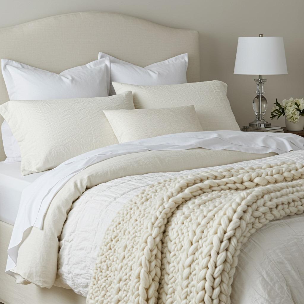
Your bed is typically the focal point of any bedroom, so the bedding layers need to showcase your monochromatic approach beautifully. Start with a fitted sheet and duvet or top sheet in your base tone, then build up with shams, decorative pillows, and throws in lighter and darker variations. The layering creates that lived-in, luxurious look that flat, single-tone bedding can’t achieve.
Different textures in bedding make a huge impact. Smooth sateen sheets, a linen duvet cover, velvet or chenille throw pillows, and a chunky knit or faux fur throw – each material catches light differently and adds visual weight to specific layers. This is honestly where you can have the most fun with monochromatic bedroom ideas.
Don’t feel obligated to match everything perfectly. Slight variations in tone between pieces actually look more sophisticated than exact matches, which can read as a “bed in a bag” situation. Your dusty blue sheets don’t need to exactly match your navy throw – the variation is what creates depth and interest within your cohesive palette.
Window Treatments That Enhance the Scheme
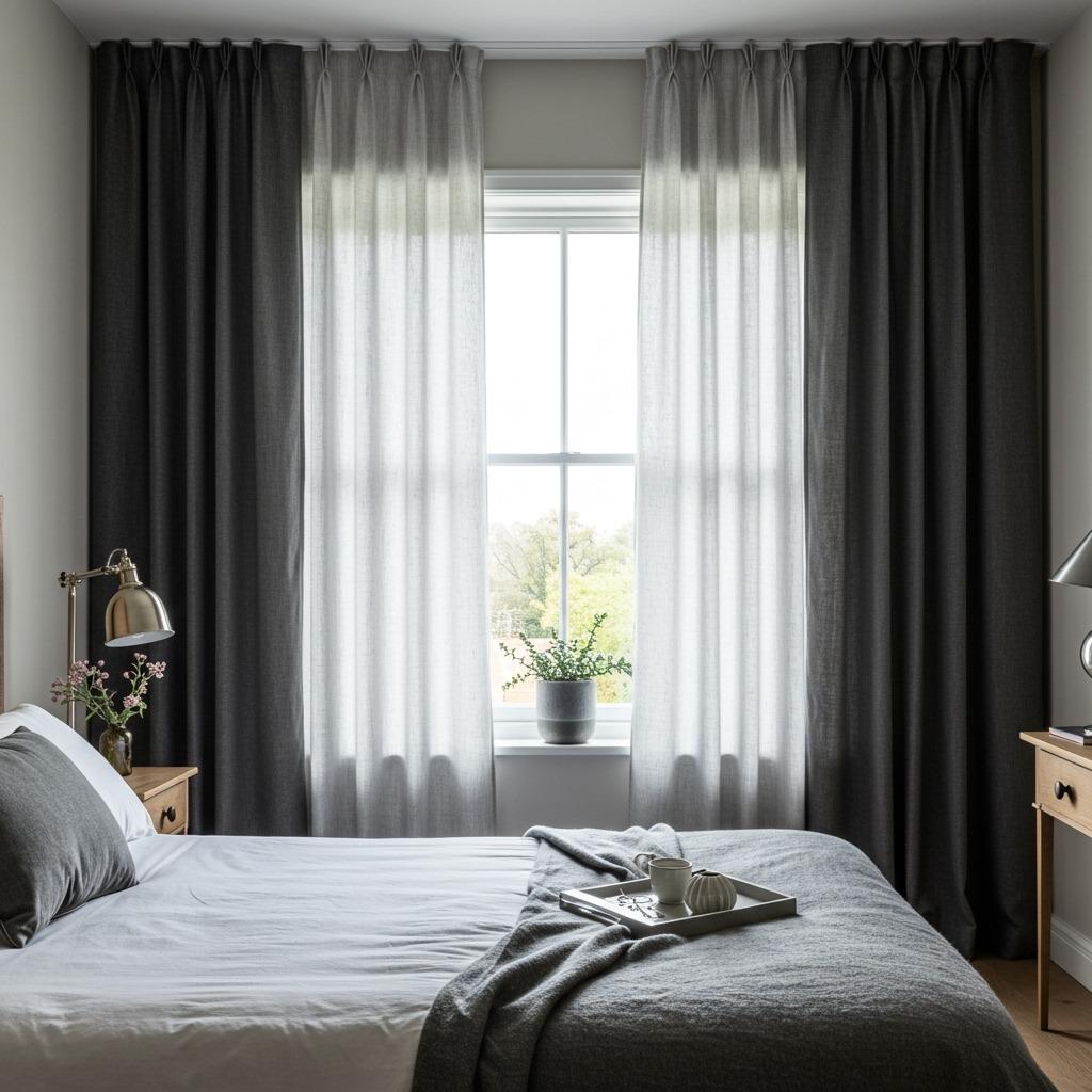
Curtains and blinds occupy a lot of visual real estate, so they’re important players in your monochromatic color story. Floor-to-ceiling curtains in a slightly different shade than your walls add height and drama while maintaining cohesion. I usually suggest going either lighter or darker than the walls, never the exact same shade – that can look like you ran out of paint and used leftover wall color.
Layering window treatments adds both function and visual interest. Sheer curtains in a lighter tone paired with heavier drapes in a deeper shade of your color gives you light control options while creating dimensional layers. Roman shades in a textured fabric behind flowing curtains achieves the same effect with a slightly different aesthetic.
The hardware matters too. In warm monochromatic bedrooms, brass or warm metal curtain rods enhance the palette. Cool-toned rooms often benefit from matte black or brushed nickel hardware. Or go with wooden rods in a tone that complements your color scheme – the hardware becomes another subtle layer in your overall design.
Flooring Considerations
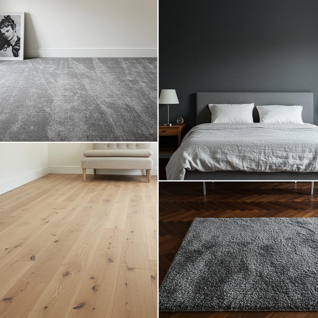
Flooring might not be the first thing you think about with monochromatic bedroom ideas, but it’s part of your palette whether you realize it or not. If you’ve got existing flooring that doesn’t quite fit your chosen color scheme, area rugs become essential for bridging that gap and reinforcing your monochromatic vision.
Light hardwood floors work beautifully with warm monochromatic palettes – think creams, beiges, warm grays. They add natural texture without fighting your color story. Darker wood floors can ground cooler palettes nicely, though you might need a lighter area rug to avoid the room feeling too heavy. Carpet in a neutral tone basically gives you a blank slate to work with any monochromatic direction.
If you’re fortunate enough to be choosing new flooring, consider how it will either blend with or contrast against your walls. Same-tone flooring and walls can make rooms feel larger by eliminating visual breaks, while contrasting floor and wall tones within the same color family creates definition and prevents the space from feeling too uniform.
Small Bedroom Monochromatic Strategies
Small bedrooms actually benefit tremendously from monochromatic approaches. The continuous color flow makes walls seem to recede, creating a sense of spaciousness that contrasting colors would interrupt. Lighter tones obviously make small spaces feel more open, but even deeper colors can work if you commit fully and use good lighting.
In tight spaces, I’d suggest limiting your tonal range slightly – maybe 4-5 shades instead of 7-8. Too much variation in a small room can start feeling busy despite the unified color palette. Stick with your base tone, one lighter shade, one darker shade, and maybe one or two mid-tones. That’s plenty to create interest without overwhelming the space.
Vertical elements help too. Floor-to-ceiling curtains, tall headboards, or vertical striped accent walls (in subtly different tones of your color) draw the eye upward, making ceilings feel higher. These tricks combined with your monochromatic palette create a small bedroom that feels intentional and serene rather than cramped. Similar space-maximizing principles apply in small space bedroom hacks if you’re working with limited square footage.
Large Bedroom Zoning With Tone
Big bedrooms can sometimes feel too vast or undefined, and monochromatic bedroom ideas can actually help create zones and purpose within the space. Use your darkest tones to define specific areas – maybe a deep charcoal accent wall behind the bed creates a sleeping zone, while lighter grays in a sitting area establish a distinct relaxation space.
Area rugs become zoning tools in large monochromatic rooms. A plush rug in a deeper tone under and around the bed defines that area, while a flatweave rug in a lighter shade under a reading chair creates visual separation. Same color family, different zones, all feeling cohesive rather than chopped up.
You can also use furniture arrangement and tone together. Cluster your darkest furniture pieces (like a navy upholstered bed and matching bench) in one zone, then use lighter pieces (pale blue dresser and chair) to define another area. The tonal variation creates natural zones without needing walls or distinct color changes.
Seasonal Adjustments to Your Palette
One beautiful thing about monochromatic bedroom ideas is how easily they adapt seasonally with minimal changes. In summer, swap heavier textures for lighter ones – trade your velvet throw for a light cotton blanket, switch out flannel sheets for linen, replace heavy curtains with breezier options. Keep the same color palette, just adjust the weight and texture.
Winter calls for layering up those cozy textures within your color scheme. Add an extra throw, bring in additional pillows, maybe swap regular curtains for heavier thermal ones in the same tone. The color story stays consistent, but the room feels more appropriate for the season through texture and layering changes.
You can also shift slightly within your color family seasonally. A gray bedroom might lean toward warmer greige tones in winter with brown undertones, then shift to cooler blue-grays in summer. The overall palette remains monochromatic, but these subtle shifts keep the room feeling fresh and season-appropriate without requiring a complete redesign.
Budget-Friendly Monochromatic Approaches
Creating monochromatic bedroom ideas doesn’t require expensive designer pieces. Paint is your most affordable tool – a few gallons in carefully chosen shades of one color can completely transform your space. Focus your budget there first, getting walls, trim, and maybe even ceiling into your cohesive palette.
Thrift stores and vintage shops are goldmines for monochromatic design. That mismatched ceramic lamp doesn’t look mismatched when everything in your room is the same color family. Odd picture frames, various textiles, different furniture pieces – they all unify under a single-color approach, making secondhand finds look intentionally curated rather than randomly collected.
DIY projects work beautifully here too. Painting existing furniture in your chosen shades costs almost nothing but transforms how pieces work in your space. Dyeing white curtains or bedding to match your palette, painting picture frames, or even creating your own abstract artwork in your color scheme – these projects add personality while maintaining your budget and color story. If you enjoy hands-on projects, check out DIY home renovation ideas for more budget-conscious transformation strategies.
Common Monochromatic Mistakes to Avoid
The biggest mistake I see is people using literally identical shades throughout the room. Everything becomes flat and lifeless without tonal variation. You need lights and darks and everything in between – that’s what creates dimension and keeps the space interesting. Aim for at least 5 different tones of your chosen color.
Another pitfall is neglecting texture entirely. A room with all smooth surfaces in one color looks unfinished, almost like a primer coat waiting for the real design. Mix your textures deliberately – rough with smooth, matte with glossy, nubby with sleek. The interplay of textures creates shadows and highlights that add depth without introducing new colors.
Going too matchy-matchy also backfires. When everything is exactly the same shade purchased as a coordinated set, it reads as generic rather than sophisticated. Slight variations in tone between elements (your pillows don’t exactly match your duvet, your rug is slightly different from your walls) actually looks more expensive and intentional than perfect matches.
Maintaining the Look Long-Term
Monochromatic bedrooms are actually easier to maintain than multi-colored spaces because additions need to work with just one color family. When you’re shopping for new throw pillows or artwork, you’re only considering “does this fit my palette?” rather than “does this go with my blue walls AND my green chair AND my pink artwork?” It simplifies future decorating decisions considerably.
That said, color consistency matters. Keep paint info and fabric samples for your main pieces so you can match them later if needed. I’ve learned this the hard way – trying to remember the exact shade of gray I used three years ago is basically impossible. Write it down, save the can label, keep a paint chip somewhere safe.
Cleaning is also simpler in monochromatic rooms. Dusting and vacuuming obviously still happen, but you’re not dealing with wildly different materials that each need special care. Light-colored schemes might show dirt more quickly, but they’re often machine-washable cottons and linens rather than fussy specialty fabrics. Darker schemes hide dirt better but might show dust more easily – it’s a trade-off either way.
There’s something deeply satisfying about a bedroom that feels this intentional, where every element works together in this quiet, cohesive way. Monochromatic bedroom ideas aren’t about restriction – they’re about focus, about creating a space where you can actually rest without visual noise competing for attention.
The best part? You can start small. Maybe just your bedding and a few accessories in a unified palette, testing the waters before committing to painted walls. Or go all in if you’re confident about your color choice. Either way, you’re creating a personal sanctuary that feels both put-together and genuinely restful. And honestly, isn’t that the whole point of a bedroom?

