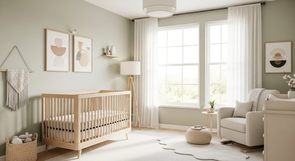
Choosing the right colors for your baby’s nursery can feel overwhelming. You want something that feels fresh and modern, but also calming enough to help your little one sleep. The good news? Today’s modern nursery color schemes go way beyond the traditional pink and blue.
Modern parents are embracing softer palettes, unexpected combinations, and colors that grow with their child. Whether you’re designing a gender-neutral space or looking for something uniquely you, these contemporary baby room ideas will spark your creativity. Let’s explore color combinations that bring light, joy, and style to your nursery without sacrificing that cozy feeling every baby needs.
Why Modern Nursery Colors Matter
The colors you choose for your baby’s room do more than just look pretty on Pinterest. They actually influence mood, sleep patterns, and even development. Soft, muted tones tend to create a calming environment that helps babies settle down for naps and bedtime.
But here’s what makes modern nursery paint trends different from traditional approaches. Instead of relying on primary colors or overly sweet pastels, contemporary palettes embrace earthy neutrals, sophisticated grays, and nature-inspired hues. These colors feel grown-up enough that you won’t want to repaint in two years.
Think of your nursery color scheme as an investment in your home’s overall aesthetic. The best modern nurseries blend seamlessly with the rest of your house while still feeling special and dedicated to your little one. That’s the beauty of choosing a stylish nursery palette that works for everyone.
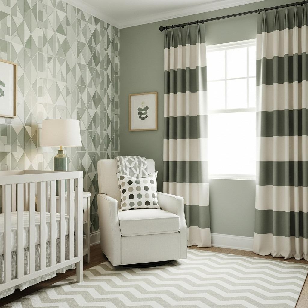
1. Sage Green and Natural Wood
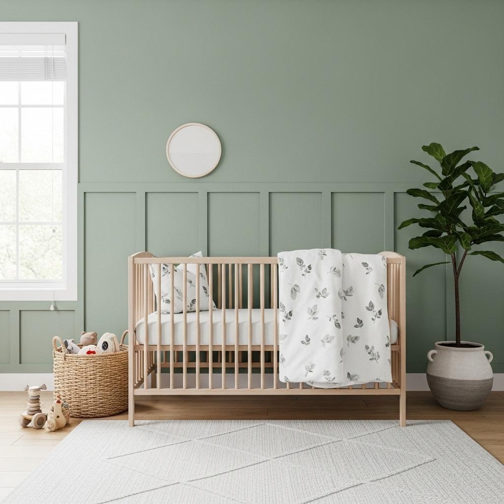
Sage green has become the star of modern nurseries, and honestly, it’s easy to see why. This soft, muted green brings the outdoors in without feeling too bold or overwhelming. It pairs beautifully with natural wood furniture and creates an organic, peaceful vibe that both babies and adults appreciate.
The key to nailing this look is choosing the right shade. You want a sage that leans more gray than yellow, keeping things sophisticated rather than overly sweet. When you combine it with light oak or birch furniture, the whole room feels airy and connected to nature.
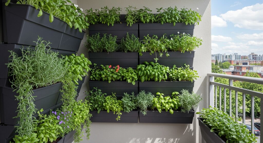
This combination works particularly well if you’re going for a Scandinavian interior bedroom vibe in your nursery. Add cream-colored textiles, simple geometric patterns, and plenty of plants (real or faux, depending on safety concerns) to complete the look. The result feels timeless, not trendy.
2. Warm Terracotta and Cream
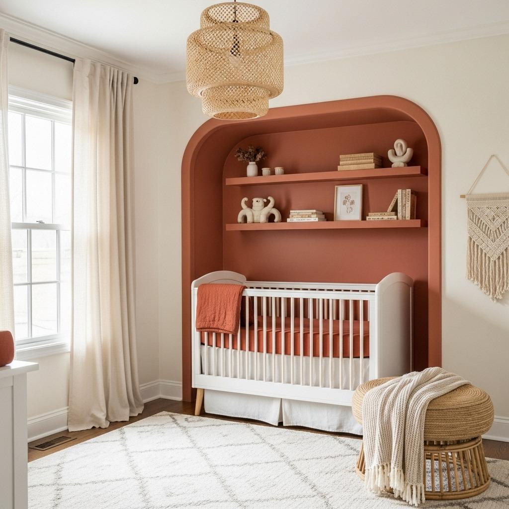
If you want something warmer and earthier, terracotta paired with cream creates an incredibly inviting space. This color duo has serious staying power because it feels both modern and timeless. Terracotta brings just enough color without overwhelming a small nursery.
The beauty of this palette is its versatility. You can use terracotta as an modern accent wall ideas behind the crib, or incorporate it through textiles, artwork, and accessories. Cream walls keep everything feeling bright and open, while terracotta accents add warmth and personality.
This combination also photographs beautifully, which means your nursery pics will look stunning. Add some natural fiber rugs, macramé wall hangings, and brass or gold accents for a boho-meets-modern aesthetic. It’s a look that grows with your child since terracotta works just as well in a toddler room as it does for a newborn.
3. Soft Gray and Mustard Yellow
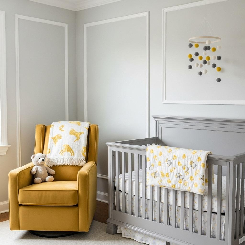
Gray gets a bad rap for being too cold, but paired with the right accent color, it creates one of the most sophisticated modern nursery color schemes out there. Mustard yellow is that perfect accent, adding cheerfulness without the harshness of bright yellow.
Choose a warm gray with slight beige undertones rather than a cool, blue-toned gray. This keeps the space feeling cozy rather than clinical. Then bring in mustard through a statement chair, throw pillows, or a fun accent wall. The contrast is eye-catching but still soothing.
This palette works especially well in nurseries with lots of natural light. The gray won’t feel dreary, and the yellow will practically glow when the sun streams in. If you’re worried about commitment, try this combination in a small space bedroom hacks approach where you can easily swap out yellow accessories as your taste evolves.
4. Blush Pink and Forest Green
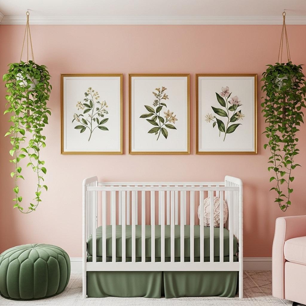
Forget everything you thought you knew about pink nurseries. When you pair blush pink with deep forest green, you get something totally unexpected and incredibly chic. This combination feels botanical and sophisticated, not babyish at all.
The trick is using blush as your base color and bringing in forest green through artwork, plants, and textiles. A large tropical print or botanical wallpaper on one wall can tie the whole look together. This approach gives you that modern, design-forward nursery that still feels soft and welcoming.
What’s great about this palette is how gender-neutral it can feel, despite the pink. The deep green grounds everything and adds a mature element that makes the space feel curated. Similar to a colorful minimalist bedroom, this combination proves you can have color without clutter.
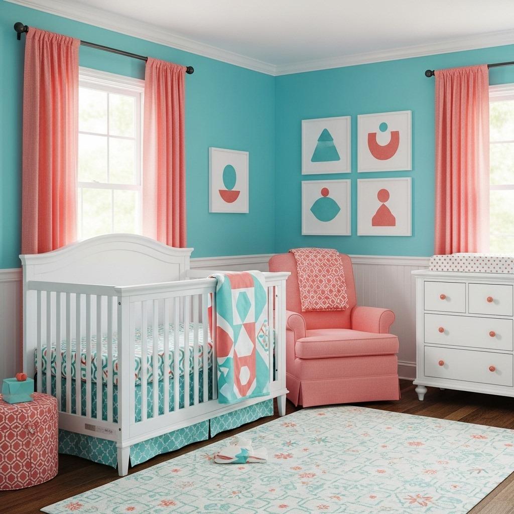
5. Navy Blue and Coral
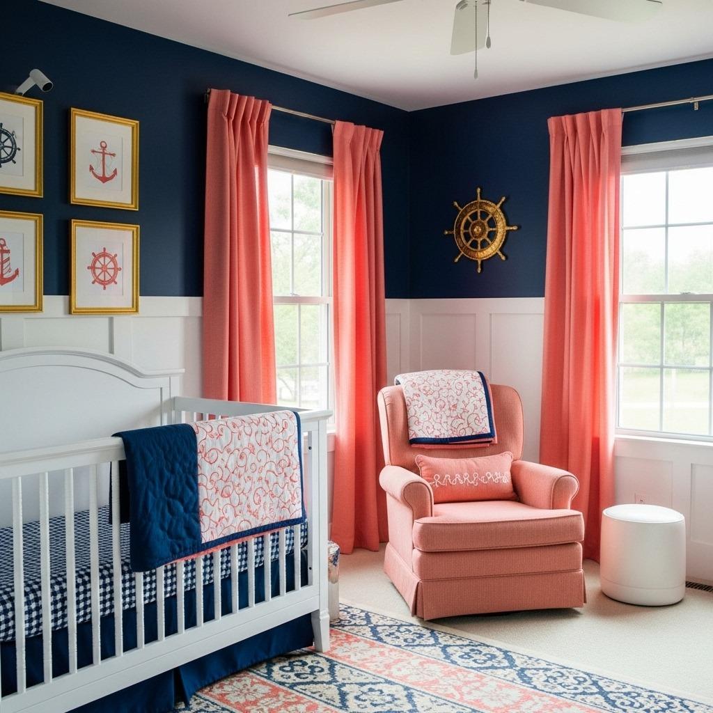
Navy blue has replaced bright primary blue in contemporary baby room design, and for good reason. It feels more sophisticated and calming while still bringing that classic appeal parents love. When you add coral as an accent, you get warmth and playfulness without going overboard.
Navy works beautifully as a feature wall or even on all four walls if your nursery gets plenty of natural light. The coral prevents it from feeling too dark or masculine, adding just the right amount of softness. This combination works equally well for boys, girls, or gender-neutral spaces.
Consider painting your ceiling in a soft coral shade while keeping walls navy. It’s an unexpected move that adds dimension and keeps the room feeling open.
6. Mint Green and Peach
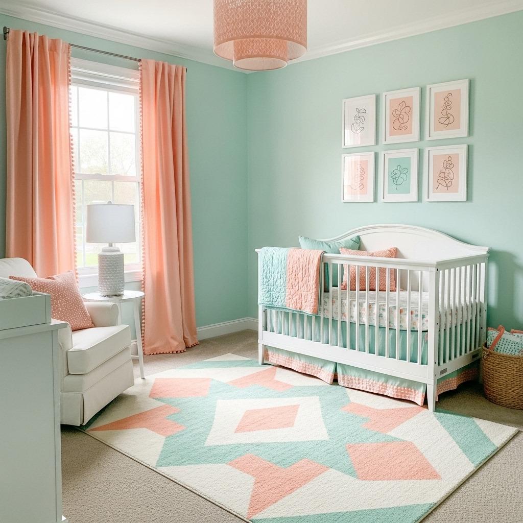
This color combination feels like a breath of fresh air, literally. Mint green and peach create a soft, dreamy atmosphere that’s perfect for a nursery. Both colors are light and airy, which helps smaller spaces feel more open and inviting.
The key is keeping both shades muted rather than saturated. Think ice cream pastels rather than neon brights. Mint can dominate as the wall color while peach comes in through bedding, rugs, and decor. Or flip it and use peach walls with mint accents for a warmer feel.
This palette photographs incredibly well, making it a favorite among design-savvy parents. It also transitions easily as your baby grows. You can shift the balance of colors by swapping out accessories, keeping the room fresh without a full repaint. The combination has that boho style bedroom vibe when paired with natural textures and layered textiles.
7. Charcoal and Soft Pink
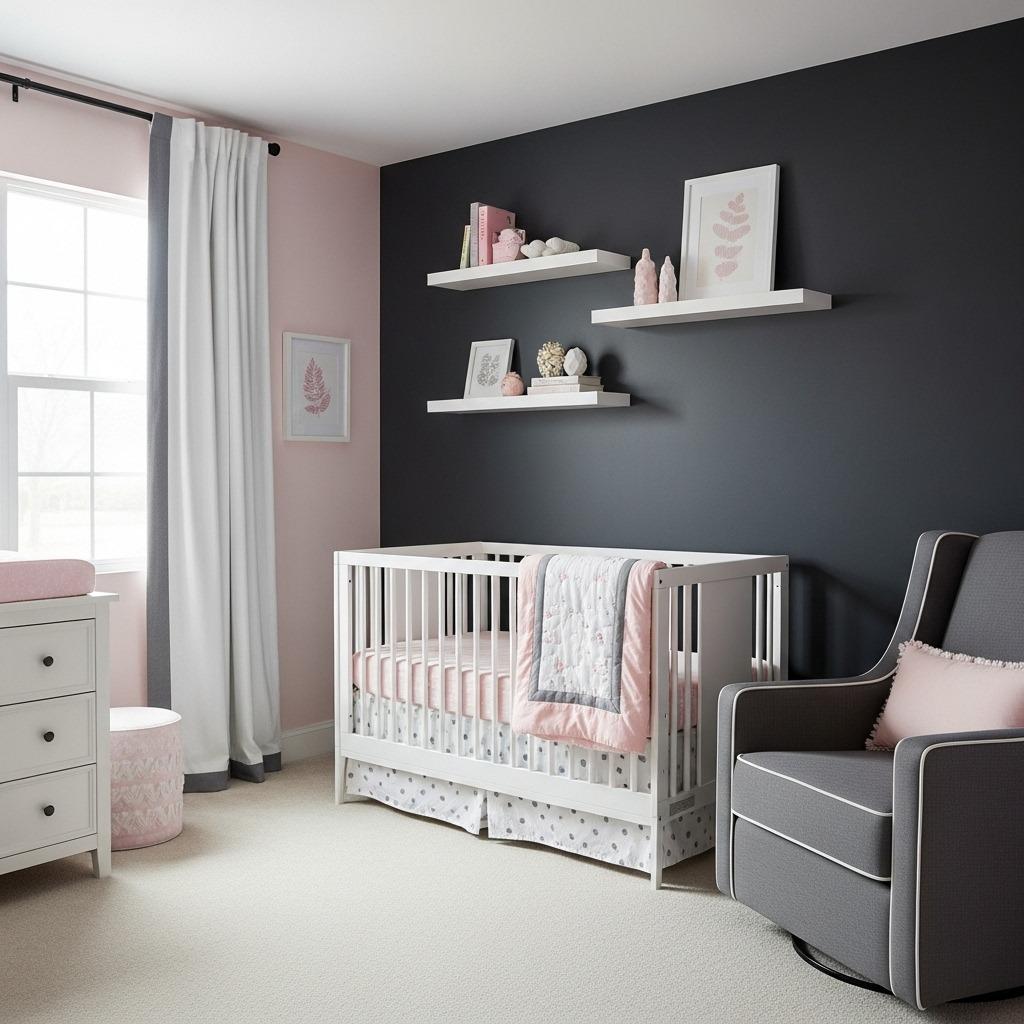
If you want something more dramatic and modern, charcoal gray paired with soft pink hits all the right notes. This high-contrast combination feels incredibly current and works particularly well in larger nurseries where darker colors won’t overwhelm the space.
Charcoal creates a cozy, cocoon-like feeling that can actually help babies sleep better. The soft pink brightens things up and adds that nursery-appropriate sweetness without being too traditional. You end up with a space that feels both sophisticated and playful.
Try painting three walls in charcoal and leaving one wall in soft pink, or vice versa depending on your room’s natural light. Add plenty of white elements like the crib, dresser, and curtains to break up the darker tones. This approach creates visual interest without requiring complicated design skills, much like the principles used in monochromatic bedroom ideas.
8. Lavender and Gold
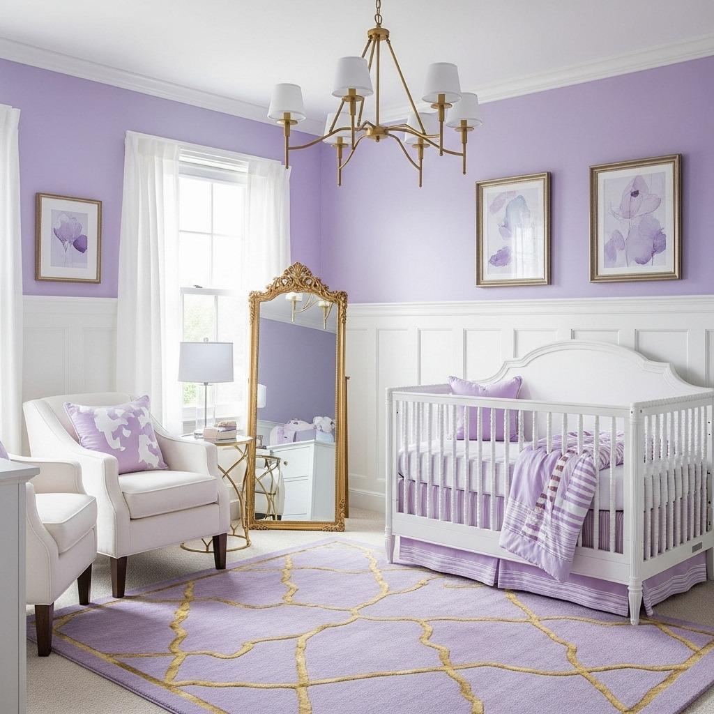
Lavender brings a sense of calm that’s hard to beat in a nursery setting. When you pair it with gold accents, you elevate the entire space into something truly special. This combination feels royal without being fussy, modern without being cold.
The secret is choosing a gray-toned lavender rather than a purple-toned one. This keeps things contemporary and prevents the room from feeling too themed. Gold accents through lighting fixtures, mirror frames, and small decor pieces add just enough glamour.
This palette works beautifully if you’re incorporating vintage or heirloom pieces into your nursery. The lavender provides a soft backdrop that lets special pieces shine, while gold ties everything together with a cohesive metallic thread. It’s similar to how you might approach a vintage bedroom, blending old and new elements seamlessly.
9. Beige and Black Accents
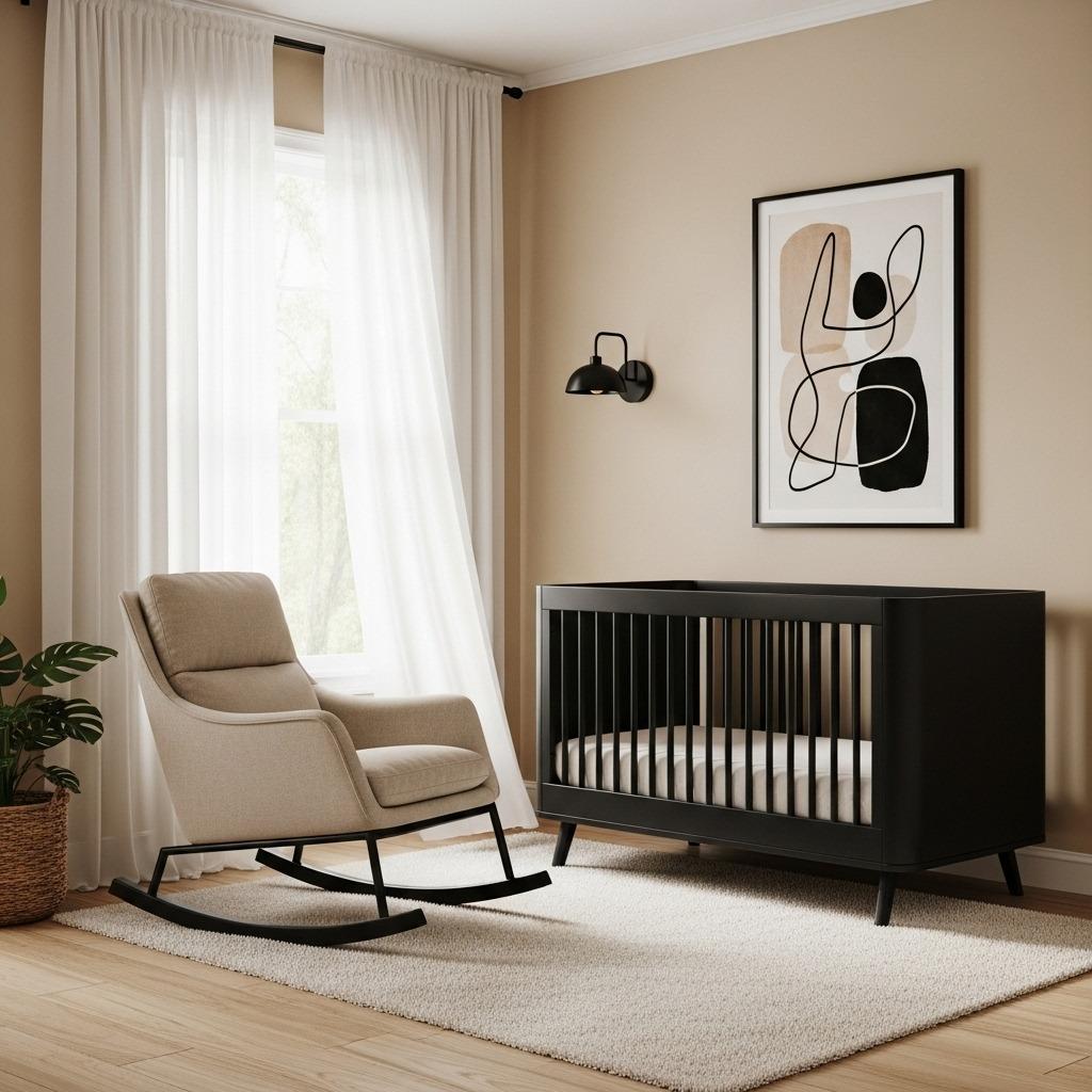
Before you dismiss beige as boring, hear me out. Modern beige is having a major moment, and when paired with strategic black accents, it creates one of the chicest contemporary baby room designs possible. This is minimalist nursery design at its finest.
Use a warm, creamy beige as your base and bring in black through intentional accents like picture frames, light fixtures, or a sleek modern crib. The contrast is striking but still feels appropriate for a baby’s space. Everything reads sophisticated and clean.
This palette is perfect for parents who want their nursery to blend seamlessly with the rest of their home decor. It doesn’t scream “baby room” from the hallway, which some people really appreciate. You can easily add color through easily changeable elements like books, toys, and artwork. The flexibility here rivals what you’d see in modern minimalist living room designs.
10. Teal and Copper
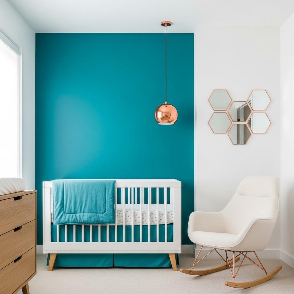
Teal offers that perfect middle ground between blue and green, creating a unique foundation for a modern nursery. Add copper accents, and you’ve got a color scheme that feels both trendy and timeless. The combination is rich without being overwhelming.
Choose a softer teal rather than a bright turquoise to keep the room feeling calm. Copper brings warmth through lighting, curtain rods, and decorative accessories. The metallic shine adds visual interest and catches light beautifully throughout the day.
This combination works especially well in rooms with white trim and natural wood flooring. The teal provides color without dominating, while copper accents create focal points that draw the eye around the room. It’s a balanced approach that feels thought-out and intentional.
11. Pale Yellow and White
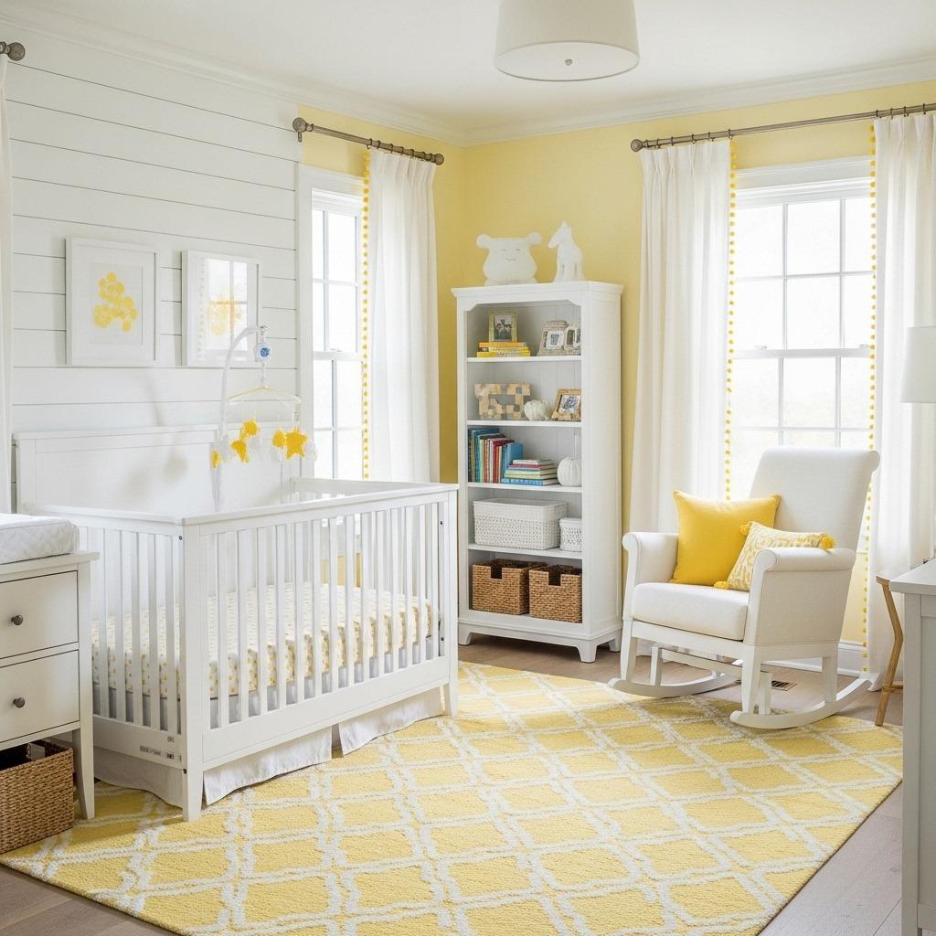
Sometimes the simplest combinations are the most effective. Pale yellow and white create a sunny, cheerful nursery that feels both modern and classic. Yellow is known for boosting mood and creativity, making it a thoughtful choice for your baby’s environment.
The key is choosing a yellow that’s barely there – think butter cream rather than school bus. This keeps the space feeling sophisticated rather than overstimulating. White furniture and trim create a crisp, clean look that lets the yellow walls glow.
This palette works particularly well in nurseries that don’t get a lot of natural light, as the yellow naturally brightens the space. You can easily add pops of other colors through toys, books, and artwork without clashing. It’s as versatile as the approach used in kids bedroom ideas, where flexibility matters.
12. Dusty Blue and Tan
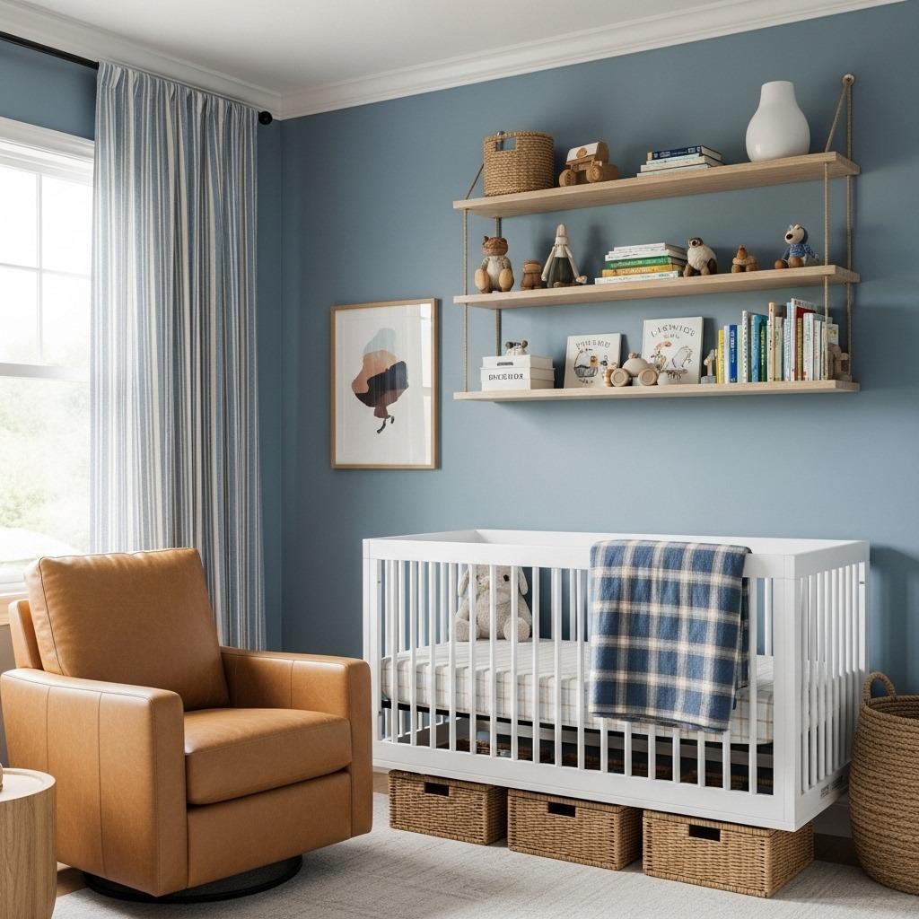
Dusty blue has become a nursery favorite because it reads as both calming and sophisticated. Pair it with warm tan tones, and you’ve got a combination that feels grounded and serene. This palette works beautifully for any gender and ages gracefully.
Tan can come in through furniture choices, wall hangings, and rugs, while dusty blue handles the walls or serves as an accent color. The two colors complement each other without competing, creating a harmonious space that’s easy on the eyes.
This combination also hides wear and tear better than stark white or very light colors, which is a practical consideration for a baby’s room. The colors have enough depth to feel intentional without being dark or heavy. Many parents appreciate this middle ground when designing their nursery.
13. Coral and Aqua
This vibrant pairing brings serious energy while still maintaining that modern sensibility. Coral and aqua together feel beachy and fun without requiring a full nautical theme. The combination is playful enough for a baby while still looking grown-up and intentional.
Use aqua as your dominant color on the walls and bring coral in through textiles, artwork, and accessories. Or flip it for a warmer feel with coral walls and aqua accents. Either way, add plenty of white to balance the boldness and keep things from feeling too busy.
This palette works especially well in garden and nursery ideas where bringing vibrant, natural colors indoors creates that connection to the outside world. The colors are bright enough to stimulate development without being harsh or overwhelming.
14. Olive Green and Cream
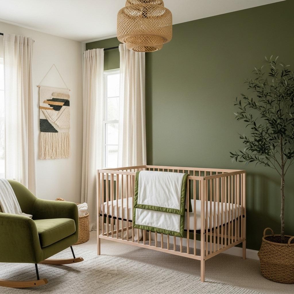
Olive green might seem like an unusual choice, but it creates one of the most calming, nature-inspired nurseries imaginable. When paired with soft cream, the combination feels earthy and warm. It’s perfect for parents who want something truly different from typical nursery colors.
The olive tone should lean more muted and grayish rather than bright or army-inspired. This keeps it feeling modern and sophisticated. Cream provides the perfect neutral backdrop, keeping the space bright while letting the olive green make a statement.
This palette pairs beautifully with natural materials like wood, linen, and jute. Think of it as bringing a forest vibe indoors without being too literal about it. The combination works year-round and feels particularly cozy in fall and winter months.
15. Soft Peach and Charcoal
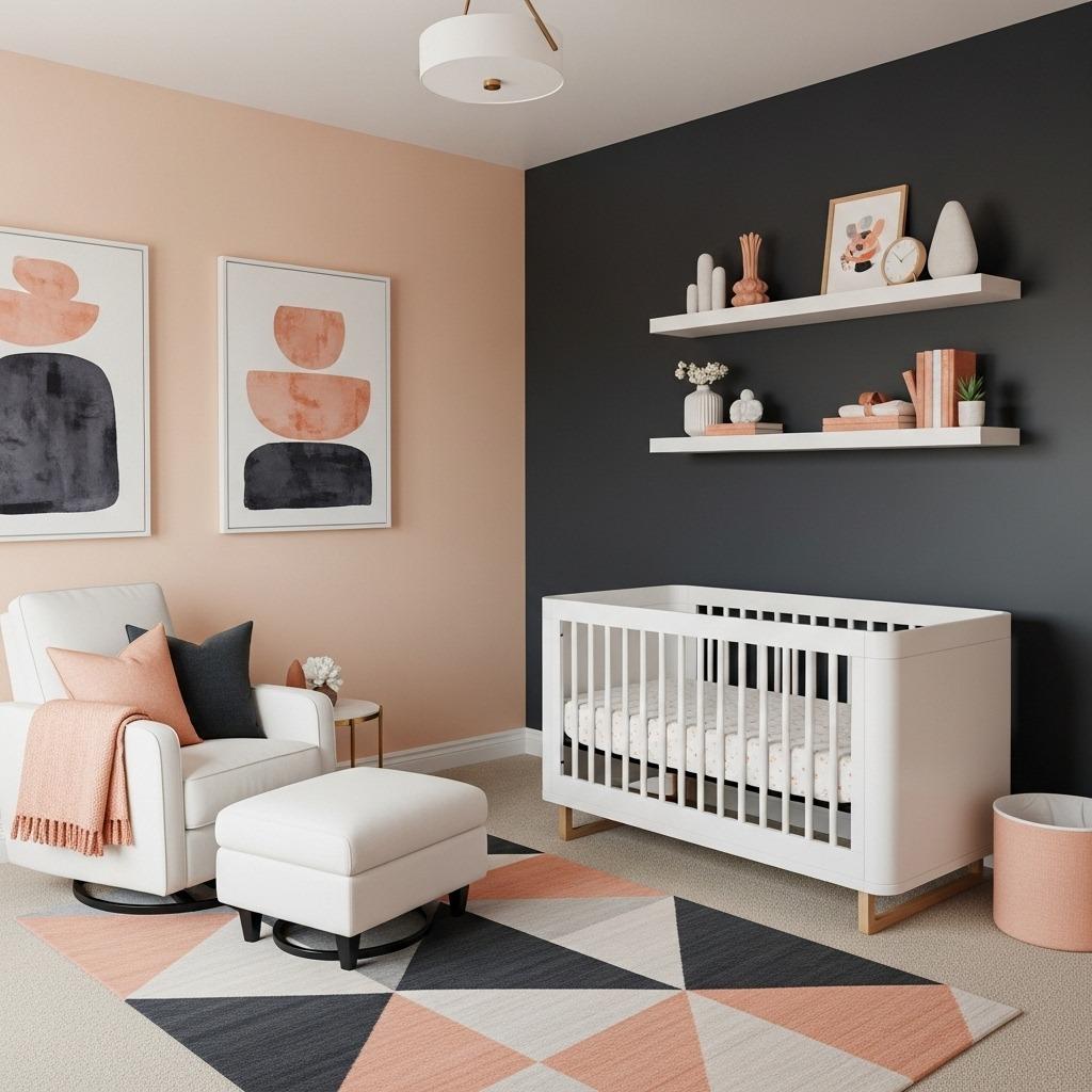
Peach and charcoal create unexpected magic together. The warmth of peach softens the intensity of charcoal, while the charcoal keeps the peach from feeling too sweet. It’s a balanced combination that works in both small and large nurseries.
Try using peach on three walls and charcoal on one accent wall behind the crib. This creates a focal point without overwhelming the space with dark color. Alternatively, charcoal walls with peach accents work if you have excellent natural light and want something more dramatic.
White furniture becomes the perfect mediator between these two colors, creating breathing room and visual breaks. Add natural wood elements and soft textiles to complete the look. The result feels current and thoughtfully designed, similar to approaches used in artistic bedroom ideas.
How to Choose Your Modern Nursery Color Scheme
Picking from all these beautiful options can feel paralyzing. Start by considering your home’s existing color palette. Your nursery should complement the rest of your space, especially if it’s visible from hallways or adjacent rooms.
Think about the lighting in your nursery. North-facing rooms benefit from warmer colors like peach, terracotta, or yellow, while south-facing rooms can handle cooler tones like gray, blue, or green. Natural light dramatically affects how colors appear throughout the day.
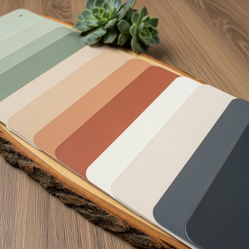
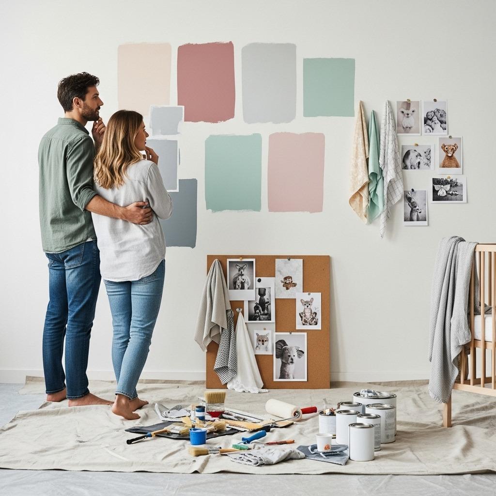
Don’t forget to order sample pots and paint large swatches on your walls. Live with them for a few days, observing how they look in morning light, afternoon sun, and evening lamp light. Colors can look completely different depending on when you’re looking at them, and you’ll be in that room at all hours once baby arrives.
Mixing Patterns with Your Color Palette
Once you’ve chosen your colors, patterns add another layer of visual interest. The trick is mixing scales – pair a large geometric print with tiny polka dots or stripes. Keep your color palette consistent across patterns to maintain cohesion.
Start with one bold patterned piece like curtains or a rug, then bring in smaller-scale patterns through throw pillows, artwork, or bedding. If you’re nervous about mixing patterns, stick to one pattern and vary it in different sizes throughout the room.
Remember that patterns don’t have to match perfectly. In fact, slightly mismatched patterns often feel more intentional and less themed. Just keep your chosen modern nursery color scheme as the common thread, and everything will feel coordinated without looking too matchy-matchy.
Adding Texture for Depth
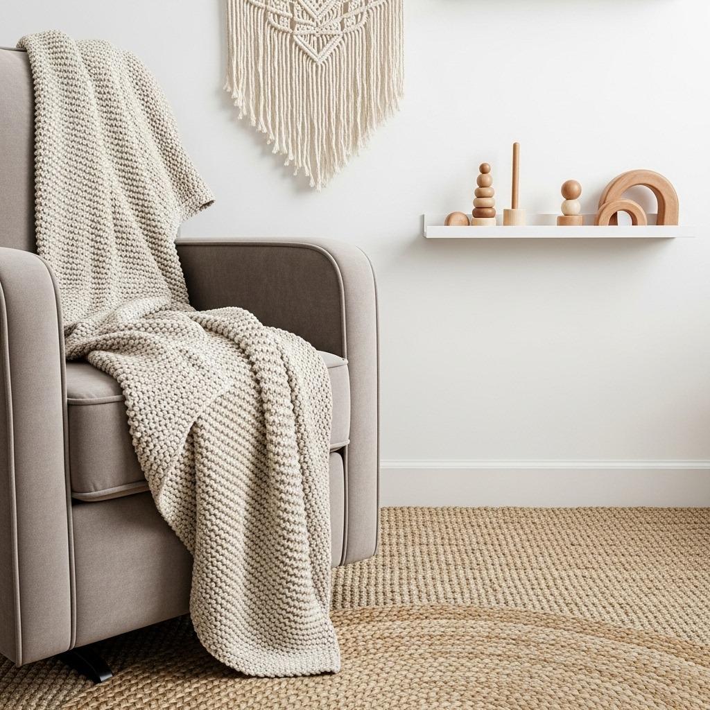
Color is important, but texture is what makes a nursery feel complete and lived-in. Even if you stick to a minimal color palette, layering different textures creates visual interest and warmth. Think chunky knit blankets, smooth leather, rough jute, and soft velvet.
Start with your major furniture pieces, then add texture through rugs, curtains, and accessories. A woven basket for toys, a macramé wall hanging, or a faux fur rug all contribute to the layered look that makes modern nurseries feel so inviting.
Don’t overlook the ceiling or unexpected places for adding texture. Exposed wood beams, wallpaper on the ceiling, or textured paint techniques can all elevate your space. These touches show attention to detail that makes your nursery feel truly special.
Finishing Touches That Complete the Look
Your color scheme sets the foundation, but the finishing touches bring personality and warmth. Artwork is crucial – choose pieces that incorporate your color palette but add new elements or patterns. Mix framed prints, canvas art, and three-dimensional pieces for variety.
Lighting deserves special attention in nurseries. A statement pendant or chandelier can become a focal point while providing necessary illumination. Add table lamps and sconces for layered lighting that works for different activities and times of day.
Finally, personalize with meaningful items. A vintage blanket from grandma, a special toy, or custom name art makes the space uniquely yours. These personal touches transform a pretty nursery into your baby’s special place, connecting your family’s story to the beautiful modern space you’ve created.
Creating a modern nursery with the perfect color palette doesn’t have to be complicated. Whether you lean toward earthy neutrals, soft pastels, or bold contrasts, the key is choosing colors that feel right for your family. Your nursery should be a space you love spending time in, not just a Pinterest-perfect room.
Remember that these stylish nursery palette ideas are starting points, not strict rules. Feel free to adjust shades, swap accent colors, or mix ideas from different combinations. The most successful nurseries reflect the parents who designed them while creating a calm, happy space for baby to grow.
What colors are you leaning toward for your nursery? Trust your instincts, test your samples, and create a space that makes you smile every time you walk in. That’s what modern nursery design is really all about.