
Gallery walls have this amazing ability to tell your story while completely transforming a blank wall into something that feels intentional and personal. But here’s the thing – creating one that looks curated rather than chaotic? That takes a bit of strategy.
I’ve pulled together some of my favorite approaches that work in real living rooms (not just the styled-for-photos kind). These living room gallery wall ideas range from the perfectly symmetrical to the beautifully unexpected, and each one offers a different way to showcase what matters to you.
Whether you’re working with family photos, collected art prints, or a mix of everything you love, there’s an arrangement here that’ll make your space feel more finished and personal. Let’s look at what actually works.
1. The Classic Grid Layout
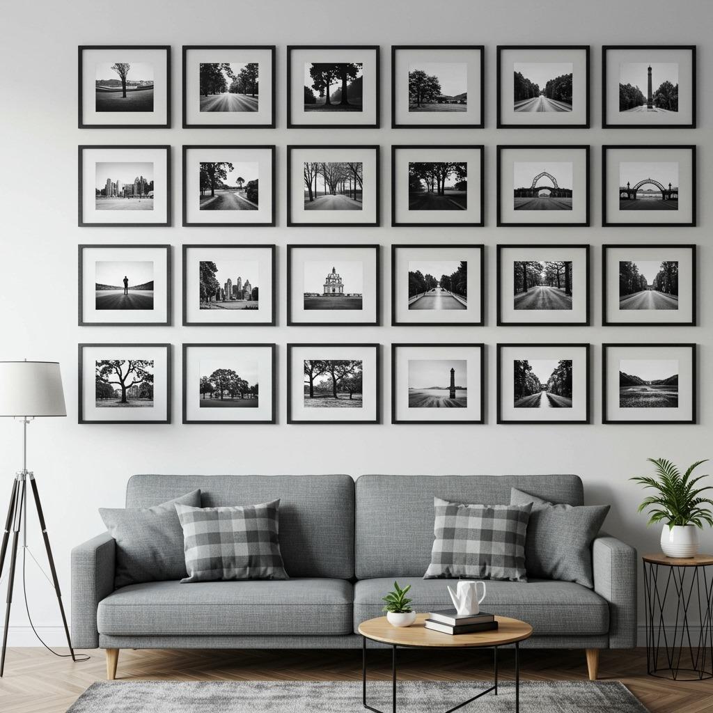
Starting with a grid might seem predictable, but it’s predictable for a reason. When you line up frames of the same size in uniform rows and columns, you create visual calm that lets the actual artwork take center stage.
This approach works especially well in modern minimalist living rooms where clean lines matter. Pick frames that match exactly – same size, same color, same mat width – and measure carefully before you start hammering nails.
The grid layout also solves one of the biggest gallery wall challenges: decision fatigue. You’re not spending hours trying to figure out which piece goes where. Just measure, mark, and hang in rows. Simple as that.
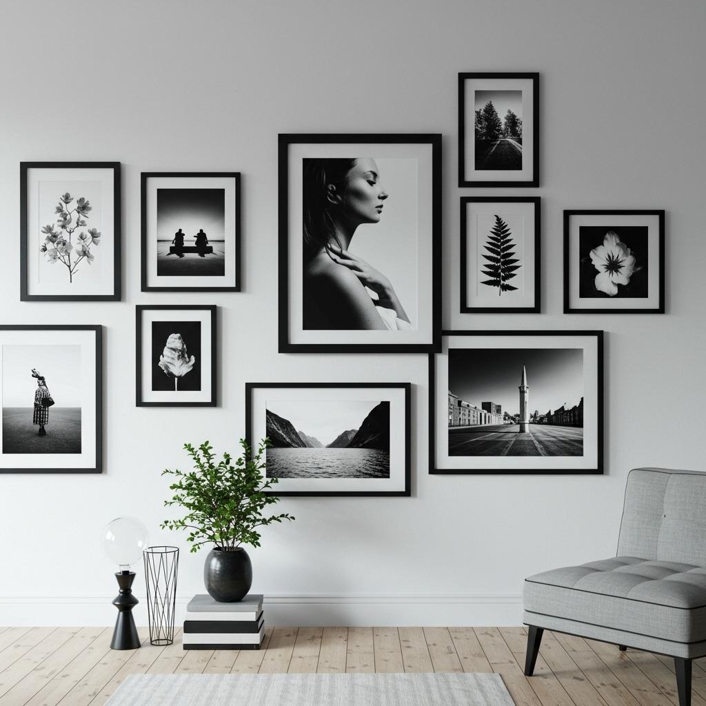
2. Salon-Style Mix
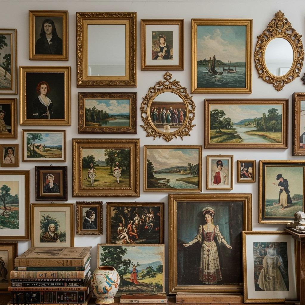
This is where things get interesting. Salon walls embrace abundance – different frame sizes, various art styles, possibly even a small mirror or two tucked in there. The frames practically touch each other, creating a collected-over-time feel.
The trick? Start with your largest piece and build around it. Place bigger frames first, then fill gaps with smaller ones. Don’t worry about perfect spacing – the slightly irregular nature is part of the charm.
I’ve seen this style work beautifully in boho chic living rooms where that layered, personal aesthetic fits right in. Just make sure there’s some visual thread connecting everything – maybe it’s all warm-toned frames, or perhaps you stick to a limited color palette in the artwork itself.
3. The Lean-and-Layer Approach
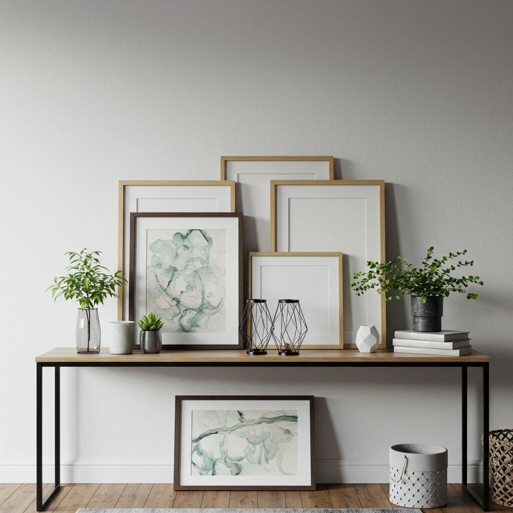
Not ready to commit to nail holes? This method gives you all the visual impact with none of the permanence. Layer frames on a console table, mantel, or even picture ledge shelving, with larger pieces in back and smaller ones leaning in front.
This creative display lounge setup means you can swap things out whenever the mood strikes. Seasonal updates become easy, and you never have to stress about measuring perfectly.
The layered look also allows you to incorporate three-dimensional objects – a small sculpture, a potted plant, maybe a stack of beautiful books. It creates depth that flat-hung walls sometimes miss.
4. Linear Horizontal Display
Sometimes less complicated is more effective. A single row of matching frames running horizontally creates clean sophistication that works in spaces where you want calm rather than visual excitement.
This works particularly well in Scandinavian living rooms where restraint is part of the aesthetic. Keep your frames identical and space them evenly – precision matters here more than in looser arrangements.
You can play with the artwork inside those matching frames though. Maybe it’s a photo series that tells a story from left to right, or perhaps individual pieces that share a color palette but differ in subject matter.
5. Asymmetrical Balance
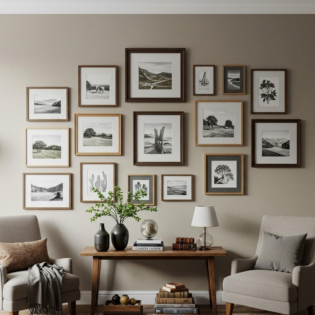
This is my personal favorite because it looks effortlessly cool while actually requiring thoughtful planning. The frames are different sizes and the layout isn’t symmetrical, but there’s still balance when you step back and look at the overall composition.
Think of it like visual weight – a large frame on one side might be balanced by several smaller frames grouped on the other. The arrangement feels organic rather than forced, which is exactly what you want in living room ideas that prioritize personality.
Start by cutting paper templates in your frame sizes and taping them to the wall. Move things around until the balance feels right – you’ll know it when you see it.
6. Corner Gallery Wrap
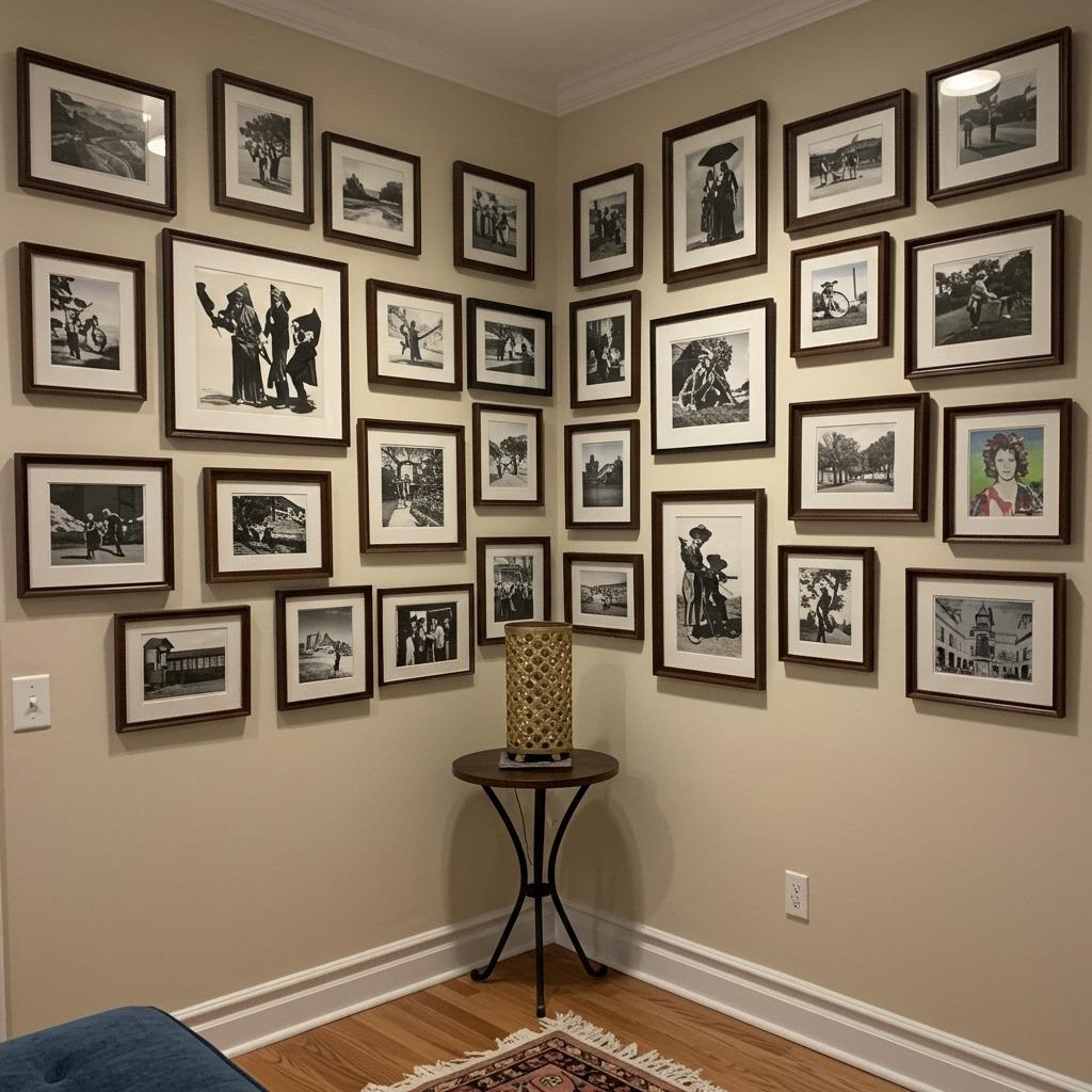
Why stop at one wall? Taking your photo wall around a corner adds unexpected dimension and makes use of space that often gets overlooked. It draws the eye through the room in a way that single-wall arrangements can’t.
This works especially well in smaller living rooms where you want to create interest without overwhelming the space. The corner wrap actually makes rooms feel larger by emphasizing the architectural lines.
Just maintain consistent spacing as you turn the corner, and make sure the two walls feel connected – maybe repeat certain frame colors or sizes on both sides so it reads as one intentional installation rather than two separate attempts.
7. Oversized Statement Pieces
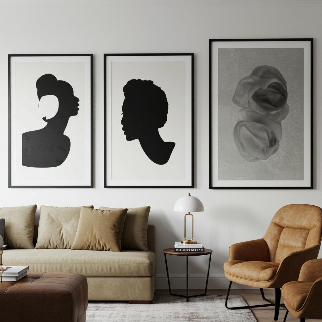
Sometimes bigger truly is better. Instead of collecting dozens of small frames, invest in a few large-scale pieces that command attention. This approach feels grown-up and decisive – you know what you like and you’re not afraid to commit.
Large artwork also solves the “my ceiling is really high” problem. Rather than trying to fill vertical space with multiple smaller pieces (which can look spotty), let one substantial piece own that wall.
This style pairs beautifully with mid-century modern living rooms where furniture tends to have lower profiles. The tall artwork adds vertical interest that prevents the room from feeling too horizontal.
8. Monochromatic Frame Story
Choosing frames in a single color immediately makes any arrangement look more intentional, even if your art itself is wildly different in style. Black frames are classic, white frames feel fresh and gallery-like, natural wood frames bring warmth.
This is one of those wall art inspiration tricks that makes curation easier – when frames match, you have more freedom with what goes inside them. Family photos can sit next to abstract prints without the combination feeling chaotic.
The unified frame color creates visual continuity that pulls everything together. Your eye moves smoothly from piece to piece rather than getting caught on mismatched frames.
9. Themed Content Collection
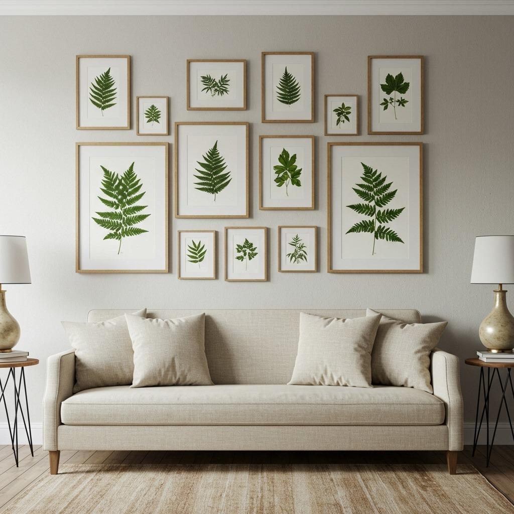
Building your gallery around a single theme – botanical prints, vintage maps, black and white portraiture, travel photography – creates immediate coherence. The consistent subject matter means frames and layouts can be more varied without the result looking scattered.
This approach works particularly well if you’re passionate about a specific aesthetic or hobby. Love hiking? Fill your wall with landscape photography. Obsessed with architecture? Collect building sketches and architectural drawings.
Themed galleries also make shopping for new pieces easier. You know exactly what you’re looking for, so you’re not wandering endlessly through art markets wondering what might work.
10. Mix Media Textures
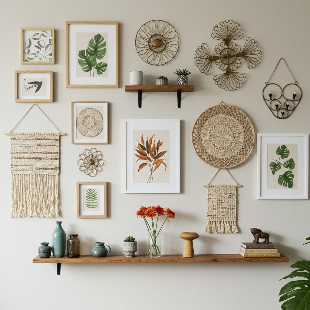
Who says a gallery wall has to be only framed art? Mixing in three-dimensional pieces – woven textiles, ceramic plates, metal sculptures, wooden shelves with tiny displayed objects – creates depth that flat frames alone can’t achieve.
This textural approach feels particularly at home in farmhouse style living rooms where that collected, imperfect vibe is part of the appeal. The varied materials catch light differently throughout the day, making your wall feel alive.
Just maintain some visual connection between pieces – maybe everything shares an earth-toned palette, or perhaps there’s a consistent level of refinement (all rough textures or all polished finishes).
11. Floating Shelf Gallery
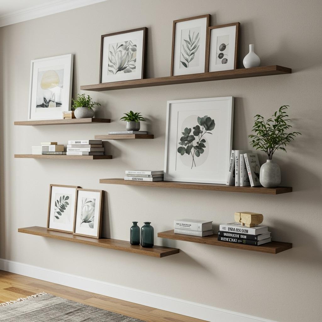
This hybrid between traditional gallery wall and open shelving gives you the best of both worlds. Frames lean rather than hang, and you can weave in other objects that add personality – small plants, interesting books, collected treasures.
The shelf approach is perfect for renters who want impact without dozens of nail holes, or for anyone who likes frequently refreshing their displays. Swap out art seasonally, rotate in new finds, shift things around when you’re feeling restless.
Picture ledges work well for this, or you can use regular floating shelves if you don’t mind artwork leaning at different angles. Either way, you get a more dynamic, changeable display than traditional hanging allows.
12. Floor-to-Ceiling Drama
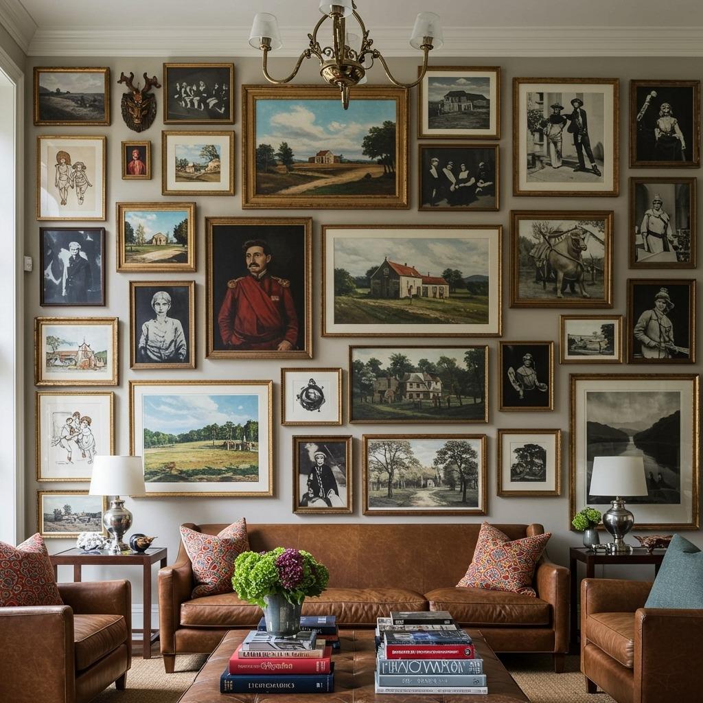
Got high ceilings? Use them. A floor-to-ceiling gallery wall makes a bold statement and solves the common problem of walls feeling too tall and empty above standard furniture.
The key is placing your most important pieces at eye level (roughly 57-60 inches from the floor to the center of the frame), then building up and down from there. Don’t stick everything important at the top where people have to crane their necks to see it.
This dramatic approach works beautifully in maximalist living rooms where more is definitely more. It transforms your wall into a true focal point that demands attention.
13. Shaped Arrangements
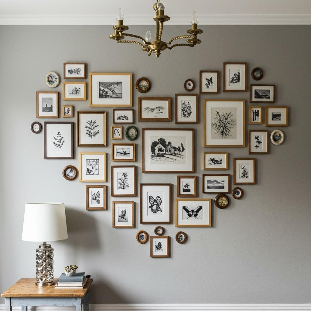
Taking your frames and arranging them to follow a specific shape – maybe a rough square, a diamond, a loose circular form – creates structure within what might otherwise feel random. The outer edges follow your chosen shape while the interior arrangement can be more free-form.
This is one of those living room gallery wall ideas that looks complex but is actually pretty straightforward if you use paper templates first. Lay out your desired shape on the floor, arrange your frames within it until it looks right, then transfer those positions to the wall.
Shaped arrangements work especially well in spaces where you want the gallery wall itself to be the focal point rather than any individual piece within it. The overall composition becomes the art.
14. Colorful Frame Mix
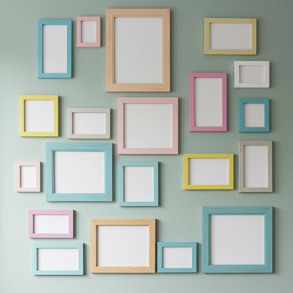
If matchy-matchy isn’t your thing, embrace the rainbow. Frames in different colors create a playful, personal feel that works beautifully in colorful living rooms where rules are made to be broken.
The trick to keeping this from looking chaotic? The artwork inside should have some visual connection, even if frames don’t. Maybe everything shares a similar graphic quality, or perhaps you stick to prints rather than mixing photos and paintings.
Colorful frames also let you incorporate thrift store finds and hand-me-downs without worrying about perfect matching. That slightly mismatched quality can feel more collected and interesting than perfect uniformity.
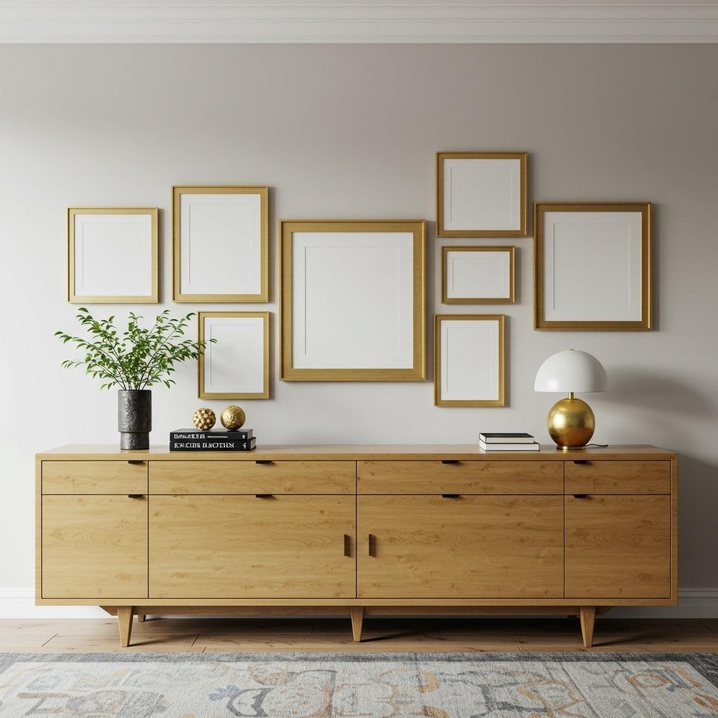
15. The Statement Wall Behind Furniture
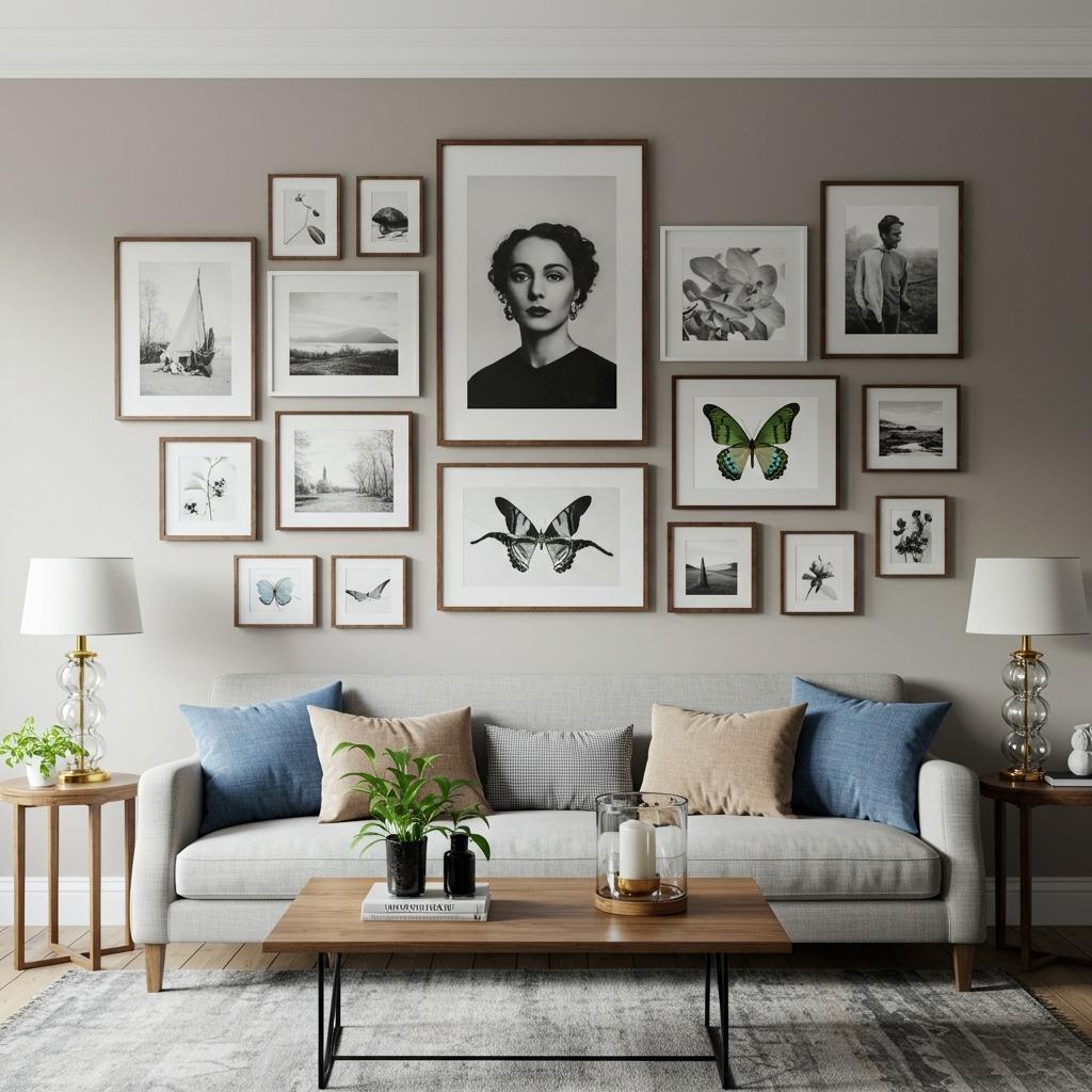
Your sofa or credenza doesn’t have to sit in front of your gallery wall – it can be part of the design. Plan your arrangement specifically to work with the furniture below, using the sofa back as a visual anchor point.
This integrated approach means your furniture and wall work together rather than competing. The gallery wall appears to grow out of the furniture piece, creating one cohesive look rather than two separate design elements happening to occupy the same wall.
Leave some breathing room though. Your frames shouldn’t crowd right up against your furniture – aim for 6-10 inches of space between the furniture top and the lowest frame. This gives each element room to be appreciated on its own while still reading as a unified composition.
For more ideas on creating cohesive living spaces, check out these home improvement ideas that can complement your new gallery wall.
Making Your Gallery Wall Work in Your Space
The best gallery wall for your living room is the one that feels like you. Maybe that’s perfectly symmetrical frames in identical sizes, or maybe it’s a chaotic salon wall packed with memories and treasures.
Start by gathering more pieces than you think you’ll need. Lay everything out on the floor first, rearranging until something clicks. Take photos of arrangements you like – what looks good from above often translates well to vertical.
And remember, gallery walls aren’t permanent tattoos. If you hang something and decide six months later that it’s not working? Change it. That’s the beauty of creating your own wall art inspiration – it’s yours to evolve as you do.
Your blank wall is waiting. Pick an approach that speaks to you and start creating something that makes your living room feel complete.

