White kitchens have had their moment. Now? People are craving personality, warmth, and spaces that actually reflect who they are.
Bold kitchen color choices do more than look pretty – they shift the entire energy of your home. A dramatic kitchen paint scheme turns a purely functional space into somewhere you want to linger over morning coffee or experiment with new recipes. I’ve watched friends completely change their relationship with cooking after painting their cabinets a color they truly love.
These 12 color ideas range from deeply saturated cabinet hues to unexpected accent walls that make everything else in the room pop. Some are moody and sophisticated, others bright and energizing. What they all share is the confidence to move beyond safe neutrals into territory that feels genuinely exciting.
1. Deep Forest Green Cabinets
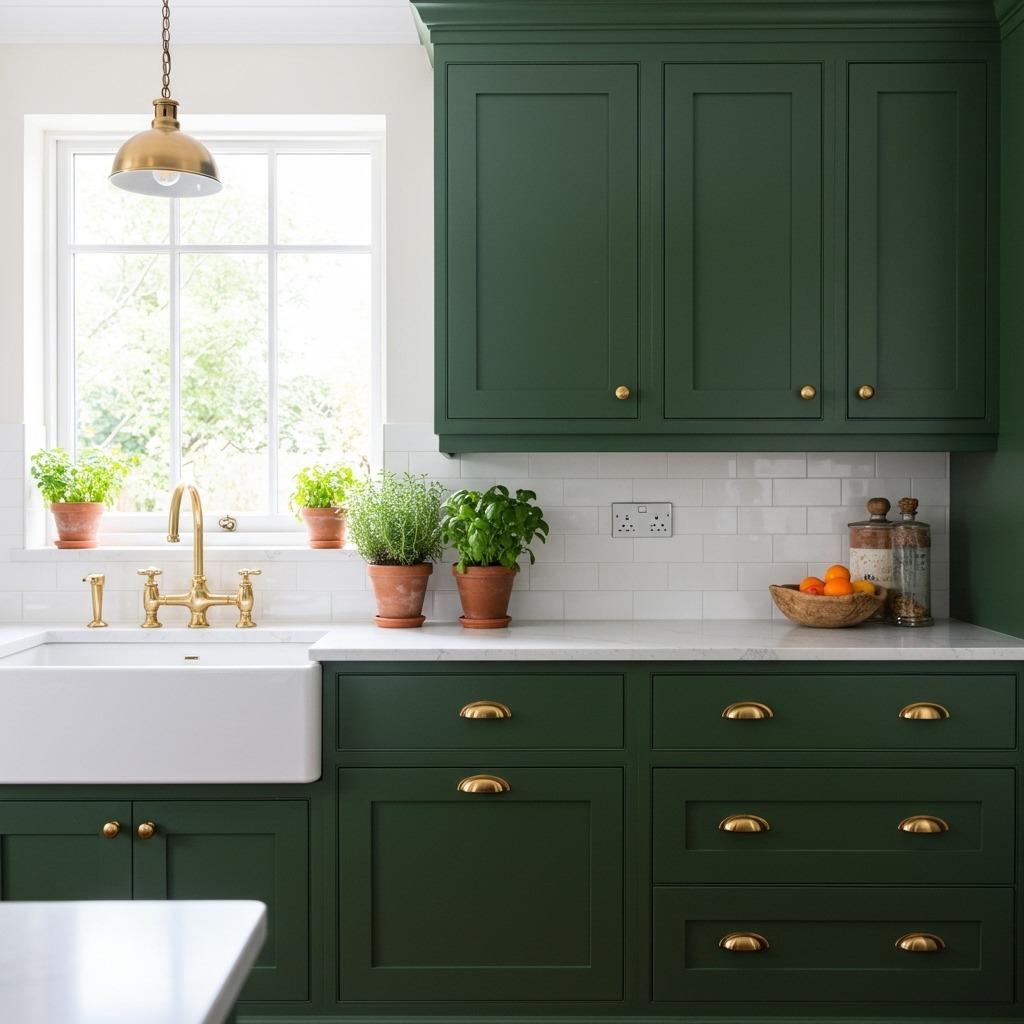
Forest green has become the sophisticated alternative to navy in kitchens. This earthy, grounded shade brings nature indoors while maintaining a formal elegance that works in both traditional and contemporary spaces.
The beauty of deep green lies in how it shifts throughout the day. Morning light makes it feel fresh and botanical, while evening illumination creates a cozy, intimate atmosphere. Pair it with natural wood tones, brass or gold hardware, and plenty of white or cream to balance the richness.
This color particularly shines in kitchen and dining ideas where you want to create a restaurant-quality ambiance. It’s dramatic without feeling heavy, especially when you incorporate plenty of lighting and reflective surfaces. Consider extending this shade to a kitchen island while keeping perimeter cabinets lighter for visual interest.
2. Terracotta Orange Accent Wall
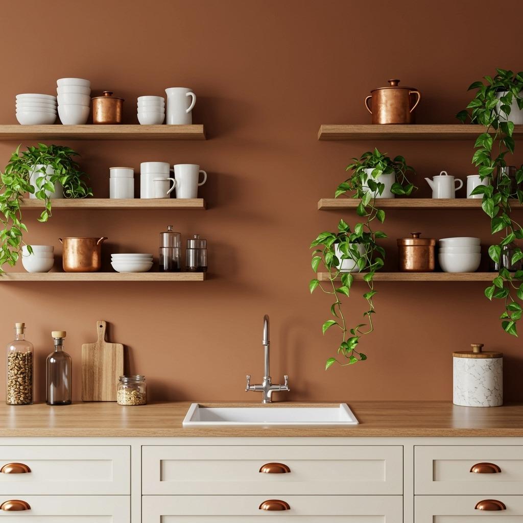
Terracotta brings warmth and earthiness without the heaviness of darker colors. This rusty orange shade feels both modern and timeless, referencing Mediterranean villas and Southwest landscapes.
An accent wall in terracotta works beautifully behind open shelving or as a backdrop for a dining nook adjacent to the kitchen. The color makes white dishes and natural wood elements absolutely glow. It’s particularly flattering in spaces with abundant natural light, where the shade can shift from burnt orange to soft coral depending on the time of day.
Keep the rest of your kitchen relatively neutral to let terracotta shine. White or light wood cabinets, natural fiber textures, and plenty of greenery complement this warm tone perfectly. The approach mirrors color principles used in colorful living room designs where one bold element anchors the entire space.
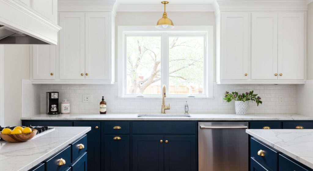
3. Navy Blue Lower Cabinets with White Uppers

The two-tone kitchen cabinet trend continues to captivate homeowners, and navy with white remains one of the most successful combinations. This classic pairing feels nautical without being themed, sophisticated without stuffiness.
Navy grounds the space visually while white uppers keep things from feeling too enclosed. This combination works especially well in kitchens with limited natural light – the white reflects brightness while navy adds necessary depth and character. Hardware choice matters here; brushed nickel or chrome keeps things crisp, while brass or gold adds warmth.
Consider carrying the navy to your island as well for cohesion. This creates visual weight at the room’s center while maintaining airiness at eye level. The contrast also cleverly disguises wear and tear on lower cabinets that see more daily use than uppers.
4. Sunny Yellow for Energizing Mornings
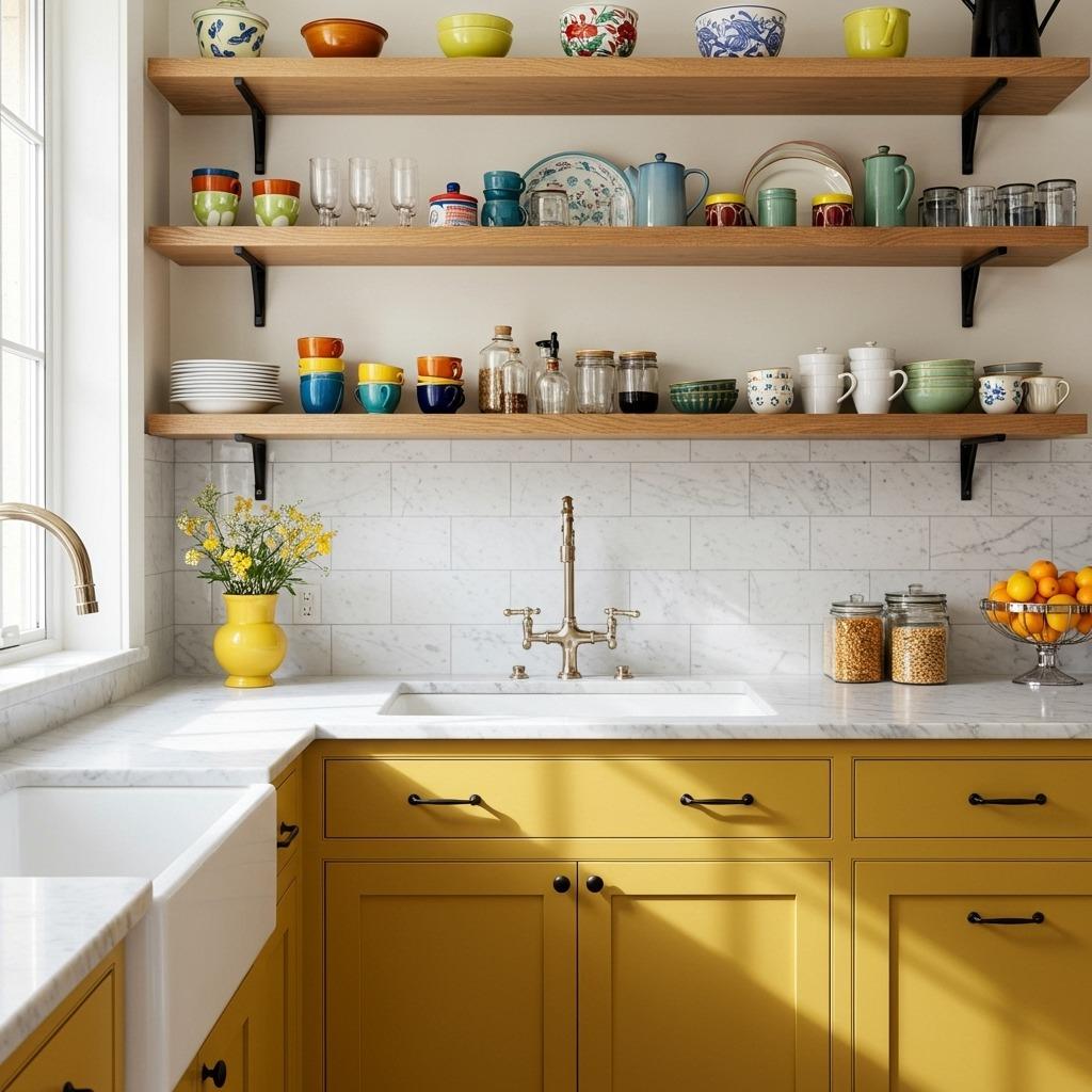
Yellow kitchens aren’t for the faint of heart, but they create unmatched energy and optimism. The right shade of yellow – not too bright, not too pale – makes even gloomy mornings feel cheerful.
Mustard yellow offers richness without overwhelming the senses. It pairs surprisingly well with dark countertops, stainless appliances, and natural wood. For those nervous about commitment, yellow works beautifully as an island color while keeping main cabinets neutral.
5. Charcoal Gray for Modern Drama
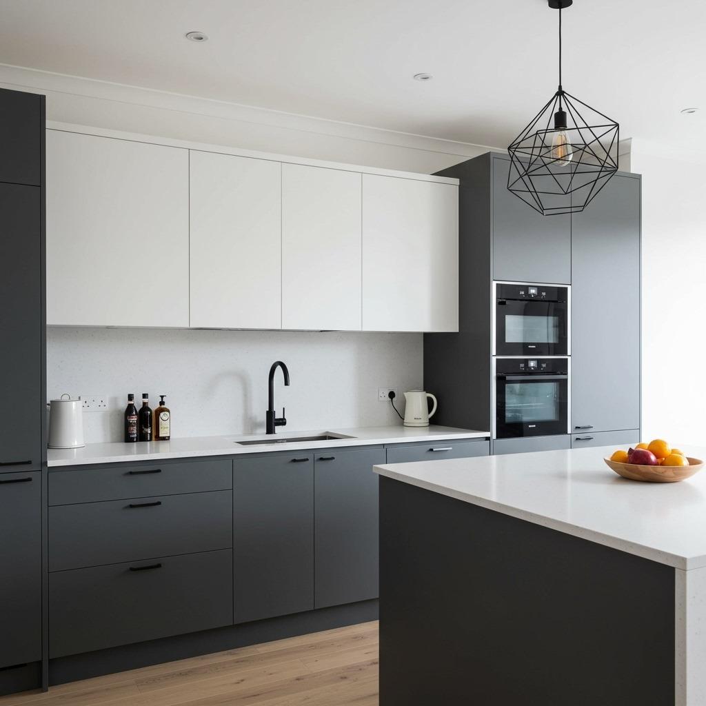
Charcoal gray delivers all the sophistication of black with slightly more flexibility. This shade creates a contemporary, urban feel that serves as the perfect backdrop for colorful accessories and fresh ingredients.
Gray cabinets work particularly well in modern farmhouse kitchen designs where you want that industrial edge balanced with warmer elements. Pair charcoal with butcher block countertops, warm metals, and plenty of texture to avoid a cold, sterile feeling.
The beauty of charcoal lies in its neutrality – it’s bold without being a color commitment. You can change your kitchen’s personality completely just by swapping out accessories, textiles, and small appliances. White grout on a subway tile backsplash creates graphic contrast, while darker grout maintains a seamless, monochromatic look.
6. Sage Green for Soft Sophistication
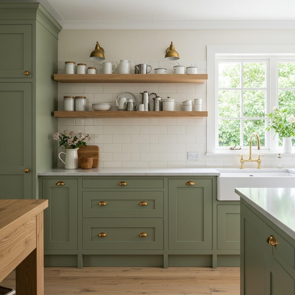
Sage green offers the earthiness of forest green with a softer, more approachable quality. This muted shade feels calming and organic, perfect for creating a kitchen that invites relaxation rather than high energy.
Unlike brighter greens, sage works beautifully in kitchens with limited natural light. Its gray undertones prevent it from looking muddy or dull even in darker spaces. Pair it with warm wood tones, cream or off-white, and natural materials like stone and linen for a cohesive, nature-inspired palette.
Sage cabinets create a versatile foundation that adapts to different styling moods. Brass hardware and vintage accessories push it vintage, while matte black fixtures and modern lighting keep it contemporary. This flexibility makes sage a practical choice for those who like to refresh their decor seasonally, similar to adaptable approaches in minimalist kitchen decor.
7. Rich Burgundy for Cozy Elegance
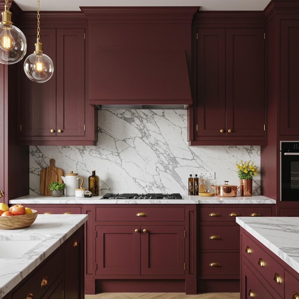
Burgundy brings unexpected warmth and luxury to kitchens. This wine-inspired shade feels intimate and sophisticated, particularly stunning in spaces used for entertaining or evening cooking.
Deep red tones like burgundy work best in kitchens with excellent lighting – both natural and artificial. Install under-cabinet lighting to prevent the space from feeling too dark. Balance the richness with plenty of white or cream on countertops, backsplashes, and walls.
Burgundy pairs beautifully with brass, copper, or oil-rubbed bronze hardware. Natural wood tones add warmth, while marble or light stone counters provide necessary contrast. This color choice creates a restaurant-quality atmosphere that makes everyday cooking feel special.
8. Coral Pink for Playful Warmth

Coral brings unexpected personality to kitchens without the intensity of red or orange. This peachy-pink shade feels playful yet sophisticated, working surprisingly well in both modern and vintage-inspired spaces.
The key to successful coral cabinets is choosing a shade with enough depth – too light reads childish, too bright feels overwhelming. Muted coral with gray or brown undertones offers staying power and pairs beautifully with natural materials. White countertops, light wood, and plenty of greenery balance the warmth.
Coral creates similar energy to what you’d find in a boho style bedroom – relaxed, creative, and welcoming. It’s particularly effective in smaller kitchens where you want color without heaviness. Matte finishes work better than glossy for coral cabinets, preventing the color from feeling too candy-like.
9. Black Cabinets with Gold Accents
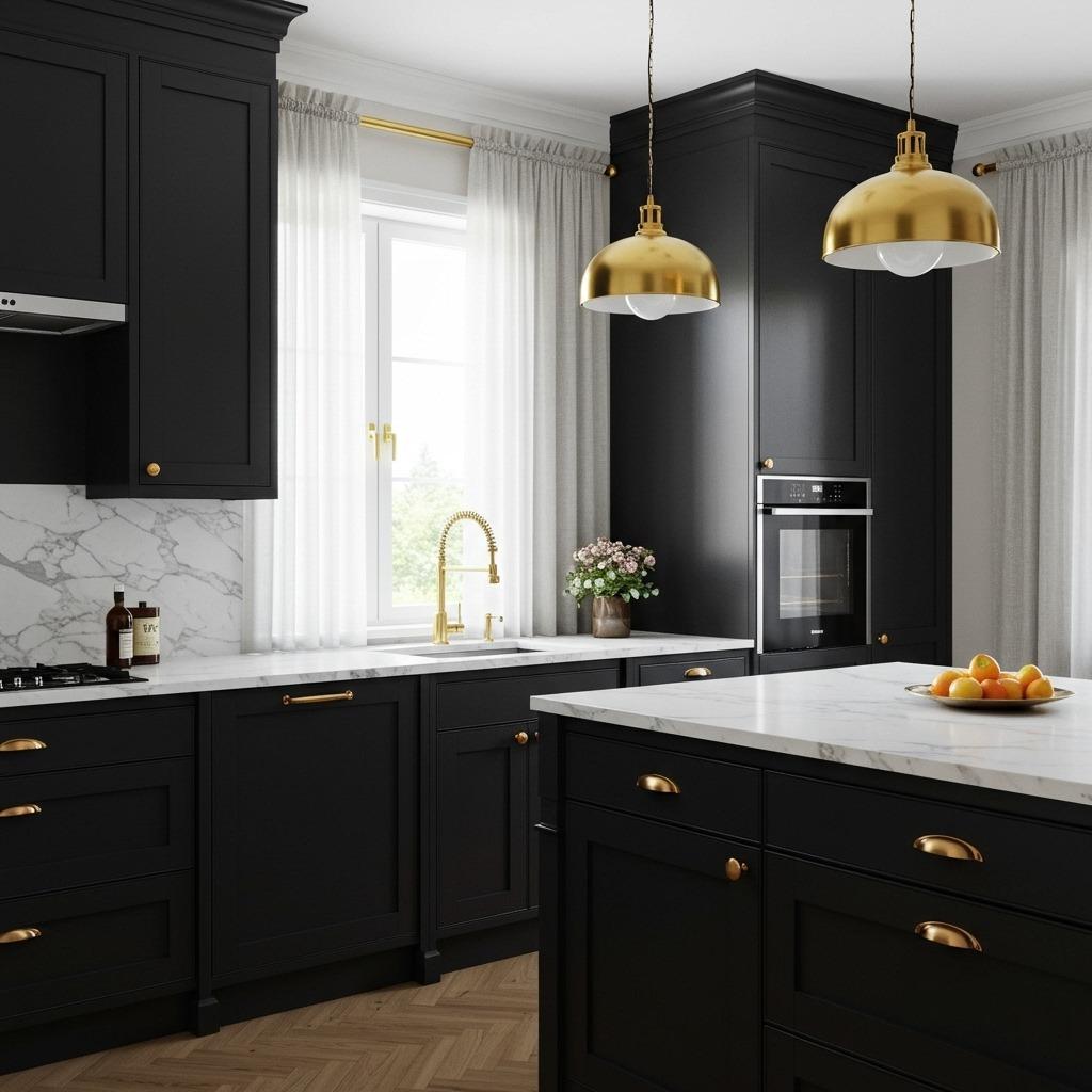
Black kitchens make a powerful statement. When executed well with plenty of contrast and metallic warmth, they feel glamorous rather than oppressive.
The secret to successful black cabinets lies in layering different finishes and textures. Matte black cabinets with glossy black countertops and shiny gold hardware create dimension. Add warmth through wood elements, whether it’s flooring, a butcher block island top, or floating shelves.
Lighting becomes absolutely critical in black kitchens. Multiple light sources at different levels – pendant lights, under-cabinet strips, and recessed ceiling fixtures – prevent the space from feeling cave-like. White or light-colored walls and ceilings help bounce light around. This dramatic approach shares principles with bold wallpaper bathroom designs where contrast and lighting make bold choices work.
10. Cobalt Blue for Vibrant Energy
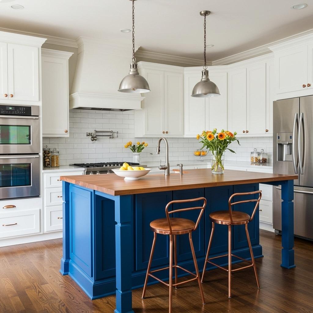
Cobalt blue packs more punch than navy while maintaining sophistication. This true blue shade energizes spaces and creates an almost electric quality when light hits it.
Cobalt works best as a statement element rather than covering every surface. Consider a cobalt island with neutral perimeter cabinets, or cobalt lower cabinets with white uppers. The intensity of this shade requires thoughtful balance – too much becomes overwhelming, but the right amount creates unforgettable impact.
Pair cobalt with warm wood tones and brass or copper hardware to prevent a cold feeling. White countertops and light backsplashes give the eye a place to rest. This color particularly shines in open concept kitchen layouts where it can serve as a defining element that separates kitchen from living areas.
11. Warm Terracotta Cabinetry
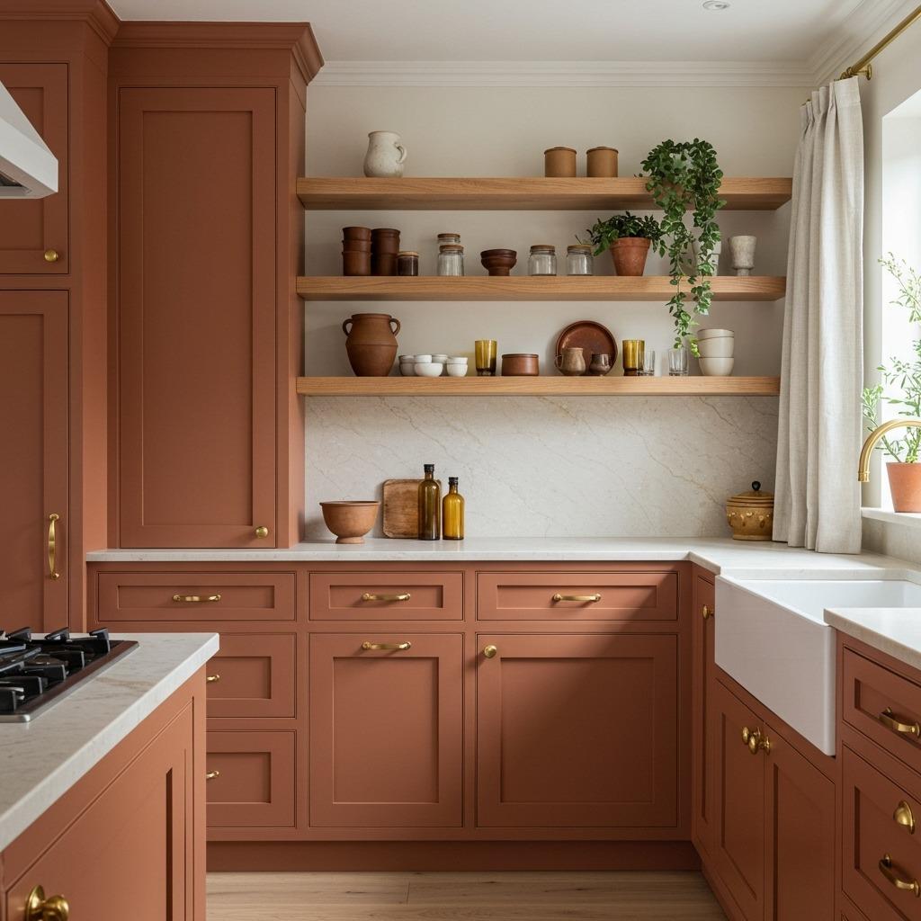
Moving beyond an accent wall, full terracotta cabinetry creates an enveloping warmth that feels both ancient and modern. This earthy orange-brown references clay pottery and sun-baked landscapes.
Terracotta cabinets work beautifully with natural materials – stone counters, wooden elements, woven textures. They’re particularly stunning in kitchens that connect to outdoor spaces or have views of nature. The color complements greenery so well that even a few potted herbs or a kitchen garden view enhances the overall aesthetic.
This shade feels less formal than many bold kitchen colors, creating a relaxed, lived-in quality from day one. It’s forgiving of everyday wear and tear, and the warmth makes spaces feel instantly welcoming. Consider this approach if you’re drawn to rustic kitchen backsplash ideas and want a cohesive earthy palette.
12. Dusty Purple for Unexpected Sophistication

Purple in kitchens remains relatively rare, which makes it perfect for those wanting truly unique spaces. Dusty purple – not bright lavender, but a muted, grayed purple – offers unexpected sophistication.
This shade bridges warm and cool tones, working well with both gold and silver hardware. It pairs beautifully with white, cream, natural wood, and even black accents. The muted quality prevents it from feeling juvenile or overly feminine, instead reading as confident and artistic.
Dusty purple cabinets create a similar atmosphere to what you might achieve in artistic bedroom ideas – creative, personal, and slightly unconventional. This choice works particularly well for home cooks who see their kitchen as a creative studio rather than just a functional workspace.
Bringing Bold Color to Your Kitchen
Choosing bold kitchen color requires confidence, but the payoff in personality and visual interest far exceeds safe neutrals. Each of these 12 approaches creates a distinctly different mood and atmosphere.
Start by considering how your kitchen connects to adjacent spaces. In open concept kitchen living room layouts, your kitchen color becomes part of a larger visual story. Test paint samples in your actual space, observing how they look throughout the day in different lighting conditions.
Remember that colorful cabinetry doesn’t require painting everything. A bold island with neutral perimeter cabinets often provides just enough statement kitchen color without overwhelming smaller spaces. You can always expand your color commitment later if you fall in love with the initial result.
Think beyond just paint, too. Colorful tile backsplashes, painted ceiling beams, or even just one dramatic accent wall can introduce bold color without the commitment of cabinet painting. The goal isn’t to follow trends but to create a kitchen that genuinely excites you every time you walk into it.
Your kitchen’s color should reflect how you want to feel while cooking and gathering. Whether that’s energized by sunny yellow, calmed by sage green, or emboldened by deep navy, there’s a bold color waiting to transform your cooking space into something truly special.